Some 25 years ago, I came up with tiny application: each day, a person picks a color that represents his or her predominant emotional state; the collection of color moods are mapped onto a calendar and displayed as an animated film, summarizing the emotional life of person. It was simple and easy and very effective. And in some way, this was also part of the affective computing — computers that use emotion as part of HCI. [Note: This could and was done with watercolors as flip book some 40 years ago when I played in my art class in school.] Affective Computing, I feel, is only recently became part of the “vocabulary” of computer-based developers. When I first started working in this field, graphics were non-existent, thus Pong. In the early nineties, my business partner and I met with the president of Organic, a web design firm in San Francisco, who promptly informed us that his business had no need for Interaction or Interface Designers, that’s what graphic artists were for. Now, psychologists, sociologists, and sociologists are routinely hired by creative firms to help solve design problems. Times change! There are a lot of posts on emotional design on this…
Tag Archive for emotional reaction
Featured, Interface Design, Perception, Pipsqueak Articles
Creativity, Perception, and Public Art
by Olga Werby •
Art or craft? Creativity or public nuisance? Sometimes, the line between these is so fine, so complex, so fractal, that it’s simply doesn’t matter. The images below span thousands of years in dates of creation. The artists used light and shadow, perspective, and clever geometry of space to add meaning to their work. All showed an amazing amount of imagination, all provide commentary on current events or a point of view. Happy holidays to all! Enjoy! [flagallery gid=3 name=”Gallery”]
Attention, Background Knowledge, Conceptual Design, Interaction Design, Language, Perception, Pipsqueak Articles, Product Design Strategy
Thinking about the Science of Communication and Interaction
by Olga Werby •
In the Galaxy Far Far Away… What if sentient being evolved on a planet with permanent cloud cover? What if these being never saw stars? Would they still be able to discover the laws of nature? These kinds of hypothetical thinking questions — the Gedankan Experiments, as Einstein put it — are very useful in science. I’ll try to use them here for analyzing product design and communication. So what senses do we need to communicate? And what body appendages are necessary to produce this communication? Note that it helps keep track of these separately. Aroma-bet When I was little, I “designed” a language based on smell: each smell was assigned a character in an alphabet and, strung together in sequence, my smelly letters transcribed into words — the Aroma-bet. There were several problems with this: It was difficult to get an alphabet-worth of distinct odors; Arranged next to each other, the odors started to blend into each other, making “reading” difficult; I got a very bad headache; My mom didn’t like her expensive perfumes used in such a creative way… And I couldn’t remember what letter each smell stood for, requiring the creation of a smell-o-dictionary, which in turn…
Conceptual Design, Cultural Bias, Interaction Design, Interface Design, Mental Model Traps, Pipsqueak Articles, Product Design Strategy
Design for Emotion, for Empowerment
by Olga Werby •
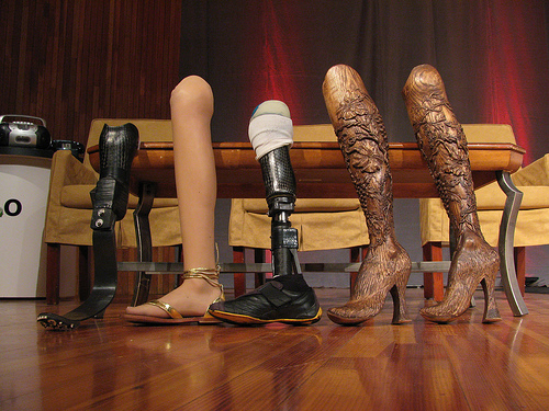
I use a cane to get around, a consequence of an unfortunate encounter with a taxi many years ago. I have many different canes (each heel size, for example, requires its own cane). All are cool. Some have animal carvings, some have silver, some have gold, some are complex in design, some are very Deco in style, and one has a sword (another a compass and a secret compartment). I get stopped on the street all the time — people love my canes and always comment. I was even told once that my limp is sexy — whatever… What I don’t have is an “old woman” cane — the kind you buy at a pharmacy. I’m just not that old, and plan never to be that old. I want funky, I want things that match my outfits and my moods. And I want them functional: the right hight, the right feel of the cane handle, the stability of the tip, the light weight, the structural security. I want it all and I want it sexy. Cane is a product — a very personal one. But most are stuck with poorly designed, boring, ugly, you-make-me-feel-like-an-invalid cane. Why? Aimee Mullins is a…
Cognitive Blindness, Mental Model Traps, Pipsqueak Articles
Intel i5 Core Commercial: When a company just doesn’t get it
by Olga Werby •
Sometimes, a company just doesn’t get it: it’s not about what a product can theoretically do, but what it can do for the user. Intel has a history of making a particular type of commercials — “the power inside” commercials, I call them. Intel marketing people use the following mental model: people/men like muscle cars; people like powerful things; thus if we emphasize the power “on the inside” people would like our computers. And so their current commercials for Intel i5 Core look like this: So what’s wrong with this? It’s all about them, it’s not about me. I don’t care what’s inside the machine, I care what it can do for me. Or, more accurately, what I can do with it. It’s about my performance. Imagine going to a car lot and the car salesmen tells you: “It got huge pistons. I mean HUGE. You’ve got to see those pistons!” Perhaps some car buyers would get inspired by such language, but I bet most would find it puzzling. Why should I care? Does it drive well? What’s the performance like? Maneuverability? Intel’s commercials about its chips are just like a car manufacturer’s fetish remarks about pistons. Sure some would…
Background Knowledge Errors, Cognitive Blindness, Errors, Mental Model Traps, Mirroring Errors, Pipsqueak Articles, Product Design Strategy
Socially Constructed Beliefs
by Olga Werby •
American Academy of Pediatrics (AAP) came out with a strong recommendation against the use of bumpers in cribs. The September 2007 issue of The Journal of Pediatrics examined deaths and injuries attributed to infant crib bumper pads: “Twenty-seven accidental deaths reported by medical examiners or coroners were attributed to bumper pads. The mechanism of death included suffocation and strangulation by bumper ties. Twenty-five nonfatal injuries were identified, and most consisted of minor contusions. All retail bumpers had hazardous properties.” AAP has finally announced that it is formally against bumpers. That certainly took a while. And, amazingly, the bumper pads are still for sale by all major baby room outfitters, and parents are still buying them and using them with their beloved offspring. Why? Why would parents knowingly endanger their children? This is an interesting case of Mental Model Traps, Mirroring Errors, and Cognitive Blindness. Mental Model Traps Let’s start by Mental Model Traps that parents fall into in this particular case. To do this, we need to back up in time a bit. The design of children’s beds had undergone considerable evolution over the last few centuries. Cribs used to be just large baskets with tightly woven sides. The weave…
Interaction Design, Interface Design, Pipsqueak Articles, Scaffolding
Passionate Interface: Siri Inspires Love
by Olga Werby •
You know your product is succeeding with its users when, within days of its launch, they write love songs to your work. Check out this love ode to Siri, Apples latest interface update.