Interface Design

What does the product feel and look like?

Developing a Story

Vars signs books

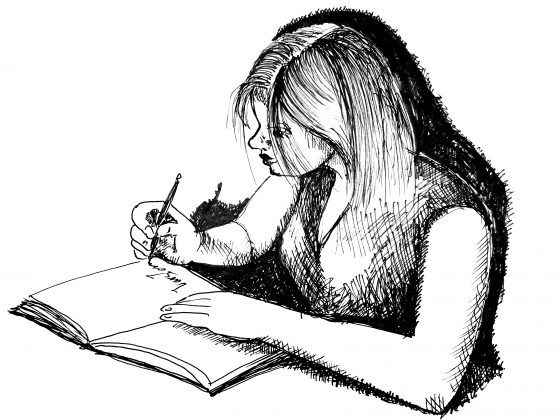
How does one choose a story? Or does a story choose its teller? For me, random triggers in my subconscious coalesce and spark inspiration that is not yet a story but rather the embryo of one. That seed, with time, might ripen enough to be worth planting. But the seed of a story doesn’t contain a compelling narrative that grabs and doesn’t let go until the very last word and beyond. A good story stays with its reader long after the last word is seen or heard. It rises unbidden in the middle of the night to infiltrate the reader’s dreams and deliver something new — a melding of what the author was trying to tell and what the reader took away. What does it take to develop a good story? A spark of imagination is one. Persistence is another — it takes time and perseverance to get words down on a page. But there’s more. I believe that good stories, like all good products, are constructed following a design process. There are always constraints on how the story needs to be told for a specific audience. There are industry demands on authors. There is a ton of background research.…

What’s in a Cover?

Coding Peter Suddenly Paris 2 Covers

The design of the cover can make the book… or so I was told. Certainly, bad covers don’t contribute to sales. But good covers are difficult. And the thought on cover design has changed over the years… just like fashion. Since I tend to design my own covers (and I’m an artist and a designer), I wanted to put together some ideas, if not rules, to follow and some background of how to think about book cover design. Because if you don’t do your own, you still need to communicate what you want with the person that does. Book Covers Through Time To appreciate a cover, it helps to understand its roots. I won’t go back far, since my genre is science fiction, just a hundred years or so. Consider the cover evolution of Jules Verne’s “Journey to the Center of the Earth”: There is a movement from frills to realism to a strong graphic look of the more modern editions. While for the 1800’s editions, we might find it difficult to identify the genre of this story, by the time we hit 1960s, there is no doubt that this is a science fiction or fantasy novel. The cover alerts…

Users Making Fun of Interface Icon Designers

laundry icons fails

You know you failed as an icon designer when users exchange humor forwards on Facebook based on your work. We’ve all done it — we’ve all looked at the little labels on our clothing and tried to figure out what those iconic instructions mean. The icons are so bad that manufacturers themselves are making fun of them! There is not a huge downside for in this case failure, though, in this case. At worst, the piece of clothing would be ruined. Painful, but in the scheme of things not that bad. But other circumstances are more troubling. Last night, an alert lit up on my car’s dashboard. It was a strange symbol, a bit rounded, some waves on top. I had no guess as to what it was. It was accompanied with a bright red glowing triangle with an exclamation sign inside — the universal sign for warning, pay attention! Should I pull off the road? Is this bad? It’s dark and raining outside. Thankfully, my car manual was in the glovebox — I could look this up. In took a few minutes but I figured out that the strange symbol means low pressure in one of my tires (no…

What’s in the Cover Art?

Coding Peter Suddenly Paris 2 Covers

This month we have released a sequel to Suddenly, Paris — Coding Peter — AND changed the covers of both books! Above is photo of before and after for the cover art of both books. Can a cover make a difference in the sales of these books? These products? Yes! Cover art makes a huge impact on how a book is perceived by its audience. Or to put it even stronger, the art on the cover of the book helps the potential reader recognize the book as something that they would like to read. Personally, I thought the original covers with strong black, red, and white design were striking. But that design didn’t communicate the genre of the books to its audience. We needed to come up with illustrations that made it clear that these stories were science fiction, and action adventure, and aimed at a new adult readers. We needed to covey a sense of mystery and danger. We wanted people to stop and notice the books based on their covers. And so we made it change. The new covers are a lot more narrative. And hopefully it would make a difference as the potential readers browse pages of…

Thoughts on An Event Apart San Francisco

AnEventApart Logo

We just returned from An Event Apart San Francisco and I am trying to put down notes and ideas while they are fresh in my mind. It was three full intense days of information — some great, some good, some not so much. But overall, it was a valuable experience (and they do conference right — great food, comfortable location, endless supply of coffee and sugar). My take is always unique — I overheard some people who were ecstatic over the presentations that I felt were completely off — but I have been in the business for over three decades now and I want ideas that are new to me. So here are my notes from the presentations. “The Fault, Dear Brutus (or: Career Advice From a Cranky Old Man)” by Jeffrey Zeldman A lot of what Jeffery spoke about resonated strongly: the need to force ourselves to get rid of disdain for our clients that just “don’t get it” — mutual respect is the foundation of designer-client relationship in conversation about design, focus on purpose and use and stay away from esthetics — every person has their own sometimes, people (clients, bosses) are incapable of seeing our growth as…

We Are the Magicians

Maximilien Luce, Morning, Interior, 1890, using pointillist technique

We all make magic every day. Don’t think so? Then consider this, we conjure up complete worlds of information with a mere suggestion, just a bit of outline, a stroke or two, a few words, a spatter of color, a dash of melody. We literally make grand visions from just a trickle of data. This is true for those who design and those who consume information. Let’s first explore our ability to comprehend very incomplete information. Take pointillism — an art movement (technique) that required artists to create images using points of pure color — why are we able to “see” the complete image from a mere collection of dots? With just a collection of colored dots, we are all able to imagine the mood, understand the story, visualize the universe behind this painting. You can say: “well, the artist was great at using dots.” But it is not just dots that we are good at. We reconstruct our reality from little bits of incomplete data all day every day of our lives. Consider the tone of voice of the person who answered the phone — you can easily tell the mood and even guess at the personality of that…

Fun, Creativity, and Good Design

springy bed frame

The best product designs not only work well, they make us smile. They solve problems we as consumers haven’t even consider yet or realized we had. Take a look at a selection of product designs below. The springy bed frame is not only functional, but a conversation starter — don’t you want to try it out? The “selfy stick” helps us take better photos of ourselves. Our arm reach is no longer a limitation or a liability — I like my portraits taken from the top to reduce that double chin! It’s fun to be elegant… until it all crushes down around us. Finger tip tray is the solution! Finger food will stay safely on top of the tray with this cool design. And again, it’s a conversation starter — a perfect tool at a party. While I’m not sure I would advertise my waist size with this imaginative belt, it could serve as a powerful reminder to keep to a diet. Serving tea to your aunt? Wouldn’t this put a smile on her face? In one of my design classes, a student proposed a bed light that would adjust to awaken the sleeper gently. This one does it with…