Tag Archive for visual processing

LEGION: Women of Sci-Fi

Legion Women Authors of SciFi

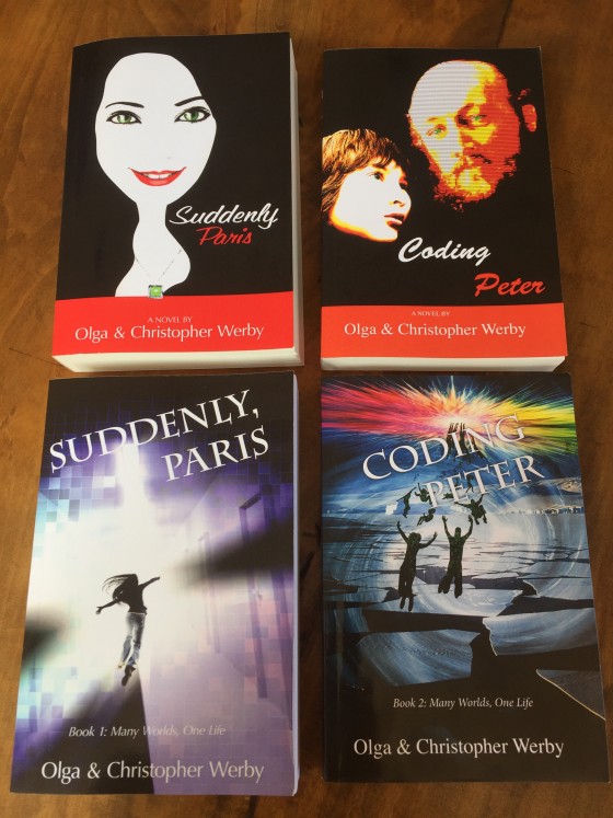
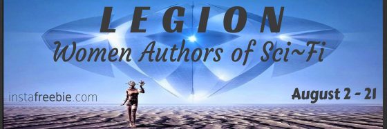
This month on Instafreebie, a group of women writers organized an ebook giveaway. There are amazing stories in this collection (and even two of mine). I hope you take a look and download a bunch… …and as you do, consider the design of a science fiction book cover! One of the interesting side benefits of these giveaways is the ability to view a bunch of covers all together. What do you see? Which books jump out at you? Can you spot problems with book design? I can — a lot of the typography doesn’t work in this size — too small or too convoluted in font selection, making either the name of the book or the name of the author unreadable. Another problem is color — some covers are too muted and lack contrast to stand out in a group. Others have too much detail and are hard to take in at a glance. First impressions matter — readers (as all humans) take in visual information quickly and make judgments based on emotion first (and then come up with reasoned justifications for those feelings). The job of a book cover designer is to make a good first impression, to allow…

What’s in a Cover?

Coding Peter Suddenly Paris 2 Covers

The design of the cover can make the book… or so I was told. Certainly, bad covers don’t contribute to sales. But good covers are difficult. And the thought on cover design has changed over the years… just like fashion. Since I tend to design my own covers (and I’m an artist and a designer), I wanted to put together some ideas, if not rules, to follow and some background of how to think about book cover design. Because if you don’t do your own, you still need to communicate what you want with the person that does. Book Covers Through Time To appreciate a cover, it helps to understand its roots. I won’t go back far, since my genre is science fiction, just a hundred years or so. Consider the cover evolution of Jules Verne’s “Journey to the Center of the Earth”: There is a movement from frills to realism to a strong graphic look of the more modern editions. While for the 1800’s editions, we might find it difficult to identify the genre of this story, by the time we hit 1960s, there is no doubt that this is a science fiction or fantasy novel. The cover alerts…

We Are the Magicians

Maximilien Luce, Morning, Interior, 1890, using pointillist technique

We all make magic every day. Don’t think so? Then consider this, we conjure up complete worlds of information with a mere suggestion, just a bit of outline, a stroke or two, a few words, a spatter of color, a dash of melody. We literally make grand visions from just a trickle of data. This is true for those who design and those who consume information. Let’s first explore our ability to comprehend very incomplete information. Take pointillism — an art movement (technique) that required artists to create images using points of pure color — why are we able to “see” the complete image from a mere collection of dots? With just a collection of colored dots, we are all able to imagine the mood, understand the story, visualize the universe behind this painting. You can say: “well, the artist was great at using dots.” But it is not just dots that we are good at. We reconstruct our reality from little bits of incomplete data all day every day of our lives. Consider the tone of voice of the person who answered the phone — you can easily tell the mood and even guess at the personality of that…

Fashion and Interface Design

Fashion Design shows have started up again: Fall 2014. I confess to a guilty pleasure of paging through photo after photo of the latest styles. There is something like a cross between artistic exuberance and freak show, all rolled into one insane media blitz. How can one not look? But there’s more to my looking than pure perverse curiosity. It’s true, I don’t really care what men will be instructed to wear and to like in the next season (or women, for that matter). But I do look for trends and patterns. And I also find something akin to Interface Design sensibility in the fashion industry — which way are we heading? What will be the next thing? What are these designers trying to say with their work? Product Design and Fashion Conceptual Design: What is it? What does this piece of clothing design to do? Keep the person warm? Cool? Modest? Allow them to get a job? Which job? Convey their personality? Cover up scars? Reveal tattoos? Make a political statement? Be cheap? Show off wealth? Last a long time? Be practical? Protect from the elements? Arm against hostiles? Depending on the purpose, clothing can take very different forms.…

Perceptual Focus Error

Early on in my academic career, I did research in a middle school classroom. Computers were just introduced to a bunch of kids that never experienced them directly before. There were very few computers in schools at the time, and students were bunched up in groups around each one. One kid got to sit and control the keyboard, another student controlled the mouse. (I bet you know the genders of these two kids.) Most kids just focused their attention on the screen. The task was to familiarize with how the desktop computer interface worked. At the end of the activity, I got to interview the kids. One of the surprises was how many of the kids didn’t associate the movement of the mouse with the action on the screen. To connect the two actions together, a kid would have had to know that mouse movements and a pointer were related. It was not an obvious observation, especially in a tight crowd of a student group around the computer screen. And to this day, this required double focus is difficult for kids on the Autistic spectrum (iPads are much more intuitive for this population). One of the conclusions of my study…

Colorblindness Test on iPhone Google Traffic Map

2013 iPhone Traffic Google Map Colorblind Test

Google Traffic Map on an iPhone (or any other mobile device) is a great product… unless you are colorblind. Then, it’s a nightmare! 5% to 20% of the population has some kind of color processing disorder. Here is a simple test if you are one of those. Which of the following look the same to you? Click on the image above to enlarge. Red/green confusion — Protanopia: red/green color blindness, no red cones; Deutanopia: red/green color blindness, no green cones; Protanomaly: anomalous red cones; Deutanomaly: anomalous green cones — are the most common visual processing problems. But there is also blue blindness — Tritanopia: blue/yellow color blindness, no blue cones; and Tritanomaly: anomalous blue cones. The most rare cases are the monochrome colorblindness, the true loss of color — Achromatopsia: low cone function; and Atypical Achromatopsia: low cone function with some color. As designers, we have to be aware of our audiences’ limitations and strength. And visual processing and comprehension is no exception. In the past, I’ve written about colorblindness: . But unfortunately, the site that helped identify problems with design doesn’t seem to work. Here’s a new sit e for your reference: Colorblind Web Page Filter If you are…