Tag Archive for Apple

“Thanks for choosing Apple”…not!

Apple Customer Service... Not

This last month, we had a bizarre customer service experience with Apple iTunes. It started on September 13th with a simple purchase that wasn’t fulfilled. It ended with us angry and frustrated for no reason. Apple was having a one-day promotion where they were selling movie bundles of 10 movies for $10 each. My husband couldn’t resist and purchased three of the six bundles on Apple TV. But the movies didn’t show up in our list of purchased movies. It’s not the first time we’ve bought movies; our credit card was up-to-date. Something technical had just gone wrong. So the next day, my husband submitted a customer service request with Apple iTunes. The Apple Customer Service rep said that he could see that the purchases had been made and said that other customers were having the same problem getting their purchases. He said that he would resolve the issue. But then, another strangely hostile customer service rep took over. He recanted what the previous rep had said, implied that my husband was a liar and said that he could tell that we had never purchased anything, and effectively told us to go get bent. The customer service interaction with Apple…

Where to post the “OK” Button on the Screen?

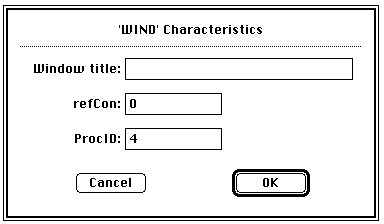
OK Button on Early Mac

I have very strong opinions about where on the screen the OK or NEXT or SUBMIT buttons go in relation to CANCEL. Without giving it away, I’m going to walk through the design decision tree and provide a lot of references for both sides of the issue — yes, there are strong feelings about the right versus the left position choice. I’m not alone! Passive versus Active Buttons Active Buttons are the ones that advance the action to the next level. Passive ones return the users to previous state, negate the action sequence. OKAY, OK, NEXT, SUBMIT, ACCEPT, GO are all active buttons. CANCEL, BACK, PREVIOUS are action that reverse forward momentum and push the user to places they’ve been before. HELP and INFO sidetrack the user and distract from forward thrust of activity. In general, product designers want to move the users toward their goals — thus we want the perceptual focus to be on the action buttons. We want to make sure that users fist see the way forward, and then click on the right button that propels them forward to completion of the task. All distractions and side movements should be downplayed with Interface Design with the…

Intel i5 Core Commercial: When a company just doesn’t get it

Sometimes, a company just doesn’t get it: it’s not about what a product can theoretically do, but what it can do for the user. Intel has a history of making a particular type of commercials — “the power inside” commercials, I call them. Intel marketing people use the following mental model: people/men like muscle cars; people like powerful things; thus if we emphasize the power “on the inside” people would like our computers. And so their current commercials for Intel i5 Core look like this: So what’s wrong with this? It’s all about them, it’s not about me. I don’t care what’s inside the machine, I care what it can do for me. Or, more accurately, what I can do with it. It’s about my performance. Imagine going to a car lot and the car salesmen tells you: “It got huge pistons. I mean HUGE. You’ve got to see those pistons!” Perhaps some car buyers would get inspired by such language, but I bet most would find it puzzling. Why should I care? Does it drive well? What’s the performance like? Maneuverability? Intel’s commercials about its chips are just like a car manufacturer’s fetish remarks about pistons. Sure some would…

Rewired Brain

Our kids have grown up in the world where computers were always present and always on. They can’t conceive of a time when they can be cut off from the Internet (vacations in the Internet-dead zones are definite no go). Our kids are the generation of fully-connected always-on Internet users. What about the kids that are born right now? Not the Millennials, as they are being called, but these babies born in the age of the iPad? The iTouch Babies? How are their brains being rewired from the experience of having the iPad as their first toy? Check out this video of a baby girl growing in the iTouch World.

Innovation 2.0

In my book on product design, Interfaces.com, I talk about a shift from evolutionary product design to the current model of version numbering. There has been a murmur of disappointment this last week when Apple issued iPhone 4S instead of the expected iPhone 5. The new features of iPhone 4S are exciting, new, and unexpected (think Siri). So what’s the problem? Is it really that the version number is too low for our expectations? In the days of yore, no one has ever heard of version numbers. What hammer do you own? Is it version 1.0 or 5.0? Do you care? We have many different types of hammers in our garage, but we don’t think of them in terms of version numbers, rather we focus on what they were designed to help us do: hammer a nail in the wall; pull out a nail; tack in the a little staple in the floor boards; create a hammered copper art piece. Each task requires a different approach and a different tool. And each tool was carefully and systematically honed to perfection by thousands of years of human use: from stone hammers to our tools in the garage a continuous progression of…