
You know you failed as an icon designer when users exchange humor forwards on Facebook based on your work.
![]()
We’ve all done it — we’ve all looked at the little labels on our clothing and tried to figure out what those iconic instructions mean. The icons are so bad that manufacturers themselves are making fun of them!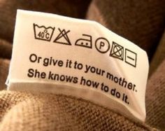
There is not a huge downside for in this case failure, though, in this case. At worst, the piece of clothing would be ruined. Painful, but in the scheme of things not that bad. But other circumstances are more troubling.
Last night, an alert lit up on my car’s dashboard. It was a strange symbol, a bit rounded, some waves on top. I had no guess as to what it was. It was accompanied with a bright red glowing triangle with an exclamation sign inside — the universal sign for warning, pay attention! Should I pull off the road? Is this bad? It’s dark and raining outside. Thankfully, my car manual was in the glovebox — I could look this up. In took a few minutes but I figured out that the strange symbol means low pressure in one of my tires (no indication which one). I pull into the gas station, walk around the car. The tires look good to me. The warning light was still on. And still on the next morning when I drove the car again.
A good icon interface designer needs to quickly communication:
- What’s the problem?
- Is it urgent?
- Where is the problem? (which tire)
And then there needs to be a suggestion of what to do next:
“Next time you bring the car in for a service, have them take a look at this.”
or
“Get out of the car and run — she’s gonna blow!”
and somewhere in between.
Icons are short-form, true, but they are also a means of communication. If they fail to communicate, then what’s the point? It’s important to not fall into the trap of “if I get it, so will my users” — mirroring errors.
PS: Thank you citizens of Internet for creating wonderful illustrations!