51 search results for "visual design"

Review eBook: Affordances and Design

Manches a Gigots

Victor Kaptelinin, a Professor at the Department of Information Science and Media Studies, University of Bergen, Norway, and the Department of Informatics, Umeaa University, Sweden, just published an eBook with Interaction Design Foundation: “Affordances and Design.” I was asked to write a review of this book and provide some insights into using affordances in interaction design and HCI. Let me start by providing the definition of affordance as given by Donald Norman: In his eBook, Victor Kaptelinin provides the history of the idea of affordance from its initial introduction by James Gibson in 1977 to the present day. The eBook’s bibliography and reference section is a great place to start the exploration of this topic for anyone new to these ideas. Unfortunately, the book doesn’t help much if an individual is looking for some guidance on how to apply these ideas in practical situations during interaction design or HCI design. For clarity’s sake, allow me to give a very brief explanation of affordances, from their roots to the present time. When James Gibson first introduced the concept of affordances, he focused on physical environment — what actions are possible? And the set of these action were invariable — just because…

When Design and Interface are Dictated by the Technology

You’ve probably heard: If you have a hammer, everything looks like a nail. This is a commentary on how our problem solving perspective is influenced by the tools we happen to have in our hands at that moment. The tools, of course, don’t have to be physical. They can be systems, or lists, or a set of approaches that we’ve learned at school or that are enforced at work. And they can also be digital tools that we feel particularly comfortable using. These “tools” constrict our metal models, limiting the possible solutions to the design problems we face at work (or at home). It’s not a surprise that if we Google “WordPress Templates,” all the results look more or less the same. This is partly because of the tool — WordPress is a great tool, but as any tool, it limits the final creative output to what is easy. (Especially, if the designer is not a programmer.) Here’s a look at Google Image results for “WordPress Screenshots”: What’s interesting is the flip side of this phenomenon. Once we see a lot of nails, we expect nails as the solution. So it is not a surprise that not only do most…

Review: Gamification at Work: Designing Engaging Business Software

gamification at work book cover

Interaction Design Foundation is about to publish Janaki Mythily Kumar’s and Mario Herger’s 2013 book: “Gamification at Work: Designing Engaging Business Software.” [reference: Kumar, Janaki Mythily and Herger, Mario (2013): Gamification at Work: Designing Engaging Business Software. Aarhus, Denmark, The Interaction Design Foundation. ISBN: 978-87-92964-06-9.] Kumar and Herger put together history and background of gamification among a broad spectrum of ventures and included a quick guide for how to apply some of the ideas and key concepts to the design of corporate dynamics for your company! Here are a few gems from the book: Figure 2.1: Player Centered Design Process. Courtesy of Janaki Kumar and Mario Herger. Copyright: CC-Att-ND (Creative Commons Attribution-NoDerivs 3.0 Unported). Figure 3.3: Bartle Player Types. Courtesy of Janaki Kumar and Mario Herger. Copyright: CC-Att-ND (Creative Commons Attribution-NoDerivs 3.0 Unported). If you think of these as user-types, then Kumar and Herger provide a set of ideas of how to design to meet the needs of these different player groups. They provide a great Player Persona Template. In Chapter 4, they explain how to gather the data for a particular company and develop user personas based on actual ethnographic information. Chapter 5 explores the motivational drivers and even…

Designing an Optimum Nudge

Tornado Exhibit at the Exploratorium

I’m sitting by a window looking out at a rainy Paris street, thinking of cultural differences between Paris and San Francisco, taking advantage of bad weather to do some writing. Over two decades ago, I did some ethnographic research a Exploratorium, looking at how different visitors interacted with the museum’s hands-on exhibits. I was looking for ways to improve the visitors’ experience, raise understanding of the phenomena they were observing. What I saw was different ways in which visitors experienced failure: p-prims that got in a way; folksy wisdom that caused confusion; lack of affordances that led to bottlenecks; permission giving that set up strange expectations; etc. The results of this study turned into a Master Thesis for UC Berkeley. Now, I would like to explore some of the ideas that surfaced during my Exploratorium research and apply them to design of nudging — carefully crafted affordances and perceptual cues that manipulated users into acting a certain way while maintaining the illusion of freedom of action. Let me start with a bit of history — a quick summary of some of the results of Exploratorium study. Permission Giving Two decades ago, “hands-on” exhibits were still novel in the museum world.…

Special Preview: Socio-Technical System Design

Segway Tours in SF

Brian Whitworth and Adnan Ahmad contributed a chapter on Socio-Technical System Design for the free Interaction-Design textbook. This is a very interesting, if technical discussion of the subject. While reading it, I kept thinking about how I would love to debate some of the points raised in this Chapter in person. But lacking this opportunity, below are my ideas and thoughts on the subject of Socio-Technical System Design. First, let me give a quick summary of what is a socio-technological system paraphrasing a bit from Whitworth and Ahmad own words: Socio-technology is about technology and people. Technology is any device. IT system is then a combination of software AND device(s). Human computer interaction (HCI) is a person plus an IT system. Introduction of “person” brings physical, informational and psychological levels into the combined system. And finally, socio-technical system (STS) is merger of community and HCI(s). A Bit of Historical Perspective When my son was in third grade, he was given an assignment: compare some technology from today with that of 100 years ago. He chose transportation. Here’s his insight: 100 years ago, going from San Francisco to Berkeley took a very long time. There were no bridges. People had to drive their…

Design Solution to Real World Problem — Speeding!

Canada Road Slowdown Project

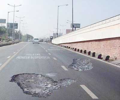
Knowing something about behavior, visual processing, and human nature, designers can nudge users into doing the right (or in this case, lawful) action. Speeding is a problem all over the world. People are notorious for underestimating the real amount of time it takes to get places they need to be. Traffic congestion, car problems, detours, and other (un)foreseen events can make a huge difference in time variability of getting from one place to another. The problem, though, is that we can’t really force people to leave on time or drive the speed limit when the drivers think that no one is looking. So with the law on our side, we can create other ways of forcing people to behave lawfully by changing environmental conditions and relying on human nature not to do what’s right, but to do what they think they have to based on circumstance. Here are a few creative ways of solving the speeding problem on our streets. Using Visual Processing Errors to Slow Traffic Canadian drives misdiagnose the problem and try to drive straddling the “hole” in the road. Everyone is successfully slowed down. The Fake Traffic Cop Threat as a Speeding Deterrent In general, people tend…

Special Preview: Visual Aesthetics

Terry Herbert Gold Sward Decoration

Interaction-Design.org is doing an amazing job of developing a textbook for Human-Computer Interaction (HCI) Design. This newest chapter, Visual Aesthetics in human-computer interaction and interaction design by Noam Tractinsky works to tease out the aspects of design that make products appealing, memorable, culturally-appropriate, emotionally satisfying, and beautiful. Beauty & Aesthetics Evolve in Time It’s good to remember that what we find beautiful and appealing changes and evolves in time as well as across cultures. Here’s a wonderful demonstration: 500 Years of Female Portraits in Western Art. What Makes Design Beautiful? In the Interaction-Design.org chapter, Tractinsky starts with Vitruvius’ design principles. Vitruvius lived in the 1st century BC and develop a set of standard criteria by which to evaluate architecture: Firmitas — durability or life-span of the building in relation to its purpose; Utilitas — usability of the building by its intended audience; and Venustas — the beauty of the building (this would be culturally-specific). 2,000 years on and we still talk about durability, usability, and aesthetics of products. Since this chapter discusses architecture, I would like to talk about weapons. Weapons pre-date architecture, but they still follow the same rules for design: durability and reusability, usability, and beauty. If you’ve…