
Not much to add here — how many other cool video games are there for visually disabled? Using tactile clues instead of visual signals is a nice interaction design solution. Well done!
51 search results for "visual design"
Conceptual Design, Featured, Flow, Pipsqueak Articles, Product Design Strategy, Scaffolding, Users
Fun, Functionality, Flow: the 3 F’s of Product Design
by Olga Werby •
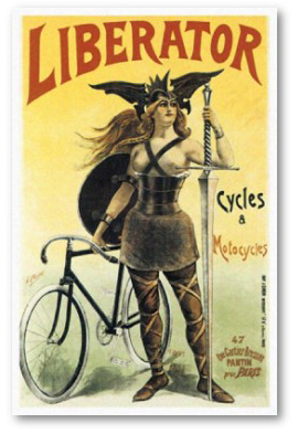
Good product design—design that solves a real need; design that considers the strengths and weaknesses of the user; design that stands the test of time and cultural fads—always incorporates the the 3 F’s: Fun, Functionality, and Flow. It’s easy to talk about the 3 F’s in abstract, but I thought taking a concrete example of a bicycle would be more productive. A bicycle is a designed object that satisfies a real need, does so in way that brings joy to its users, and the act of riding results in flow experience for many. The old “Liberator” poster tries to communicate all 3 F’s to the potential buyers of its products: liberator means freedom to move, real functionality; the woman warrior communicates power and fun—you will feel the way she looks! It’s exhilarating! Notice the high heels and the beautiful vista (with a rough terrain) and a kid pointing at the riders with envy. These posters, old advertising ads for bicycles, try to communicate the same: it’s fun, functional, and exciting to ride a bike. Ride, and look good. Ride, and be the center of attention. Design for Fun So what makes a particular design fun? It seems that one of…
Contributor, Cultural Bias, Cultural Differences, Ethnographic & User Data, Language, Metaphor Mistakes, Product Design Strategy
Language and thought in user-centered design
by mabelev •
Deutscher, G. (2010). “Does language shape the way you think?” New York Times Online Edition. Retrieved on October 4, 2010. http://www.nytimes.com/2010/08/29/magazine/29language-t.html This article summarizes the history and the current status of the linguistic relativity hypothesis or the idea that “language shapes thought.” This idea comes in several different formulations. The version on which Deutscher’s review focuses is a cross-linguistic claim that speakers of different languages use different mental representations or processes as a result of having learned different languages as children. A particularly strong version of the cross-linguistic hypothesis suggests that our native language provides us with a basic toolbox of conceptual representation, so if a concept or a mode of thought is not encoded in a given language, its monolingual speakers would be incapable of thinking about such a concept or thinking in such a mode. For instance, linguistic relativity led to the prediction that people’s perception of differences in color should reflect the way their language encodes color. This prediction was spectacularly disproven by the discovery that people whose language only has two color terms in its vocabulary perceive and categorize colors similarly to speakers of English, which has 11 basic color terms, plus many non-basic ones (Berlin…
Product Design Resources
Below is a collection of product design resources that I find particularly interesting. Most are gathered from the TED Conference. Each provides a take on design that is unique and perhaps controversial. All are extremely interesting. Piano Stairs: Making Design Motivational Jan Chipchase: Street Use of Cell Phones Robert Sapolsky: The Uniqueness of Humans David Kelley: Human-Centered Design Don Norman: Design for Happiness David Carson: Design, Discovery, & Humor Philippe Starck: Why Design? Paul Bennett: Design is in the Details Seth Godin: Sliced Bread & Other Marketing Delights Scott McCloud: Understanding Comics Rory Sutherland: Life Lessons from an Ad Man Rory Sutherland: Sweat the Small Stuff Joyce Thomas: Empathic Design David Byrne: How Architecture Helped Music Evolve John Underkoffler: The Future of UI Nicholas Christakis: The Hidden Influence of Social Networks Nic Marks: The Happy Planet Index Clay Shirky: Cognitive Surplus Aditi Shankardass: A Second Opinion on Learning Disorders Ross Lovegrove: The Power and Beauty of Organic Design Will Wright: Toys That Make Worlds David Perry: Will Videogames Become Better than Life? Sergey Brin and Larry Page: Inside the Google Machine Barry Schwartz: The Paradox of Choice Hans Rosling: No More Boring Data Clifford Stoll: 18 Minutes with an Agile…
Ethnographic & User Data, Interface Design, Perceptual Focus Errors, Pipsqueak Articles, Product Design Strategy, Users
Understanding Complex Visual Information…
by Olga Werby •
…or not comprehending it, as the case may be. A few years ago, I wrote a paper about people’s ability to comprehend complex visual information such as graphs, charts, diagrams, maps, and so on. Intuitively, we are culturally-trained to believe that it’s much easier to extract information from a picture than from text. But upon testing this belief (p-prim, for those in the know), I found that contrary to the notion “a picture is worth a thousand words,” it’s much more difficult to get data from an illustration than from a story. While emotional impact might be larger with a picture, it’s not true for comprehension. You can read the results of my study at http://www.pipsqueak.com/pages/papers.html “Visual Symbolic Processing in Modern Times” paper presented at AACE ED-MEDIA Conference in 2008. Since then, I’ve collected more data, and the results are similarly aligned: problem-solving requiring higher level visual symbolic processing skills is difficult and results in communication failures. A secondary, and surprising, finding was a gender discrepancy in performance outcome testing of visual symbolic processing skills. Higher level and lower level visual symbolic processing are defined in the paper. And anyone interested in testing their visual processing skills are welcome to…
Anchoring Errors, Background Knowledge, Book, book promotion, Conceptual Design, Interaction Design, Interface Design, Newsletter, Pipsqueak Articles, Product Design Strategy, Users
What’s in a Cover?
by Olga Werby •
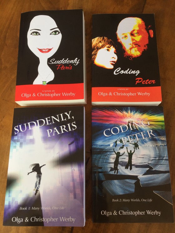
The design of the cover can make the book… or so I was told. Certainly, bad covers don’t contribute to sales. But good covers are difficult. And the thought on cover design has changed over the years… just like fashion. Since I tend to design my own covers (and I’m an artist and a designer), I wanted to put together some ideas, if not rules, to follow and some background of how to think about book cover design. Because if you don’t do your own, you still need to communicate what you want with the person that does. Book Covers Through Time To appreciate a cover, it helps to understand its roots. I won’t go back far, since my genre is science fiction, just a hundred years or so. Consider the cover evolution of Jules Verne’s “Journey to the Center of the Earth”: There is a movement from frills to realism to a strong graphic look of the more modern editions. While for the 1800’s editions, we might find it difficult to identify the genre of this story, by the time we hit 1960s, there is no doubt that this is a science fiction or fantasy novel. The cover alerts…
Attention, Conceptual Design, Contributor, Interaction Design, Interface Design, Users
RE: Preloading and The Above-Average Effect
by Micah Johnson •
Valdesolo, P. (2010). “Flattery Will Get You Far.” ScientificAmerican.com. Visited on October 8, 2012: http://www.scientificamerican.com/article.cfm?id=flattery-will-get-you-far A study suggests that flattery is effective, illustrating that even obviously manipulative comments play into the an individual’s high self-regard, affecting later behavior. This phenomenon, called the above-average effect, can be found for example in advertising. When a person views an advertisement showing an exaggerated response to a product’s use, their response in the aisle when making a choice, is measurably swayed. Sunlight, breezes, and smiling people in light sweaters walking through green pastures create a positive impression we remember when buying liquid laundry detergent of a certain brand, even if we know there is little rational correlation. Conceptual Design: The principle of the above-average effect could be used strategically. Research into a population’s background might give a picture of how to articulate a product; or, similarly, the idea of preloading expectations through associations in a programmed environment could be used to aim a particular audiences preferences or choices, or make rational jumps easier when transitioning from one experience to another. Interaction Design: “I want to be special!” Letting the user interact and uniquely configure their use of the product. Research into cultural background should be…