Games can be used to change our behavior — make something fun, and we are likely to do it again and again. Psychologists call is positive reinforcement. Pleasure triggers our amygdalas — makes us make strong neural connections between the activity and positive emotion. Thrills are memorable and we seeks them out in our daily lives. Here are two examples of using fun to change people’s behavior, to make us do something we ordinarily don’t particularly want to: climb stairs and recycle. November 17th Update A fellow member of the Human Factors and Ergonomics Society (HFES), David Watts, recommended the following:
Tag Archive for YouTube
Conceptual Design, Pipsqueak Articles, Product Design Strategy, Scaffolding, Users
Special Preview: Social Media by Thomas Erickson
by Olga Werby •
Interfaces.com was given a free advanced preview of Thomas Erickson’s report and videos on social computing. The videos are very well produced and provide an interesting point of view and good insights on social media. Below are few of my notes based on the video content and ideas discussed on this blog in the past (my former students should find these familiar). Social Media Definitions & Ideas Social Computing: this is really about groups working together using ICT (Information Communication Technologies). I think this is a broader definition then the one offered by Thomas Erickson, as it includes all forms of ICT. Social Scaffolding: we all have a set of social scripts — culturally-specific, socially constructed norms of behavior — that help us navigate group interactions and allow for self-organization of crowds, at least shot-term and for a limited goal (like crossing the street). [Please watch Dr. Erickson’s example of street crossing in “Video 4.3: Social Computing video 3 – Face-to-face Interaction as Inspiration for Designing Social Computing Systems”.] Product design needs to create opportunities for social interaction — these scaffolds have to be built into the system: meeting spaces, places to sit down, well-lit areas, easy communication tools, games,…
Conceptual Design, Cultural Bias, Interaction Design, Interface Design, Mental Model Traps, Pipsqueak Articles, Product Design Strategy
Design for Emotion, for Empowerment
by Olga Werby •

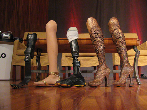
I use a cane to get around, a consequence of an unfortunate encounter with a taxi many years ago. I have many different canes (each heel size, for example, requires its own cane). All are cool. Some have animal carvings, some have silver, some have gold, some are complex in design, some are very Deco in style, and one has a sword (another a compass and a secret compartment). I get stopped on the street all the time — people love my canes and always comment. I was even told once that my limp is sexy — whatever… What I don’t have is an “old woman” cane — the kind you buy at a pharmacy. I’m just not that old, and plan never to be that old. I want funky, I want things that match my outfits and my moods. And I want them functional: the right hight, the right feel of the cane handle, the stability of the tip, the light weight, the structural security. I want it all and I want it sexy. Cane is a product — a very personal one. But most are stuck with poorly designed, boring, ugly, you-make-me-feel-like-an-invalid cane. Why? Aimee Mullins is a…
Cognitive Blindness, Mental Model Traps, Pipsqueak Articles
Intel i5 Core Commercial: When a company just doesn’t get it
by Olga Werby •
Sometimes, a company just doesn’t get it: it’s not about what a product can theoretically do, but what it can do for the user. Intel has a history of making a particular type of commercials — “the power inside” commercials, I call them. Intel marketing people use the following mental model: people/men like muscle cars; people like powerful things; thus if we emphasize the power “on the inside” people would like our computers. And so their current commercials for Intel i5 Core look like this: So what’s wrong with this? It’s all about them, it’s not about me. I don’t care what’s inside the machine, I care what it can do for me. Or, more accurately, what I can do with it. It’s about my performance. Imagine going to a car lot and the car salesmen tells you: “It got huge pistons. I mean HUGE. You’ve got to see those pistons!” Perhaps some car buyers would get inspired by such language, but I bet most would find it puzzling. Why should I care? Does it drive well? What’s the performance like? Maneuverability? Intel’s commercials about its chips are just like a car manufacturer’s fetish remarks about pistons. Sure some would…
Interaction Design, Interface Design, Pipsqueak Articles, Scaffolding
Passionate Interface: Siri Inspires Love
by Olga Werby •
You know your product is succeeding with its users when, within days of its launch, they write love songs to your work. Check out this love ode to Siri, Apples latest interface update.
Anchoring Errors, Background Knowledge Errors, Cognitive Blindness, Conceptual Design, Cultural Bias, Cultural Differences, Errors, Ethnographic & User Data, Metaphor Mistakes, Mirroring Errors, Pipsqueak Articles, Product Design Strategy
Lost in Translation: Cultural Differences in Advertising
by Olga Werby •
“Lost in Translation” was a wonderful movie by Sofia Coppola, starring Bill Murray and Scarlett Johansson. It depicted the delicious confusion of Western tourists in total Japanese cultural emersion. In particular, the scenes where Bill Murray shoots a liquor commercial for the Japanese market are simply priceless. In retrospect, I see where Ms. Coppola got her ideas. Her cousin, Nicholas Cage, have been making wonderfully odd (to our sensibilities) commercials for years. He clearly had stories to share. Here are a few of his gems, courtesy the World Wide Web: and But it’s not only Japan that surprises our/my cultural biases. This morning, my husband and I went to a local grocery store in Rome, Italy. In the cheese section, there was a little paper bottle of parmesan cheese with a mouse of the package. The mouse didn’t work for me at all! So much for cultural differences. Here’s a small collection of ads for McDonalds from all over the world. Please compare it to the packaging and menus for this restaurant chain that I’ve posted here in the past: “Cultural World Domination”. Notice all of the anchoring errors, metaphor mistakes, cultural biases, mirroring errors, and general cognitive and cultural…
Background Knowledge Errors, Pipsqueak Articles
Decision Scaffolding and Crisis Mapping
by Olga Werby •

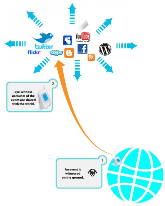
I’m working on a series of illustrations to highlight the need for decision scaffolding during an aide mission. The ideas are based on the Ushahidi deployment experience in Haiti after the 2009 earthquake. But the idea is to make this more general. I would love ideas and recommendations on how to make this visualization better and more communicative. (read more about crisis mapping here) Crisis: Smoke Signals from Eye-Witnesses Let’s start with a crisis—a natural disaster or a political upheaval leaves thousands of people in desperate need of help. The people on the ground witness the suffering and use ICT (Information Communication Technology) to send up the spoke signals. Please not that Internet services might be compromised (due to deliberate actions taken by the authorities; infrastructure failures; chaotic conditions on the ground), but people tend to be very creative and use phone lines, radios, satellite links, and just person to person communication to get the information out there. During the current Libyan crisis, people were very creative: “To avoid detection by Libyan secret police, who monitor Facebook and Twitter, Mahmoudi, the leader of the Ekhtalef (“Difference”) Movement, used what’s considered the Match.com of the Middle East to send coded love…
