Knowing something about behavior, visual processing, and human nature, designers can nudge users into doing the right (or in this case, lawful) action. Speeding is a problem all over the world. People are notorious for underestimating the real amount of time it takes to get places they need to be. Traffic congestion, car problems, detours, and other (un)foreseen events can make a huge difference in time variability of getting from one place to another. The problem, though, is that we can’t really force people to leave on time or drive the speed limit when the drivers think that no one is looking. So with the law on our side, we can create other ways of forcing people to behave lawfully by changing environmental conditions and relying on human nature not to do what’s right, but to do what they think they have to based on circumstance. Here are a few creative ways of solving the speeding problem on our streets. Using Visual Processing Errors to Slow Traffic Canadian drives misdiagnose the problem and try to drive straddling the “hole” in the road. Everyone is successfully slowed down. The Fake Traffic Cop Threat as a Speeding Deterrent In general, people tend…
Tag Archive for visual comprehension
Conceptual Design, Cultural Bias, Cultural Differences, Pipsqueak Articles, Product Design Strategy
Special Preview: Visual Aesthetics
by Olga Werby •
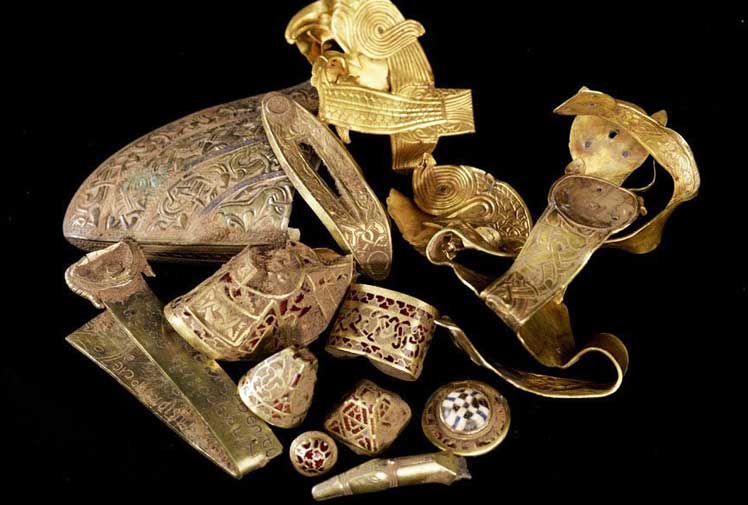
Interaction-Design.org is doing an amazing job of developing a textbook for Human-Computer Interaction (HCI) Design. This newest chapter, Visual Aesthetics in human-computer interaction and interaction design by Noam Tractinsky works to tease out the aspects of design that make products appealing, memorable, culturally-appropriate, emotionally satisfying, and beautiful. Beauty & Aesthetics Evolve in Time It’s good to remember that what we find beautiful and appealing changes and evolves in time as well as across cultures. Here’s a wonderful demonstration: 500 Years of Female Portraits in Western Art. What Makes Design Beautiful? In the Interaction-Design.org chapter, Tractinsky starts with Vitruvius’ design principles. Vitruvius lived in the 1st century BC and develop a set of standard criteria by which to evaluate architecture: Firmitas — durability or life-span of the building in relation to its purpose; Utilitas — usability of the building by its intended audience; and Venustas — the beauty of the building (this would be culturally-specific). 2,000 years on and we still talk about durability, usability, and aesthetics of products. Since this chapter discusses architecture, I would like to talk about weapons. Weapons pre-date architecture, but they still follow the same rules for design: durability and reusability, usability, and beauty. If you’ve…
Perception, Pipsqueak Articles, Users
McGurk Effect — Synesthesia in Action
by Olga Werby •
McGurk Effect is synesthesia in action. The sounds you hear depend on the visual information you’re getting through your senses! This is an amazing little video demonstration. Imagine if all your senses were so interconnected — perseptual information tangled up mid stream…
Background Knowledge, Background Knowledge Errors, Conceptual Design, Cultural Bias, Cultural Differences, Ethnographic & User Data, Interface Design
How Do We Think of Brands
by Olga Werby •
I found this video by Adam Ladd — he made a video of an interview with his 5 year old daughter talking about brands. He showed her some very famous logos, and she told him what she thought they were. Naturally, this is a girl from a middle class background, from America. The answers would be very different from a 5 year old brought up in Russia or Papua New Guinea. Notice how she is able to quickly identify a Nike logo. And Disney’s D. And what’s really amazing is that she knows what a logo is in the first place! This little kid has developed a brand p-prim! And she has a well-developed comprehension of visual symbols. I wonder how the same interview would play out in a different culture…
Featured, Interface Design, Perception, Pipsqueak Articles
Creativity, Perception, and Public Art
by Olga Werby •
Art or craft? Creativity or public nuisance? Sometimes, the line between these is so fine, so complex, so fractal, that it’s simply doesn’t matter. The images below span thousands of years in dates of creation. The artists used light and shadow, perspective, and clever geometry of space to add meaning to their work. All showed an amazing amount of imagination, all provide commentary on current events or a point of view. Happy holidays to all! Enjoy! [flagallery gid=3 name=”Gallery”]
Conceptual Design, Cultural Differences, Interaction Design, Interface Design, Pipsqueak Articles, Product Design Strategy, Scaffolding
Designing for the Blind
by Olga Werby •
Not much to add here — how many other cool video games are there for visually disabled? Using tactile clues instead of visual signals is a nice interaction design solution. Well done!
Attention, Background Knowledge, Conceptual Design, Interaction Design, Language, Perception, Pipsqueak Articles, Product Design Strategy
Thinking about the Science of Communication and Interaction
by Olga Werby •
In the Galaxy Far Far Away… What if sentient being evolved on a planet with permanent cloud cover? What if these being never saw stars? Would they still be able to discover the laws of nature? These kinds of hypothetical thinking questions — the Gedankan Experiments, as Einstein put it — are very useful in science. I’ll try to use them here for analyzing product design and communication. So what senses do we need to communicate? And what body appendages are necessary to produce this communication? Note that it helps keep track of these separately. Aroma-bet When I was little, I “designed” a language based on smell: each smell was assigned a character in an alphabet and, strung together in sequence, my smelly letters transcribed into words — the Aroma-bet. There were several problems with this: It was difficult to get an alphabet-worth of distinct odors; Arranged next to each other, the odors started to blend into each other, making “reading” difficult; I got a very bad headache; My mom didn’t like her expensive perfumes used in such a creative way… And I couldn’t remember what letter each smell stood for, requiring the creation of a smell-o-dictionary, which in turn…