
Geoghegan, T. (2010). “Lessons to be learnt from the Gap logo debacle.” BBC News Magazine. Retrieved on October 12, 2010: http://www.bbc.co.uk/news/magazine-11517129 A new logo can brighten up a company’s image or enrage loyal customers. In the case of GAP, the latter was obvious. The release of the new logo led to a huge online backlash from customers on FB and twitter conveying how unhappy they were with the logo. Within a week of release, GAP chose to revert back to the original logo after a slew of criticism. GAP LOGO The importance of being an iconic brand has been severely undervalued. The association of the image and brand is overlaid in the minds of people for the last 20 years. Changing the visual must have pre empted GAP to have tested the logo with focus groups and understand the reactions of the audience. The changed their visual imagery without upsetting customers. The logos below have retained their sense of familiarity which is refreshing and yet without really giving customers the need to process an all together new image to associate with the brand. Companies uniformly moved from serif font to a more elegant Helvetica. MSNBC LOGO GE LOGO Product Positioning:…
Tag Archive for visual comprehension
Cultural Bias, Interface Design, Pipsqueak Articles, Product Design Strategy
Type & Brand
by Olga Werby •
Helvetica: Period. Cultural shifts as expressed in type: the story of Helvetica. Trajan is the Movie Font. Some fonts are in vogue for certain industries only.
Attention, Attention Controls Errors, Background Knowledge, Perception, Perceptual Blindness, Perceptual Focus Errors, Pipsqueak Articles
Perceptual Illusions
by Olga Werby •
Our minds play tricks on us all the time. Once the information has entered our cognition via our senses, it still has to get processed to be understood. Like any other data, it’s all about context. For interesting examples of optical illusions, please visit http://www.lottolab.org/articles/illusionsoflight.asp. R. Beau Lotto has put together a few interesting examples of mis-processing! Or watch him deliver a talk at TED.
Autopilot Errors, Background Knowledge Errors, Conceptual Design, Diagnostic Errors, Errors, Interaction Design, Interface Design, Interruptus Errors, Misapplication of Problem Solving Strategies, Mode Errors, Perceptual Blindness, Perceptual Focus Errors, Pipsqueak Articles, Product Design Strategy, Scaffolding, Users, Working Memory
The History of Usability
by Olga Werby •
When did we start being concerned with usability? Some will say that such concern is part of being human: cavemen worked their stone tools to get them just right. Interaction design mattered even then. But the field of usability research really came into being when the tools we used started to run up against our cognitive and physical limitations. And to avoid hitting literal, as well as psychological, walls, it was the aviation engineers who started to think about usability seriously. While cars were becoming ever more sophisticated and trains ever faster, it was the airplanes that were the cause of most usability problems around WWI. Cars were big, but didn’t go very fast or had a lot of roads to travel on at the turn of the century. In the first decade of the 20th century, there were only 8,000 cars total in the U.S. traveling on 10 miles of paved roads. In 1900, there were only 96 deaths caused by the automobile accidents. Planes were more problematic. For one thing, the missing roads weren’t a problem. And a plane falling out of the sky in an urban area caused far more damage than a car ever could. Planes…
Cognitive Blindness, Errors, Featured, Interface Design, Perception, Pipsqueak Articles
Color Blind Design
by Olga Werby •
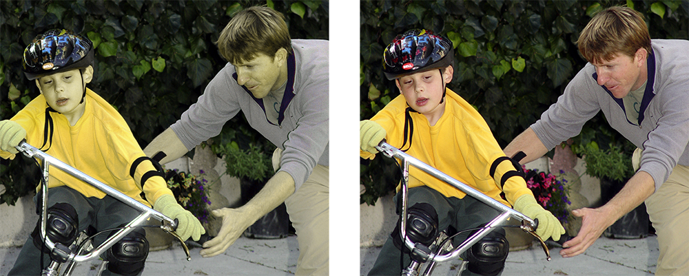
Do you see any difference between these two images? About 10% of the male population (with up to 20% among some ethnic groups) do not. Do differences in the way individuals perceive and process color information matter? Sometimes… Consider this informational graphic: It’s easy to see how the information contained within this chart has been transformed and no longer carries the same meaning. Which is the right one? When designing information for communication, it’s important to consider the totality of the intended audience: What are their strength? What are their limitations? Like cognitive traits, perceptual differences have to be accommodated by good design. Some issues that individuals with deuteranope deficit (red/green confusion) face is inability to tell the difference between colored items that are too thin (lines), point sources, and blinking lights (think traffic lights blinking green or yellow). These problems effect real-life performance and can lead to accidents: think traffic light color confusion. It is the job of a product designer to reduce the difficulties these individuals face. You can use this URL to check your site for color blind usability: http://www.vischeck.com/vischeck/vischeckURL.php
Background Knowledge, Background Knowledge Errors, Diagnostic Errors, Perception, Pipsqueak Articles, Users
Distilling Information
by Olga Werby •
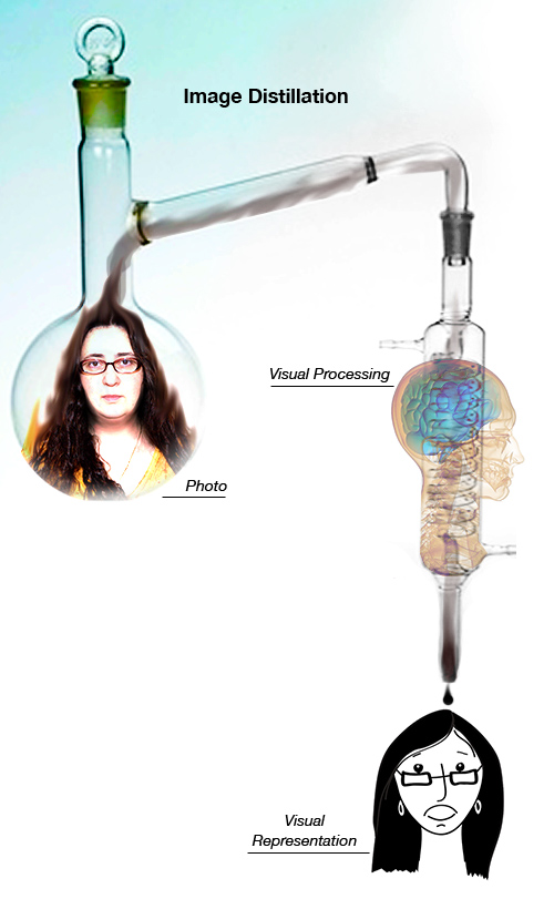
When it comes to my students’ participation in this blog, it’s all about distilling information found in the news to something product designers in our midst would find useful, on a practical level. Consider the illustration below. We see a person’s face (mine in this case). We can describe some of the features. But what do we actually remember? Remembering complex visual information is hard—too many details. Recalling a drawing is easier. That’s because an artist already distilled the complexity into its essential parts—only those details that are required to remind us of a particular individual are included in the rendering. We are all pretty good at judging wether a portrait looks like the person it was intended to represent. We can quickly say if it does or if it doesn’t. But it would be difficult to explain what details in the illustration make the likeness or what’s missing from the drawing that didn’t hit its mark. Distillation of information is hard. Some people are good at it, some are not. It’s an acquired skill. And each category (e.g. sensory like visual, audio, tactile or knowledge-based like physics, economics, biology) requires its own training and its own set of talents.…
Ethnographic & User Data, Interface Design, Perceptual Focus Errors, Pipsqueak Articles, Product Design Strategy, Users
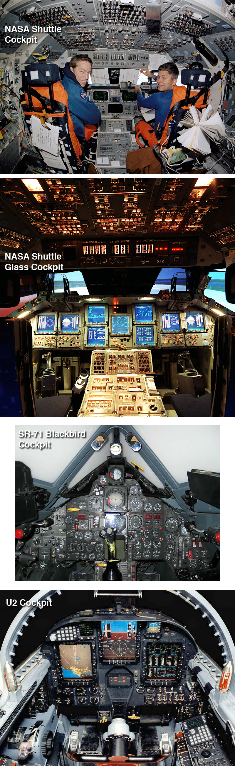
Understanding Complex Visual Information…
by Olga Werby •
…or not comprehending it, as the case may be. A few years ago, I wrote a paper about people’s ability to comprehend complex visual information such as graphs, charts, diagrams, maps, and so on. Intuitively, we are culturally-trained to believe that it’s much easier to extract information from a picture than from text. But upon testing this belief (p-prim, for those in the know), I found that contrary to the notion “a picture is worth a thousand words,” it’s much more difficult to get data from an illustration than from a story. While emotional impact might be larger with a picture, it’s not true for comprehension. You can read the results of my study at http://www.pipsqueak.com/pages/papers.html “Visual Symbolic Processing in Modern Times” paper presented at AACE ED-MEDIA Conference in 2008. Since then, I’ve collected more data, and the results are similarly aligned: problem-solving requiring higher level visual symbolic processing skills is difficult and results in communication failures. A secondary, and surprising, finding was a gender discrepancy in performance outcome testing of visual symbolic processing skills. Higher level and lower level visual symbolic processing are defined in the paper. And anyone interested in testing their visual processing skills are welcome to…