Geoghegan, T. (2010). “Lessons to be learnt from the Gap logo debacle.” BBC News Magazine. Retrieved on October 12, 2010: http://www.bbc.co.uk/news/magazine-11517129
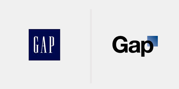
A new logo can brighten up a company’s image or enrage loyal customers. In the case of GAP, the latter was obvious. The release of the new logo led to a huge online backlash from customers on FB and twitter conveying how unhappy they were with the logo. Within a week of release, GAP chose to revert back to the original logo after a slew of criticism.
The importance of being an iconic brand has been severely undervalued. The association of the image and brand is overlaid in the minds of people for the last 20 years. Changing the visual must have pre empted GAP to have tested the logo with focus groups and understand the reactions of the audience. The changed their visual imagery without upsetting customers. The logos below have retained their sense of familiarity which is refreshing and yet without really giving customers the need to process an all together new image to associate with the brand. Companies uniformly moved from serif font to a more elegant Helvetica.
GE LOGO
Product Positioning:
As humans we don’t embrace change very well. We like to have things the way are, especially when they are good the way they are. As marketers, it is important to realize the need for the audience to grow with the brand. Essentially, innovation in terms of product placement and positioning is what GAP needed. Changing brand perception cannot be merely visual change in logo.
On Interface:
The new logo was popularly termed as cheap, tacky & ordinary. The font, Helvetica is sublime, non controversial and definitely bears semblance to brands that we have seen before. The blue gradient square was extremely unappealing and un-aesthetically out of place. But more importantly logos evoke great emotional responses in us. The familiarity of visual elements, tone of color and the typography play hugely on the recollection of the brand.
On Meaning:
In today’s world, we are bombarded with logos. As we scan through all of them, do we really look for meaning? For example, the sea siren on the star bucks logo does not really associate with coffee. Then maybe, logos are all about just creating something memorable
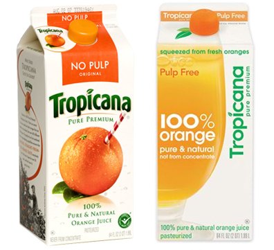
Tropicana’s redesign was aesthetic but failed severely when launched into the market. Arnell, the president of Omnicom describes in his video the meaning behind the design.
The orange screw cap, the act of the squeeze and the imagery of the product conveyed meaning. But the earlier design conveyed the meaning of freshness and purity. Showing the actual product on the packaging alters the perception of the product.
On Context:
Tropicana is a household brand for many. You open a fridge and you expect to see the same carton with the same imagery. While change is good, it is not really appreciated. People are not game for revolutionary design.
On Intent:
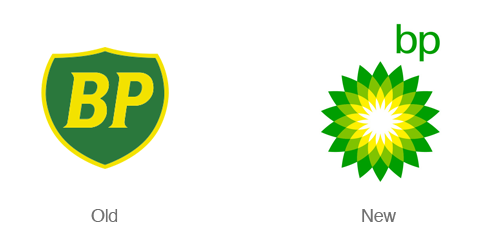
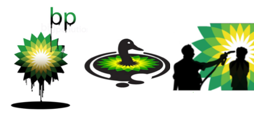
In 2000, BP unveiled a new greener logo, replacing the shield with a green, white and yellow flower-shaped one. At the same time, it adopted the slogan Beyond Petroleum. The move cost £4.5m ($7m) in brand research, with tens of millions more dollars to be spent supporting the change.
Of course, there were a whole lot of revolts that question the eco- friendly intent of a petroleum company. But the actual effect was not realized until the Oil spill this year.
And then suddenly people used the logo to interpret the disaster and destroy the brand. “That’s no environmental green and sunny yellow circle. It’s a toxic, flesh-eating spore. Just touching one of their slimy nozzles ought to be enough to make you hurl” The trend of creating logos had begun.
Logo redesign can be tricky and the results of the exercise can be unpredictable owing to the emotion that the visual imagery involves. But it does not have to be that complicated. The internet has opened various areas of communication for marketers, designers to hear the voice and the reaction of the consumer. Paying careful attention to their voice and avoiding previous errors from the big brands are definitely the way to go.

Starbucks logo evolution—on its 40th anniversary, Starbucks unveiled a new logo design.