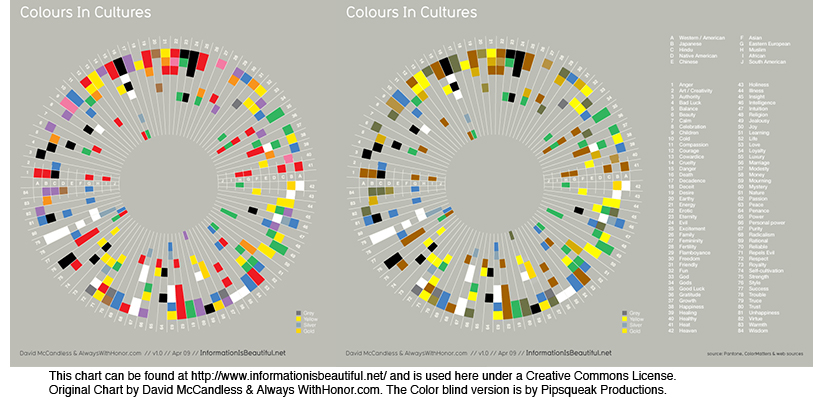
Do you see any difference between these two images? About 10% of the male population (with up to 20% among some ethnic groups) do not. Do differences in the way individuals perceive and process color information matter? Sometimes…
Consider this informational graphic:
It’s easy to see how the information contained within this chart has been transformed and no longer carries the same meaning. Which is the right one?
When designing information for communication, it’s important to consider the totality of the intended audience: What are their strength? What are their limitations? Like cognitive traits, perceptual differences have to be accommodated by good design.
Some issues that individuals with deuteranope deficit (red/green confusion) face is inability to tell the difference between colored items that are too thin (lines), point sources, and blinking lights (think traffic lights blinking green or yellow). These problems effect real-life performance and can lead to accidents: think traffic light color confusion. It is the job of a product designer to reduce the difficulties these individuals face.
You can use this URL to check your site for color blind usability:


Scientific American Online has a little slide show of color illusions:
http://www.scientificamerican.com/slideshow.cfm?id=illusions-colors
It’s interesting to see the illusions in the context of color blindness.