Here’s a nice collection of bus ads. The design of the ads was carefully targeted to the delivery vehicle (pun intended). Enjoy!
“Lost in Translation” was a wonderful movie by Sofia Coppola, starring Bill Murray and Scarlett Johansson. It depicted the delicious confusion of Western tourists in total Japanese cultural emersion. In particular, the scenes where Bill Murray shoots a liquor commercial for the Japanese market are simply priceless. In retrospect, I see where Ms. Coppola got her ideas. Her cousin, Nicholas Cage, have been making wonderfully odd (to our sensibilities) commercials for years. He clearly had stories to share. Here are a few of his gems, courtesy the World Wide Web: and But it’s not only Japan that surprises our/my cultural biases. This morning, my husband and I went to a local grocery store in Rome, Italy. In the cheese section, there was a little paper bottle of parmesan cheese with a mouse of the package. The mouse didn’t work for me at all! So much for cultural differences. Here’s a small collection of ads for McDonalds from all over the world. Please compare it to the packaging and menus for this restaurant chain that I’ve posted here in the past: “Cultural World Domination”. Notice all of the anchoring errors, metaphor mistakes, cultural biases, mirroring errors, and general cognitive and cultural…

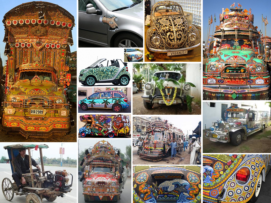
Which car do you find more pleasing? Which car would evoke a feeling of envy? Would you shake your head or starting thinking of how you can improve on the looks of your car? Which car’s origin would you place in the South Asia? Which in South America? Which owner cares about the aerodynamic qualities of the vehicle? Regardless of your personal feelings, the owners of these automobiles have clearly invested a tremendous amount of energy and effort into making them look like this and are very proud of the results! Telling a Story Each of the vehicles above tells a story about its owner and about its culture. The story conveys information: the owner’s goals for the car: utility or status symbol or both cultural value of design cultural symbols owner’s attitude towards possessions (e.g.: How long is the car expected to stay with one owner?) owner’s place in the social hierarchy owner’s unique identity owner’s investment into the vehicle (e.g.: time, money, skill, etc.) the perceived value of the vehicle to its owner These stories of cars and their owners change from culture to culture, from place to place, and of course in time. What we consider beautiful…

Geoghegan, T. (2010). “Lessons to be learnt from the Gap logo debacle.” BBC News Magazine. Retrieved on October 12, 2010: http://www.bbc.co.uk/news/magazine-11517129 A new logo can brighten up a company’s image or enrage loyal customers. In the case of GAP, the latter was obvious. The release of the new logo led to a huge online backlash from customers on FB and twitter conveying how unhappy they were with the logo. Within a week of release, GAP chose to revert back to the original logo after a slew of criticism. GAP LOGO The importance of being an iconic brand has been severely undervalued. The association of the image and brand is overlaid in the minds of people for the last 20 years. Changing the visual must have pre empted GAP to have tested the logo with focus groups and understand the reactions of the audience. The changed their visual imagery without upsetting customers. The logos below have retained their sense of familiarity which is refreshing and yet without really giving customers the need to process an all together new image to associate with the brand. Companies uniformly moved from serif font to a more elegant Helvetica. MSNBC LOGO GE LOGO Product Positioning:…
Helvetica: Period. Cultural shifts as expressed in type: the story of Helvetica. Trajan is the Movie Font. Some fonts are in vogue for certain industries only.

How do we spend our money? Well, the first cut goes to survival: essential goods and services that are absolutely necessary to our survival. Food, housing, medical care are all part of the basic necessities of life. Some, of course, are more necessary than others (we might postpone going to a dentist…but not for long), but there’s a core of stuff that we need to live. The next tier up from survival is comfort. This is a very large tier—what’s comfort to some is a necessity to others and visa versa. People use their income to increase their general comfort level. This might mean a large house, more comfortable beds, larger selection of clothing. But generally, when we talk of comfort, we don’t include jet setting to Paris for a nice date out on the town. Comfort is about everyday life needs, but more comfortable. The top tier of our income is the disposable income and it is spent on luxury—the money we have left over from dealing with our needs and comforts; the money we can chose to spend in an extravagant and even wasteful manner. When economists make predictions about the average size of the available disposable income,…
Elliot, C. (2010). “How to brand a disease—and sell a cure .” CNN. Retrieved on 11 October, 2010: http://www.cnn.com/2010/OPINION/10/11/elliott.branding.disease/index.html?hpt=C2 Carl Elliott in his article for CNN cites examples of how pharmaceutical companies sell a cure by disease branding. Drug companies today are embracing the ideology that Edward Bernays’, the father of PR proposed—The public relations business was less about selling things than about creating the conditions for things to sell themselves. Why disease branding works? As Carl Elliott states in his article, disease branding is particularly effective in two types of situations. Let us consider the first situation, a shameful condition that can be de-stigmatized through disease branding. If a condition, however shameful, is prevalent enough in the common population then a ready market exists for the cure. It is the rare shameful condition for which a market typically does not exist where disease branding will help ‘create’ a market. Individuals with this rare condition would need to overcome the stigma attached with such conditions and discuss them with their health care providers. By branding a disease and de-stigmatizing the condition, the pharmaceutical companies act as catalysts and enablers to the process of individuals coming forward and discussing the condition…