Perception

Summer Writing and Reading and Editing

Girl Reading

Writing In July, I finally finished editing my latest book: God of Small Affairs (first three chapters are available here). It will be a while before it gets published, but it is nice to move into the next stage of this story’s life. I have a cover that I like…I have several! Here are two: Here is a book description that will definitely NOT appear on the cover of this book: Time is made out of threads. Pull one and someplace somewhere things unravel. We know how to pull on the right thread because we see the whole tapestry of life’s possibilities. That’s why we are so good at finding a good path into the future. I say a future because there is no such thing as the future. We are made of time threads — thick bundles of knots that can pull and twist and change the course of history. It’s all about connections — pull one strand, and the others twist with it. Like Newton’s second law, for every action, there is an equal an opposite reaction. But humans are small in relation to civilized time, planetary time, cosmological time. To make a big change requires a course…

What’s in the Cover Art?

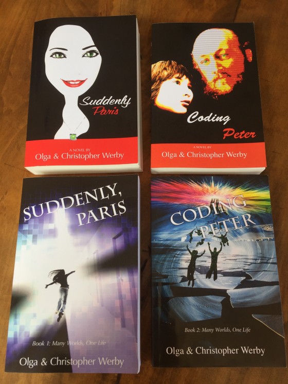
Coding Peter Suddenly Paris 2 Covers

This month we have released a sequel to Suddenly, Paris — Coding Peter — AND changed the covers of both books! Above is photo of before and after for the cover art of both books. Can a cover make a difference in the sales of these books? These products? Yes! Cover art makes a huge impact on how a book is perceived by its audience. Or to put it even stronger, the art on the cover of the book helps the potential reader recognize the book as something that they would like to read. Personally, I thought the original covers with strong black, red, and white design were striking. But that design didn’t communicate the genre of the books to its audience. We needed to come up with illustrations that made it clear that these stories were science fiction, and action adventure, and aimed at a new adult readers. We needed to covey a sense of mystery and danger. We wanted people to stop and notice the books based on their covers. And so we made it change. The new covers are a lot more narrative. And hopefully it would make a difference as the potential readers browse pages of…

We Are the Magicians

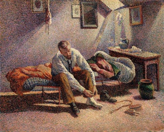
Maximilien Luce, Morning, Interior, 1890, using pointillist technique

We all make magic every day. Don’t think so? Then consider this, we conjure up complete worlds of information with a mere suggestion, just a bit of outline, a stroke or two, a few words, a spatter of color, a dash of melody. We literally make grand visions from just a trickle of data. This is true for those who design and those who consume information. Let’s first explore our ability to comprehend very incomplete information. Take pointillism — an art movement (technique) that required artists to create images using points of pure color — why are we able to “see” the complete image from a mere collection of dots? With just a collection of colored dots, we are all able to imagine the mood, understand the story, visualize the universe behind this painting. You can say: “well, the artist was great at using dots.” But it is not just dots that we are good at. We reconstruct our reality from little bits of incomplete data all day every day of our lives. Consider the tone of voice of the person who answered the phone — you can easily tell the mood and even guess at the personality of that…

Colorblindness Test on iPhone Google Traffic Map

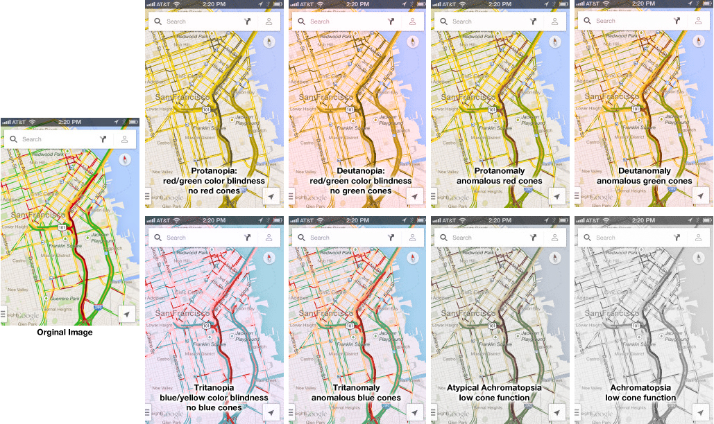
2013 iPhone Traffic Google Map Colorblind Test

Google Traffic Map on an iPhone (or any other mobile device) is a great product… unless you are colorblind. Then, it’s a nightmare! 5% to 20% of the population has some kind of color processing disorder. Here is a simple test if you are one of those. Which of the following look the same to you? Click on the image above to enlarge. Red/green confusion — Protanopia: red/green color blindness, no red cones; Deutanopia: red/green color blindness, no green cones; Protanomaly: anomalous red cones; Deutanomaly: anomalous green cones — are the most common visual processing problems. But there is also blue blindness — Tritanopia: blue/yellow color blindness, no blue cones; and Tritanomaly: anomalous blue cones. The most rare cases are the monochrome colorblindness, the true loss of color — Achromatopsia: low cone function; and Atypical Achromatopsia: low cone function with some color. As designers, we have to be aware of our audiences’ limitations and strength. And visual processing and comprehension is no exception. In the past, I’ve written about colorblindness: . But unfortunately, the site that helped identify problems with design doesn’t seem to work. Here’s a new sit e for your reference: Colorblind Web Page Filter If you are…

The Tone and the Interface

2013-03-21 Cheese from Farmers Market Amsterdam

I just returned from a brief visit to The Hague and Amsterdam. When in a foreign country encountering an unfamiliar language, it’s easy to focus on the visual presentation of content since the linguistic portion of the presentation is unavailable for processing. People who can read can’t help but do so when presented with text. But when one can’t process the linguistic content, all that is left are visual clues (and smells and sounds…). So I took a few snapshots to show how the tone of the interface impacts the emotional processing of content and attitude of the customer to the content. Selling Cheese in Amsterdam This is a farmers’ market stall in the middle of Amsterdam, selling home-made cheese. The woman in the photo is the actual cheese maker. Note the hand-lettered signs, the simple wooden boxes, the plain presentation — the overall effect is home made goods, care in production, quality product, even made with love. Fancy production values would just be off putting in this context, and probably result in lower sales of cheese. This NOT a museum, but rather a neighborhood cheese store in Amsterdam. (It is located next door to the flower museum…). What is…

Perceptual Blindness in Design

Toy Packaging and Design Fails

It is not always users that fail to see some particularly “cool” aspect of design, failure to notice which leads to failure in product use. Designers are people too and are just as prone to cultural and perceptual blindness — total inability to notice additional (sexual) meanings hidden in their designs. Below are examples that I’ve been collecting from email forwards over the last few years. The general groups are toy packaging, store signs, logos, religious strangeness (especially with cultural shifts in time), product labels, and in particular strange dentists’ ads… Enjoy! Thank you all who contributed to this post!

Task Analysis and Product Design

Kids from India and Vegetable Choices

Imagine your were given an assignment to develop a product that could help people eat healthy. How would you go about creating such a thing? What would you need to learn/understand? What is the right medium or technology vehicle for such a product? How would you even start? Below is a very brief outline of how to get started and the key tools necessary for the job. Project Goals The first order of business is figuring out the business needs and goals: What is the product really supposed to do? You have to ask this even if you are the one who is the client on this project. But, most probably, you are working for someone else — the client — and you have to start by understanding what your client really wants to do. You can do that in several ways: Analyzing the Request for Proposals: On many such projects, there will be an initial document, something like an RFP, that outlines the business goals and desires of the client. While some RFPs are very detailed and fully fleshed out, most are not. There are many reasons for this. Some clients are worried someone will “steal” their ideas and…