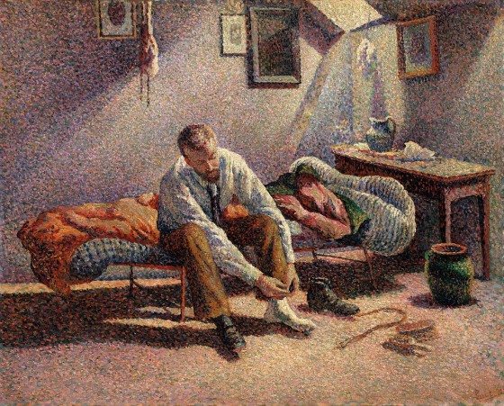
Perception

Task Analysis and Product Design

Kids from India and Vegetable Choices

Imagine your were given an assignment to develop a product that could help people eat healthy. How would you go about creating such a thing? What would you need to learn/understand? What is the right medium or technology vehicle for such a product? How would you even start? Below is a very brief outline of how to get started and the key tools necessary for the job. Project Goals The first order of business is figuring out the business needs and goals: What is the product really supposed to do? You have to ask this even if you are the one who is the client on this project. But, most probably, you are working for someone else — the client — and you have to start by understanding what your client really wants to do. You can do that in several ways: Analyzing the Request for Proposals: On many such projects, there will be an initial document, something like an RFP, that outlines the business goals and desires of the client. While some RFPs are very detailed and fully fleshed out, most are not. There are many reasons for this. Some clients are worried someone will “steal” their ideas and…

Haptics and the Uniformity of Gloss

For an introduction into the science of haptics, the article, “Primal, Acute and Easily Duped: Our Sense of Touch,” provided great examples about the accuracy and fallibility of our sense of touch. However, the proliferation of touch-sensitive input devices over the past 4 years since it was written didn’t provide the author with any insight into their pending popularity, or the effect they would have on our fingertips. If our fingertips can feel a bump the thickness of one micron, imagine the sensitivity they have even as they slide over a touch-sensitive glass tablet, a glossy plastic mouse, or an anodized smooth track pad. The more our fingertips are required to touch, drag, swipe, and pinch, even over smooth surfaces, the more abrasive those surfaces become over time and the more those subtle abrasions wear on our skin. Glass becomes scratched, plastic becomes scuffed, and biological stains build up on anodized aluminum along with all other surfaces. The point being that these smooth surfaces end up hurting, if not annoying, our fingertips over time. If the fingertips are the equivalent of the fovea of our eyes, why subject ourselves to these increasingly painful disturbances and not return to using an…

RE: Deadline Pressure Distorts Our Sense of Time

Article:  Herbert, W. (2011). “Deadline Pressure Distorts Our Sense of Time.” scientificamerican.com. Visited on October 9th, 2012: http://www.scientificamerican.com/article.cfm?id=looming-deadlines Summary:  The perceived difficulty and deadline pressure associated with a task alters our perception of time. In an initial study, subject were presented with a series of tasks of varying difficulty and asked how far away the day of completion felt to them. The tasks that were more complex and work intensive were perceived as being further in the future. To arrive at this result our brains are translating effort into time, assuming that the more difficult tasks must be further away since they will require more work to complete. An opposite effect is encountered when deadlines are associated with the tasks. If subjects are presented with either an easy or difficult task that they must complete by a set date in the future, those with the more complex and effortful task report that the date feels much closer to them than those with the simple task. This effect may sometimes cause us to feel overwhelmed as multiple complex tasks pile up on us, but our skewed perception of time also ensures that we typically complete necessary tasks within the actual amount of time…

RE: Is Pink Necessary?

How many different ways can someone describe a color? There is a delightful video titled “Luscious” by the Sappi paper company Off Register. In it, the main character attempts to describe the exact shade of “luscious” she wants printed on paper. “It’s like the inside of a baby polar bear’s ear,” she tells the printer. “It’s a nuclear accident, but there’s no problem with it,” she insists. “It’s like King Kong French kissed you … stop it Kong!” All of the metaphors from “Luscious” have another thing in common: They link disparate ideas, a seductive idea with a dangerous one. This is the problem encountered with Annie Paul’s article “Is Pink Necessary?,” which is a review of the book Cinderella Ate My Daughter by Peggy Orenstein. What color best describes a little girl’s sexuality? But little girls have no sexuality, one may protest. Research indicates they do, that children identify with external signs to determine their sex. What then is the hue of sparkly tulle and chiffon? What is the color of a kiss blown from the palm of your hand or a coyly twirled finger in softly dimpled cheek? From the viewpoint of product design, the article is better contemplated as a…

Optical Illusion — Peripheral Vision Distorts Faces into Grotesque Masks

Here’s an interesting optical illusion — by focusing on the center point of the image and using peripheral vision to observe the faces, the perception of the faces changes drastically, making what we culturally consider “beautiful people” into grotesque masks. In particular, watch the eyes. The eyes seem to grow in size and in proportion to the face. The effect in more pronounced with brown eyes.

Where to post the “OK” Button on the Screen?

OK Button on Early Mac

I have very strong opinions about where on the screen the OK or NEXT or SUBMIT buttons go in relation to CANCEL. Without giving it away, I’m going to walk through the design decision tree and provide a lot of references for both sides of the issue — yes, there are strong feelings about the right versus the left position choice. I’m not alone! Passive versus Active Buttons Active Buttons are the ones that advance the action to the next level. Passive ones return the users to previous state, negate the action sequence. OKAY, OK, NEXT, SUBMIT, ACCEPT, GO are all active buttons. CANCEL, BACK, PREVIOUS are action that reverse forward momentum and push the user to places they’ve been before. HELP and INFO sidetrack the user and distract from forward thrust of activity. In general, product designers want to move the users toward their goals — thus we want the perceptual focus to be on the action buttons. We want to make sure that users fist see the way forward, and then click on the right button that propels them forward to completion of the task. All distractions and side movements should be downplayed with Interface Design with the…