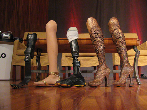
I use a cane to get around, a consequence of an unfortunate encounter with a taxi many years ago. I have many different canes (each heel size, for example, requires its own cane). All are cool. Some have animal carvings, some have silver, some have gold, some are complex in design, some are very Deco in style, and one has a sword (another a compass and a secret compartment). I get stopped on the street all the time — people love my canes and always comment. I was even told once that my limp is sexy — whatever… What I don’t have is an “old woman” cane — the kind you buy at a pharmacy. I’m just not that old, and plan never to be that old. I want funky, I want things that match my outfits and my moods. And I want them functional: the right hight, the right feel of the cane handle, the stability of the tip, the light weight, the structural security. I want it all and I want it sexy. Cane is a product — a very personal one. But most are stuck with poorly designed, boring, ugly, you-make-me-feel-like-an-invalid cane. Why? Aimee Mullins is a…
Tag Archive for usability
Background Knowledge, Background Knowledge Errors, Causal Net Problems, Cognitive Blindness, Conceptual Design, Cultural Bias, Cultural Differences, Ethnographic & User Data, Featured, Group Decision Errors, Mental Model Traps, Mirroring Errors, Pipsqueak Articles, Product Design Strategy
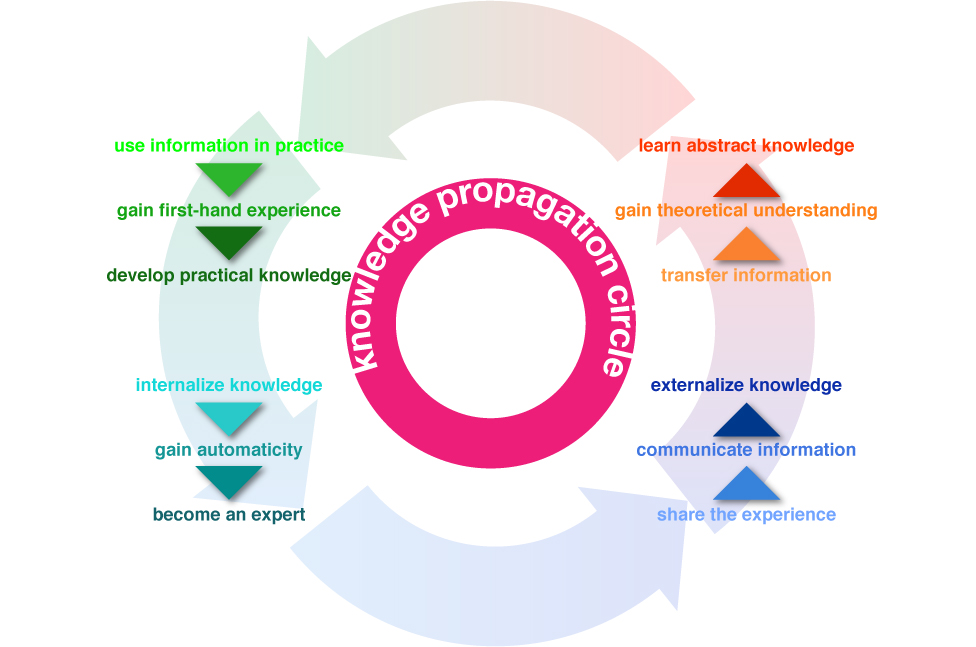
Community of Practice and Knowledge Propagation Circle
by Olga Werby •
This summer my family and I travelled to Rome. While the temperatures didn’t reach the usual astronomic heights, it was rather warm. But we, and other visitors, didn’t have to worry about thirst. Rome has the best network of public drinking fountains that I have ever seen. Every few blocks, there’s a beautifully-designed basin with a spigot of continuously running water (I know, being from California, the never-ending stream made us very uncomfortable, too). There are two bits of information that have to be passed on to the first-time visitors of Rome: the water is potable—safe to drink, and how to use the fountain—there’s a bit of a trick to them. Above is my son demonstrating a little secret interaction. There’s a small hole on the top of the pipe that can serve as drinking fountain if the main hole at the end is plugged up (with a finger). While we learned about the great drinking water in Rome from many traveling guides (books, online sites, etc.), we obviously didn’t know about the trick until we watched a pro do it. Knowledge Propagation Circle Information propagates through communities. When we first encounter a novel bit of data, it tends to…
Conceptual Design, Cultural Bias, Flow, Interaction Design, Interface Design, Language, Perception, Pipsqueak Articles, Product Design Strategy, Scaffolding, Working Memory
The Haptic Feel of Books versus eBooks
by Olga Werby •
We’ve traveled to Rome for our family vacation this year, and aside from a few summer reading books that I couldn’t find in an eBook format, we relied on our two Kindles and 3 iPads for our family reading needs. This is the second summer we brought primarily electronic versions of books—”The Count of Monte Cristo” is much easier to read when it fits into your hand and doesn’t weigh a ton… In the days before the Kindle and iPad, we carried an extra suitcase just for books. But there are drawbacks to buying and reading eBooks. Below are some of my thoughts and experiences—the cogitations of a voracious reader. Time & Progress As I was reading my novels, I found myself repeatedly trying to figure out where in the book I was. How far along was I? When is the next natural break (chapter, section end)? How many pages are there to the end of the chapter, end of the section, end of the book? These were not idle curiosities about my reading accomplishments, although when you do finish reading the book version of “The Count of Monte Cristo”, you do have a sense of having read something. An…
Conceptual Design, Pipsqueak Articles, Product Design Strategy
Good Idea, Bad Idea
by Olga Werby •
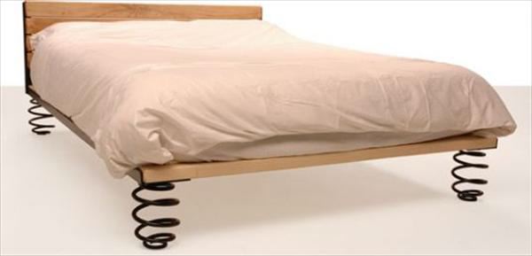
In the spirit of Animaniacs’ “Bad Idea, Good Idea,” enjoy the following product ideas. And for those who’ve never heard of Animaniacs, please watch the short segment (you can see more on YouTube!). Need a bit of assist in your bedroom? Add springs for the extra bounce. Find yourself in need of a sure grip? Make room for fingers. Short on space? Don’t waste the cupboards under each stair. Need more animation in the morning? Use the light. Bored with tea? Get a personal assistant. Worried about your waistline? Get measured. Live to serve? Bump it up. Too sure-footed? Make every climb a challenge. Too close? Give your photos some distance. Product design is limited only by imagination. A Short Introduction to Animaniacs’ “Bad Idea, Good Idea”
Interface Design, Pipsqueak Articles, Product Design Strategy
Information Architecture: Building Mental Castles
by Olga Werby •
Prosopagnosia and Topographical Agnosia Not all memory structures are created equal. Humans have an amazing variability in our capacities to commit information to memory and to use this information flexibly to achieve our certain goals. Consider facial memory: our ability to remember a face even when out of context of original interaction. Like all cognitive abilities, facial recognition spans the continuum: there are people who basically lack this capacity (Oliver Sacks, a famous neurologist who wrote “A Man Who Mistook His Wife for a Hat” and “Awakenings” is one such example.) and then there are those who “never forget a face.” Most us are somewhere in between. I’m, personally, worse than most but perhaps not as bad as Dr. Sacks. (I taught science at a local elementary school, and to this day people stop me on a street and greet me in a very familiar way while I haven’t a slightest idea of who they are, never mind their names—very disconcerting.) The condition of being a lousy face recognizer is called Prosopagnosia and it tends to come with a complimentary Topographical Agnosia (or inability to identify places and thus having bad navigational skills). If you don’t remember faces and places,…
Attention, Attention Controls Errors, Cognitive Blindness, Conceptual Design, Cultural Bias, Featured, Flow, Interaction Design, Interface Design, Mental Model Traps, Perceptual Focus Errors, Pipsqueak Articles, Product Design Strategy, Users, Working Memory
Multitasking Myth
by Olga Werby •
I’ve been noticing a lot of praise and demand for mutlitaskers: “We are looking for a talented individual who is [insert a laundry list of qualifications here] and is also a great multitasker!” or “Women are naturally better at multitasking.” or “Not only is he gifted, but he is able to work on all these projects simultaneously. If only we had a dozen more just like him!” (—probably just to get anything done!) The interesting aspect of this increased demand for multitasking is the rise of ADHD diagnosis. So I thought it would be an interesting exercise to pin down what exactly is being praised and diagnosed. A Curious Case of ADHD Let’s start with formal diagnostic criteria for ADHD (attention deficit hyperactivity disorder). What are the symptoms of ADHD? Below is a list of attributes that is adapted from the Diagnostic and Statistical Manual of Mental Disorders 4th ed. (DSM-IV). When you read this list the first time, imagine an eight year old boy trapped in an elementary classroom. On the second reading, consider an 80-year-old woman in a nursing home. On the third, visualize a soldier just back from Afghanistan. And finally, when you read the list for…
Attention, Conceptual Design, Flow, Pipsqueak Articles, Product Design Strategy, Scaffolding
Toilet Games
by Olga Werby •
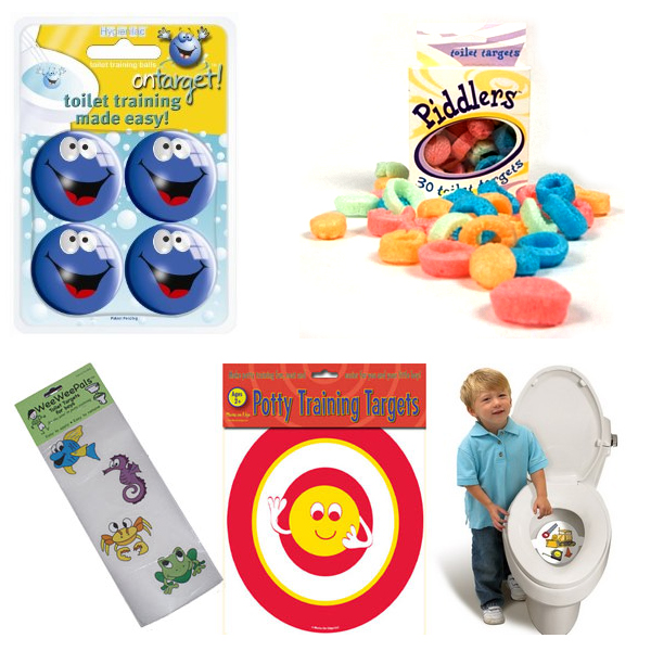
If you have small children…boys, you are undoubtably familiar with things like: “My Wee Friend”; “Piddlers Toilet Targets for Potty Training”; “Potty Training Targets – Look like real targets!”; “Tinkle Targets for Boys”; “Wee Wee Pals”; or “On Target Infant Toilet Training Balls” from Amazon. Problem: boys have to learn to aim; boys attention span is shorter than the time it takes to empty their bladder; Solution: make going to the bathroom fun; design an activity that extends the attention and improves aim; The conceptual design is pretty straightforward: align the goals of the parents (teaching bathroom skills) with the goals of a toddler (have fun) to improve the toilet experience for all concern–basic goal alignment! Unfortunately, the problem doesn’t seem to go away as these boys grow up. Product design to the rescue! The Urinal Lips design uses the same product design strategy: make aiming fun! What sign on the walls of the bar’s men’s room couldn’t achieve, a playful design did–these men’s room stay clean. One Step Farther… While attention controls might lag during a long bathroom break, video games seem to have a tighter control over attention. So welcome to the future of urinals: These are the…