Most everyone in my family, most of our friends, and a lot of our neighbors have received at least one COVID vaccination shot! It is starting to feel like this year-long nightmare is winding down. And we are lucky to live in the right country and in the right state and in the right city where things are likely to get back to normal sooner rather than later. No one can deny that this had been a very difficult year. But part of the difficulty had been our own behavior. It is quite possible that if we heeded the science and recommendations from the doctors (not the politicians), we would have been here sooner with fewer lives lost and less devastation to our economy. So why didn’t we do all we could to arrest the progress of this devastating disease? Why did we take stupid risks? Why did some people refuse to wear masks and self-isolate? Well, consider the Marshmallow Test. In brief, a Marshmallow Test is an experiment that tries to measure the delayed gratification quotient. A child is given a marshmallow (or any other small but highly desired reward) and asked to wait alone in the room with…
Tag Archive for problem solving
Anchoring Errors, Conceptual Design, Interaction Design, Interface Design, Mirroring Errors, Pipsqueak Articles, Product Design Strategy, Scaffolding
Thoughts on An Event Apart San Francisco
by Olga Werby •
We just returned from An Event Apart San Francisco and I am trying to put down notes and ideas while they are fresh in my mind. It was three full intense days of information — some great, some good, some not so much. But overall, it was a valuable experience (and they do conference right — great food, comfortable location, endless supply of coffee and sugar). My take is always unique — I overheard some people who were ecstatic over the presentations that I felt were completely off — but I have been in the business for over three decades now and I want ideas that are new to me. So here are my notes from the presentations. “The Fault, Dear Brutus (or: Career Advice From a Cranky Old Man)” by Jeffrey Zeldman A lot of what Jeffery spoke about resonated strongly: the need to force ourselves to get rid of disdain for our clients that just “don’t get it” — mutual respect is the foundation of designer-client relationship in conversation about design, focus on purpose and use and stay away from esthetics — every person has their own sometimes, people (clients, bosses) are incapable of seeing our growth as…
Background Knowledge, Cognitive Blindness, Conceptual Design, Cultural Bias, Pipsqueak Articles
Remarking on the Unremarkable
by Olga Werby •
What’s the difference between a consumer of good design and a designer? Well, it boils down to the ability to notice an opportunity where a product or a fix or a nudge can make a positive difference in someone’s life. During his 1989 interview with Inc Magazine, Steve Jobs famously said: “You can’t just ask customers what they want and then try to give that to them.” You see, designers don’t ask for solutions. They discover them and share them with the world. So what does it take to discover a good design solution? I believe it comes down to ability to see a pain point, to notice an opportunity, to remark on the unremarkable! Allow me to share to few examples from personal experience in the last few months. Drug Labels I recently had a heart stress test. Unfortunately, the IV drug they tried to use had an unusual side effect — my heart rate would go up and then quickly drop, enabling the doctors to perform the test. The nurses scrambled for another drug, but they also needed to make a report — such and such a drug on such and such a patient resulted in bad reaction.…
Conceptual Design, Interaction Design, Interface Design, Pipsqueak Articles, Product Design Strategy
Fun, Creativity, and Good Design
by Olga Werby •
The best product designs not only work well, they make us smile. They solve problems we as consumers haven’t even consider yet or realized we had. Take a look at a selection of product designs below. The springy bed frame is not only functional, but a conversation starter — don’t you want to try it out? The “selfy stick” helps us take better photos of ourselves. Our arm reach is no longer a limitation or a liability — I like my portraits taken from the top to reduce that double chin! It’s fun to be elegant… until it all crushes down around us. Finger tip tray is the solution! Finger food will stay safely on top of the tray with this cool design. And again, it’s a conversation starter — a perfect tool at a party. While I’m not sure I would advertise my waist size with this imaginative belt, it could serve as a powerful reminder to keep to a diet. Serving tea to your aunt? Wouldn’t this put a smile on her face? In one of my design classes, a student proposed a bed light that would adjust to awaken the sleeper gently. This one does it with…
Anchoring Errors, Conceptual Design, Interaction Design, Interface Design, Mental Model Traps, Product Design Strategy
When Design and Interface are Dictated by the Technology
by Olga Werby •
You’ve probably heard: If you have a hammer, everything looks like a nail. This is a commentary on how our problem solving perspective is influenced by the tools we happen to have in our hands at that moment. The tools, of course, don’t have to be physical. They can be systems, or lists, or a set of approaches that we’ve learned at school or that are enforced at work. And they can also be digital tools that we feel particularly comfortable using. These “tools” constrict our metal models, limiting the possible solutions to the design problems we face at work (or at home). It’s not a surprise that if we Google “WordPress Templates,” all the results look more or less the same. This is partly because of the tool — WordPress is a great tool, but as any tool, it limits the final creative output to what is easy. (Especially, if the designer is not a programmer.) Here’s a look at Google Image results for “WordPress Screenshots”: What’s interesting is the flip side of this phenomenon. Once we see a lot of nails, we expect nails as the solution. So it is not a surprise that not only do most…
Conceptual Design, Cultural Differences, Interaction Design, Interface Design, Product Design Strategy, Reference, Scaffolding
Design for Social Good
by Olga Werby •
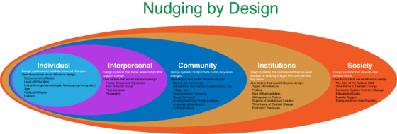
Social engineering is way of designing products and situations which actively encourage people to behave in a desired way — Nudging for Good. EDF Challenge “Sharing energy in the city, 2030” seems an ideal circumstance for social engineering for the greater social good. The basic question is how do we as designers find ways to incentivize individuals to save energy? How do we make a bit of personal sacrifice an attractive option for most? How do we “nudge” people to behave in a socially responsible ways when it comes to energy use? First, it makes sense to break up the problem into several user categories: personal energy sharing, family sharing, neighborhood or community sharing, city or village sharing. At each level we expand the circle to involve more and more individuals, and so we need a different approach for each category. Each category has a set of pressure points on which social engineers can apply pressure to achieve the desired changes. Once we identify the user groups targeted for “nudging”, game theory can be used to find the most attractive options. While there are numerous strategies that can be borrowed from game theory to incentivize the desired energy sharing behavior,…
Cultural Differences, Errors, Interaction Design, Pipsqueak Articles, Product Design Strategy
Cultural Differences in Interaction Design, a few observations
by Olga Werby •
A couple of months ago, I went on the business trip to The Hague and Amsterdam. There are always cultural differences, especially when a person visits a previously unfamiliar place. And so it was with me. Here are two quirky examples. The Room with a View I’m not particularly prudish or modest, especially when staying alone in a hotel room. But this feature of my room in The Hague was a bit puzzling. The shower and toilet were connected to the room not only by a door (with lock), but also by a picture window. The window coverings were controlled from the OUTSIDE of the bathroom — so effectively, if you were sharing a room, you were at a whim of your roommate when it came to your toilet privacy. But perhaps that’s how they roll in The Hague… I should also add that directly opposite of the toilet window was the window to the outside — if you haven’t considered what internal lighting does to your visibility to the outside world in time, you are out of luck. The Double Action As a designer, most of my work in web-based. But this doesn’t stop me from being annoyed at…