This is probably the strangest story I’ve ever written. The idea for the book came from reading endless articles on “singularity” — what would it really mean to pour one’s soul into the machine? What are some implications? What would it feel like? So this story is a cyberpunk adventure into life beyond death as we know it. I hope you’ll give it a try. Here are the first few chapters.
Tag Archive for mental models
Anchoring Errors, Mental Model Traps, Misapplication of Problem Solving Strategies, Pipsqueak Articles
Meditations on Blockchain
by Olga Werby •
The internet is flooded with contemplations, broodings, and cogitations on Blockchain. One of the possible uses of this technology, Bitcoins and its ilk, has been the reverie, prayer, and speculation engine for endless get rich schemes and the constant fodder for media rumination. But what is it really? The direct answer is that Blockchain is just a digital form of trust. Allow me to walk you through it. Trust has always been the foundation of any society. Early on, when social groups were numbered in low dozens and basically consisted of associations of family members, trust was the currency among the members. You can trust your father-in-law because the survival of his grandkids was in his interest as much as your own, presumably. If a member of the family strayed, everyone knew about and punished the transgression accordingly, including by removing personal trust. But once the social groups grew in size, trust was more difficult to establish — who could remember who did what and to whom? To supplement trust born of personal knowledge, institutional trust was invented: laws, banks, governments, … and of course religious institutions. It no longer mattered if you were not familiar with a stranger, you…
Anchoring Errors, Conceptual Design, Interaction Design, Interface Design, Mirroring Errors, Pipsqueak Articles, Product Design Strategy, Scaffolding
Thoughts on An Event Apart San Francisco
by Olga Werby •
We just returned from An Event Apart San Francisco and I am trying to put down notes and ideas while they are fresh in my mind. It was three full intense days of information — some great, some good, some not so much. But overall, it was a valuable experience (and they do conference right — great food, comfortable location, endless supply of coffee and sugar). My take is always unique — I overheard some people who were ecstatic over the presentations that I felt were completely off — but I have been in the business for over three decades now and I want ideas that are new to me. So here are my notes from the presentations. “The Fault, Dear Brutus (or: Career Advice From a Cranky Old Man)” by Jeffrey Zeldman A lot of what Jeffery spoke about resonated strongly: the need to force ourselves to get rid of disdain for our clients that just “don’t get it” — mutual respect is the foundation of designer-client relationship in conversation about design, focus on purpose and use and stay away from esthetics — every person has their own sometimes, people (clients, bosses) are incapable of seeing our growth as…
Cognitive Blindness, Conceptual Design, Cultural Differences, Mirroring Errors, Product Design Strategy
Matters of Trust
by Olga Werby •
In the last few months I’ve started several new relationships. One was with BlueShiled of California — a relationship that was forced on me by the changing health insurance laws. The other came about from trying to find a place to stay in United Kingdom for our family vacation. I didn’t actively want these relationships, but here I am. And I am not very happy. The basic problem comes from the flow of trust. I’ve never heard of anyone else talk about the directionally of trust, but it is a very important concept to understand for any customer service oriented company. I will illustrate the idea using my new relationships. BlueShield Customer Service Failure! Let me start by saying that I wasn’t overly fond of my previous insurance company. In fact, that relationship was very much like this new one with BlueShield — antagonistic. My story begins in October of 2013, when I created a spreadsheet of all my family doctors versus possible new health insurance companies. I wanted to make sure that which ever insurance I picked, my family doctors would take it. I spent the afternoon making phones calls and ended up with BlueShield of California as my…
Anchoring Errors, Conceptual Design, Interaction Design, Interface Design, Mental Model Traps, Product Design Strategy
When Design and Interface are Dictated by the Technology
by Olga Werby •
You’ve probably heard: If you have a hammer, everything looks like a nail. This is a commentary on how our problem solving perspective is influenced by the tools we happen to have in our hands at that moment. The tools, of course, don’t have to be physical. They can be systems, or lists, or a set of approaches that we’ve learned at school or that are enforced at work. And they can also be digital tools that we feel particularly comfortable using. These “tools” constrict our metal models, limiting the possible solutions to the design problems we face at work (or at home). It’s not a surprise that if we Google “WordPress Templates,” all the results look more or less the same. This is partly because of the tool — WordPress is a great tool, but as any tool, it limits the final creative output to what is easy. (Especially, if the designer is not a programmer.) Here’s a look at Google Image results for “WordPress Screenshots”: What’s interesting is the flip side of this phenomenon. Once we see a lot of nails, we expect nails as the solution. So it is not a surprise that not only do most…
Conceptual Design, Cultural Differences, Interaction Design, Interface Design, Product Design Strategy, Reference, Scaffolding
Design for Social Good
by Olga Werby •
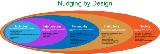
Social engineering is way of designing products and situations which actively encourage people to behave in a desired way — Nudging for Good. EDF Challenge “Sharing energy in the city, 2030” seems an ideal circumstance for social engineering for the greater social good. The basic question is how do we as designers find ways to incentivize individuals to save energy? How do we make a bit of personal sacrifice an attractive option for most? How do we “nudge” people to behave in a socially responsible ways when it comes to energy use? First, it makes sense to break up the problem into several user categories: personal energy sharing, family sharing, neighborhood or community sharing, city or village sharing. At each level we expand the circle to involve more and more individuals, and so we need a different approach for each category. Each category has a set of pressure points on which social engineers can apply pressure to achieve the desired changes. Once we identify the user groups targeted for “nudging”, game theory can be used to find the most attractive options. While there are numerous strategies that can be borrowed from game theory to incentivize the desired energy sharing behavior,…
Conceptual Design, Contributor, Personality, Product Design Strategy
Flat or 3D?
by Natesh Daniel •
Recently, on a LinkedIn discussion board, a designer asked if logo design was following the flat trend in UI design. The original post cited an article on DesignTaxi, “Top 10 Most-Talked-About Logo Redesigns Of 2013.” Most designers who responded to the discussion favored the idea that “All good logos can be written in sand with a stick.” The concept being: simplicity is better than complexity and one-color flat design is better than multi-colored three-dimensional design. I disagreed with a lot of the discussion. Though the UI design trend is flat and less skeuomorphic, logos are increasingly becoming three dimensional in look. This started with AT&T’s logo in 2005 and continues with Autodesk’s new logo from this year. Not many people favored this point of view and one comment indicated that the examples I shared were “exceptions, not the rule.” My point is that technology has changed and logos must be designed to look good in a variety of contexts and resolutions. Looking at the Autodesk logo, it has a three-dimensional color version, a flat color version, a black and white version like a stencil, and specs for literally reproducing it in three dimensions for signage. The key here is that logos are…