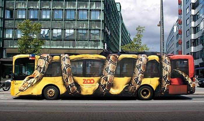
I’ve posted a video on this blog: “Because Product Should Be Fun!” The point is that design should create an emotional reaction in its audience. Here’s a collection of bus wrappings that have a strong emotional component, go amygdala! For another example of emotional design in packaging, please check out these blogs: “Emotional Design” and “Creative Use of Media to Advance a Message” for more bus fun.
Tag Archive for emotional design
Conceptual Design, Interface Design, Pipsqueak Articles, Product Design Strategy
Creative Use of Media to Advance a Message
by Olga Werby •
Anchoring Errors, Background Knowledge Errors, Cognitive Blindness, Conceptual Design, Cultural Bias, Cultural Differences, Errors, Ethnographic & User Data, Metaphor Mistakes, Mirroring Errors, Pipsqueak Articles, Product Design Strategy
Lost in Translation: Cultural Differences in Advertising
by Olga Werby •
“Lost in Translation” was a wonderful movie by Sofia Coppola, starring Bill Murray and Scarlett Johansson. It depicted the delicious confusion of Western tourists in total Japanese cultural emersion. In particular, the scenes where Bill Murray shoots a liquor commercial for the Japanese market are simply priceless. In retrospect, I see where Ms. Coppola got her ideas. Her cousin, Nicholas Cage, have been making wonderfully odd (to our sensibilities) commercials for years. He clearly had stories to share. Here are a few of his gems, courtesy the World Wide Web: and But it’s not only Japan that surprises our/my cultural biases. This morning, my husband and I went to a local grocery store in Rome, Italy. In the cheese section, there was a little paper bottle of parmesan cheese with a mouse of the package. The mouse didn’t work for me at all! So much for cultural differences. Here’s a small collection of ads for McDonalds from all over the world. Please compare it to the packaging and menus for this restaurant chain that I’ve posted here in the past: “Cultural World Domination”. Notice all of the anchoring errors, metaphor mistakes, cultural biases, mirroring errors, and general cognitive and cultural…
Conceptual Design, Cultural Bias, Flow, Interaction Design, Interface Design, Language, Perception, Pipsqueak Articles, Product Design Strategy, Scaffolding, Working Memory
The Haptic Feel of Books versus eBooks
by Olga Werby •
We’ve traveled to Rome for our family vacation this year, and aside from a few summer reading books that I couldn’t find in an eBook format, we relied on our two Kindles and 3 iPads for our family reading needs. This is the second summer we brought primarily electronic versions of books—”The Count of Monte Cristo” is much easier to read when it fits into your hand and doesn’t weigh a ton… In the days before the Kindle and iPad, we carried an extra suitcase just for books. But there are drawbacks to buying and reading eBooks. Below are some of my thoughts and experiences—the cogitations of a voracious reader. Time & Progress As I was reading my novels, I found myself repeatedly trying to figure out where in the book I was. How far along was I? When is the next natural break (chapter, section end)? How many pages are there to the end of the chapter, end of the section, end of the book? These were not idle curiosities about my reading accomplishments, although when you do finish reading the book version of “The Count of Monte Cristo”, you do have a sense of having read something. An…
Conceptual Design, Pipsqueak Articles, Product Design Strategy
Good Idea, Bad Idea
by Olga Werby •
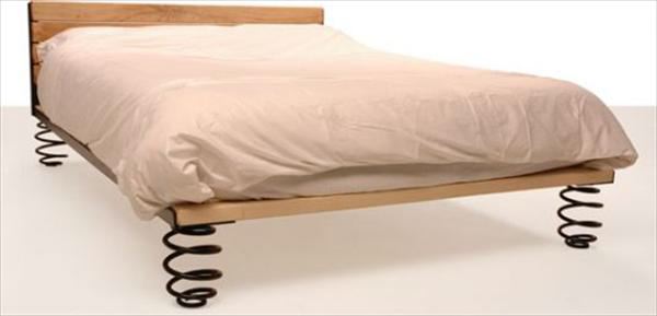
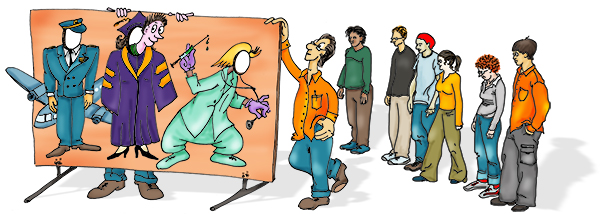
In the spirit of Animaniacs’ “Bad Idea, Good Idea,” enjoy the following product ideas. And for those who’ve never heard of Animaniacs, please watch the short segment (you can see more on YouTube!). Need a bit of assist in your bedroom? Add springs for the extra bounce. Find yourself in need of a sure grip? Make room for fingers. Short on space? Don’t waste the cupboards under each stair. Need more animation in the morning? Use the light. Bored with tea? Get a personal assistant. Worried about your waistline? Get measured. Live to serve? Bump it up. Too sure-footed? Make every climb a challenge. Too close? Give your photos some distance. Product design is limited only by imagination. A Short Introduction to Animaniacs’ “Bad Idea, Good Idea”
Cognitive Blindness, Conceptual Design, Diagnostic Errors, Errors, Featured, Mirroring Errors, Pipsqueak Articles, Product Design Strategy, Scaffolding
Empathy on the Brain
by Olga Werby •
Empathy is a necessary component of product design. To design and make something that is comfortable to use for someone else, requires the maker of the product to imagine how another human being would feel while using it. This is a hard thing to do. Medical students have to take “bed side manners” classes that explicitly teach empathy for the patient. Some design schools do the same (check out this video in Product Design Resources). Fortunately, humans come equipped with a special region in the brain whose job it is to help us see the world from another’s point of view. Here’s a short introduction by Rebecca Saxe, “How we read each other’s minds.” So when we go to the movies, we relate to the characters and feel what they feel, and cry when they are sad, and laugh when they are happy, and cringe when things get awkward, because we have the Right TPJ (or RTPJ) region in our brain just behind and above our right ear. We aren’t born ready to use this part of our brain, as the experiments described by Dr. Saxe in the video show. It takes a long time for this social problem solving…
Conceptual Design, Cultural Differences, Ethnographic & User Data, Pipsqueak Articles, Product Design Strategy, Users
Demonstration of Wealth
by Olga Werby •
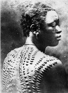
People have been flashing “bling” around since the cave days. But what we perceive as “bling” has changed dramatically over the years and over cultures. We are social animals, we put a lot of value in our place in the social hierarchy of the group. By demonstrating wealth, we are advertising our social status in the community. Body Image How can you tell how much influence a cave man had in his group? Well, one was probably the way he looked: body paint, tattoos, scarification, body modification, hairdos, teeth filings, nail beautification, and accessories. And while somethings were transitory—beads are easily lost in battle, nails broken during a hunt—some are permanent status symbols. When all you owe is carried on you, then permanent modifications is a good solution to broadcasting your importance and achievements to the group. Each scar carries meaning and is much easier to show off than notches on the bed post. But body modifications is a very painful bling. Products Once the society is a bit more stable, stuff becames a preferred way of social display. Jewelry can be worn, homes can be owned, cars can be seen—there are many ways to show off wealth in the…