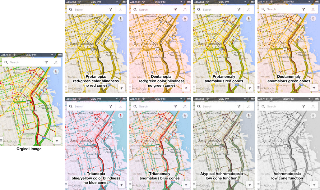
Google Traffic Map on an iPhone (or any other mobile device) is a great product… unless you are colorblind. Then, it’s a nightmare! 5% to 20% of the population has some kind of color processing disorder. Here is a simple test if you are one of those. Which of the following look the same to you? Click on the image above to enlarge. Red/green confusion — Protanopia: red/green color blindness, no red cones; Deutanopia: red/green color blindness, no green cones; Protanomaly: anomalous red cones; Deutanomaly: anomalous green cones — are the most common visual processing problems. But there is also blue blindness — Tritanopia: blue/yellow color blindness, no blue cones; and Tritanomaly: anomalous blue cones. The most rare cases are the monochrome colorblindness, the true loss of color — Achromatopsia: low cone function; and Atypical Achromatopsia: low cone function with some color. As designers, we have to be aware of our audiences’ limitations and strength. And visual processing and comprehension is no exception. In the past, I’ve written about colorblindness: . But unfortunately, the site that helped identify problems with design doesn’t seem to work. Here’s a new sit e for your reference: Colorblind Web Page Filter If you are…