Error Opportunity Space

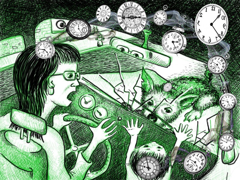
Confronted with one “True or False” question, an individual has a very small error opportunity space: three. There are three possible responses: true, false, or no answer. “No answer” will always be wrong, a betting man should choose one of the possible answers. But unfortunately situations where the error opportunity space is so narrow are rare. And in the real world, dealing with real problems, these spaces tend to be very large. Note that the size of the error opportunity space, EOS, makes no representations about the consequences of getting the problem right or wrong (or partially right or wrong). When the stock market tanked on May 7th, people involved in that process had a very large EOS. A week out, experts and participants are trying to figure out what went wrong and how to limit similar incidents in the future—they are trying, in effect, to drastically reduce the error opportunity space. This is a job of product designers. By analyzing the goals of the users and the system’s constraining variables, we can come up with conceptual design, interaction design, and interface design that would address the problems that were exposed on May 7th. Coming up with a solution is…

The Anatomy of Failure

On May 7th 2010, at around 2:30 p.m. Eastern Time, the stock market went on a wild ride, dropping over 900 points in matter of just minutes. What happened? There’s lot’s of speculation, and some know more then they are willing to say. But what’s clear is that there was just the right confluence of world events, human and computer errors, and system-wide communication breakdown that triggered a mass sell-off of stocks at fantastic prices. In other words, there was a catastrophic failure during product interaction. I’m not an investment analyst and have limited knowledge in this subject area, but I am interested in product failure. So Thursday’s stock market episode was very interesting. Here’s a little background on the events of that day broken down into steps leading to the failure. Step 1: When the New York stock market opened on Thursday, bad news was streaming in from Europe—there were fears that Greece would ultimately default on its loans; its people were staging massive demonstrations in Athens; Euro was going down. Step 2: In our very interconnected world, this kind of news makes investors skittish and the stock market was dropping value all morning. Step 3: At around 2:45…

Globalization and Cultural Errors

Jew's Ear Juice

There was a time when a product designed for a specific geopolitical region would have stayed there for the duration of its existence. With few exceptions, products didn’t travel the world to areas where they would be considered a fopaux. These products were cultural curiosities displayed by adventurous tourists for the pleasure and laughs of their friends and family. But things change. Product design and usability protocols now have to include culture experts. What works well in one place, for one group of users, at a particular time won’t do so under other circumstances.

Before you cast that vote on the ballot this November…

Article: McGrath, M (2008). “Political views ‘all in the mind’.” BBC World Service. Visited on 18 September 2008 http://news.bbc.co.uk/2/hi/science/nature/7623256.stm Conceptual Design —  to investigate the level of connection between a person’s political views and her/his physiological makeup, e.g. that person’s sensitivity to fear or threat. Interaction Design — small study targeting potential voters, exposing them to various sights & sounds that may provoke fear, and checking their responses against their political views on multiple issues.  Subjects were first asked a series of questions regarding their political views on multiple issues (like gun control, capital punishment, abortion, etc.).  Then, using electrical conductance to measure subjects’ skin & blink responses, they were exposed to a series of intentionally frightful images & sounds.  This is used to determine their levels of sensitivity to fears & threats Interface Design — creepy images like a scared man with a tarantula on his face, and an open wound with maggots in it, and loud, unexpectedly intrusive noises Summary — while this study is geographically limited (conducted only in Nebraska) and statistically insignificant (n=46), it does offer an interesting hypothesis that people who are highly sensitive to threats & fears tend to support a right-wing agenda. From…

Neuro-Parasites & Problem Solving Errors

Dr. Robert Sapolsky is a professor of neurobiology at Stanford University. He started his career studying baboons, charting the relationship between stress hormones and an individual animal’s social ranking in the baboon society hierarchy. The lower the rank, the more stress the animal experiences, the more consequences there are to the health outcomes and longevity of the baboon. Making a parallel to human society, the conclusions of Dr. Sapolsky’s study is that it sucks to be at the bottom of the social order. In his books “Primate’s Memoir” and “Zebras Don’t Get Ulcers,” Dr. Sapolsky provides copious details of his work and his conclusions. (see Recommended Books for details) But residing on the bottom of the social ladder is not the only problem a mammal like us can experience. In his video interview with Edge (www.Edge.org), Dr. Sapolsky describes the adventures of Toxoplasma–a protozoan parasite carried by cats which causes an infection Toxo–in our amygdala. Post an active infectious state, Toxo is able to manipulate human dopamine levels. People with the post-Toxo infection have higher than normal dopamine levels, resulting in some interesting cognitive consequences. There’s been solid research that documents a high level of Toxo infections in schizophrenic patients. There…

Reinventing the wheel to help disabled.

Article: Elliot, J. (2008). “Reinventing the wheel to help disabled.” BBC NEWS. Visited on 5 September 2008 http://news.bbc.co.uk/2/hi/health/7475609.stm Summary: Wheelchair wheels are not optimally designed for wheelchair users who must travel. While the wheels may be removed from a folding wheelchair, they do not themselves pack well and must often be checked in on flights or stowed separately from the folded chair in other travel scenarios. Former Royal College of Arts (RCA) student Duncan Fitzsimons designed a folding wheel for bicycles and is modifying the design to work for wheelchair users. His design, which folds the full-sized wheel flat while allowing use of a regular tire and inner tube, gives the wheelchair user the ability to quickly stow their chair when using other modes of transportation. Conceptual design: Wheelchair wheels must be removed from wheelchairs, even folding models, to be stowed  when traveling. Design a wheel which does not require removal from the chair and significantly reduces the amount of space needed to stow the chair. Interaction design: The wheel must be large, as this is the key to a wheelchair user’s independence. It should be designed to fit different budgets and performance needs. It must fold flat so it may be…

Understanding Complex Visual Information…

US Military PowerPoint slide designed to explain Afghanistan strategy.

…or not comprehending it, as the case may be. A few years ago, I wrote a paper about people’s ability to comprehend complex visual information such as graphs, charts, diagrams, maps, and so on. Intuitively, we are culturally-trained to believe that it’s much easier to extract information from a picture than from text. But upon testing this belief (p-prim, for those in the know), I found that contrary to the notion “a picture is worth a thousand words,” it’s much more difficult to get data from an illustration than from a story. While emotional impact might be larger with a picture, it’s not true for comprehension. You can read the results of my study at http://www.pipsqueak.com/pages/papers.html “Visual Symbolic Processing in Modern Times” paper presented at AACE ED-MEDIA Conference in 2008. Since then, I’ve collected more data, and the results are similarly aligned: problem-solving requiring higher level visual symbolic processing skills is difficult and results in communication failures. A secondary, and surprising, finding was a gender discrepancy in performance outcome testing of visual symbolic processing skills. Higher level and lower level visual symbolic processing are defined in the paper. And anyone interested in testing their visual processing skills are welcome to…