Last week, we went to listen to a talk by Daniel Kahneman and by coincidence I’ve just finished reading his book, Thinking Fast and Slow, just a few months ago. The ideas in the book are amazing and worth a read (it would be great if the two academic papers included in the back of the book and for which Dr. Kahneman received his Nobel Prize in Economics were printed in a font larger than 8 points!). And a few days after the lecture, I was struck by an obvious application of his ideas, or more to the point, how his experiential self versus remembering self concepts help explain the customer service phenomenon. It has been known for a long time that politeness of error messages and civility of customer service play a strong roll in how the experience with the product is remembered. Above a small portion of the Google Image Search results for “error messages”. The internet is full of these because people get so irked by such messages that they want to share their bad experiences with others. The results are just as illuminating for “bad customer service stories”. Again, a good bad story has legs! But…
Product Design Strategy
Cognitive Blindness, Conceptual Design, Cultural Bias, Cultural Differences, Product Design Strategy
Extreme Hypocrisy
by Olga Werby •
On the same day as I read about Gul Meena — a 17 year old Pakistani girl who was almost killed and severely maimed by her own brother — I bought a pair of skinny jeans. When I got home, I noticed they were made in Pakistan. I think I don’t need to say more… Gul Meena, 17, left her abusive husband in Pakistan for another man. Meena’s brother hacked her friend to death with an ax, before turning on her. Skinny Jeans Made in Pakistan
Conceptual Design, Cultural Bias, Cultural Differences, Interface Design, Perception, Pipsqueak Articles, Product Design Strategy
The Tone and the Interface
by Olga Werby •
I just returned from a brief visit to The Hague and Amsterdam. When in a foreign country encountering an unfamiliar language, it’s easy to focus on the visual presentation of content since the linguistic portion of the presentation is unavailable for processing. People who can read can’t help but do so when presented with text. But when one can’t process the linguistic content, all that is left are visual clues (and smells and sounds…). So I took a few snapshots to show how the tone of the interface impacts the emotional processing of content and attitude of the customer to the content. Selling Cheese in Amsterdam This is a farmers’ market stall in the middle of Amsterdam, selling home-made cheese. The woman in the photo is the actual cheese maker. Note the hand-lettered signs, the simple wooden boxes, the plain presentation — the overall effect is home made goods, care in production, quality product, even made with love. Fancy production values would just be off putting in this context, and probably result in lower sales of cheese. This NOT a museum, but rather a neighborhood cheese store in Amsterdam. (It is located next door to the flower museum…). What is…
Cultural Bias, Perception, Perceptual Focus Errors, Product Design Strategy
Perceptual Blindness in Design
by Olga Werby •
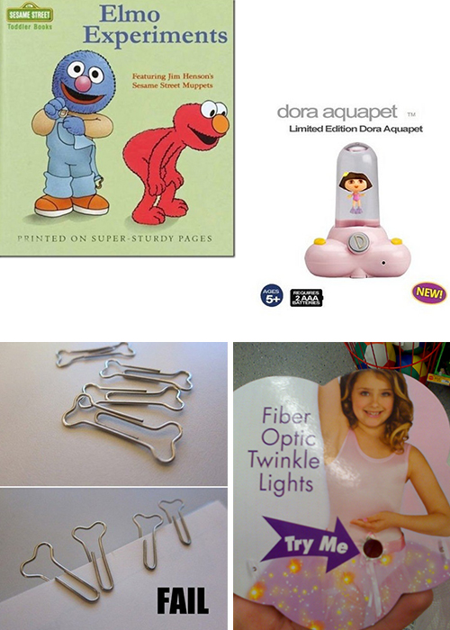
It is not always users that fail to see some particularly “cool” aspect of design, failure to notice which leads to failure in product use. Designers are people too and are just as prone to cultural and perceptual blindness — total inability to notice additional (sexual) meanings hidden in their designs. Below are examples that I’ve been collecting from email forwards over the last few years. The general groups are toy packaging, store signs, logos, religious strangeness (especially with cultural shifts in time), product labels, and in particular strange dentists’ ads… Enjoy! Thank you all who contributed to this post!
Background Knowledge, Conceptual Design, Cultural Bias, Featured, Pipsqueak Articles, Product Design Strategy
Forgetting by Design
by Olga Werby •
I get a lot of email forwards…don’t we all? And just the other day I got one that I have seen many times already over the past few years… Usually, you look, you smirk, you move on. But this time, the photo got me thinking: that poor kid — he has no memory of this shot, but he will be remembered for it for the rest of his life! The shot has long ago slipped from the close circle of sharing that his parents intended it for and has been widely distributed through out the world. Someday, this kid might even get it as mail forward himself: an adult man looking at a silly embarrassing moment that got away… Information with Expiration Date Somehow, I don’t imagine that getting “an image that got away” of oneself would be a source of continuous pleasure. One might want to forget the whole thing… And it is not just images — although having images with expiration dates would be very valuable — there are loads of information that should be forgotten by design. When my generation was growing up, the silly and stupid things we did didn’t end up as data for public…
Conceptual Design, Cultural Differences, Pipsqueak Articles, Product Design Strategy
What is a socio-technical system?
by Olga Werby •
We have to work within the boundaries of what’s possible given the history of the social system, the constraints of technology, the limitations of budgets, and cultural limits of the society wich endevers to implement the socio-technical system.
Anchoring Errors, Background Knowledge, Background Knowledge Errors, Cognitive Blindness, Conceptual Design, Diagnostic Errors, Ethnographic & User Data, Interaction Design, Interface Design, Misapplication of Problem Solving Strategies, Perception, Perceptual Focus Errors, Pipsqueak Articles, Product Design Strategy, Scaffolding, Users, Working Memory
Task Analysis and Product Design
by Olga Werby •
Imagine your were given an assignment to develop a product that could help people eat healthy. How would you go about creating such a thing? What would you need to learn/understand? What is the right medium or technology vehicle for such a product? How would you even start? Below is a very brief outline of how to get started and the key tools necessary for the job. Project Goals The first order of business is figuring out the business needs and goals: What is the product really supposed to do? You have to ask this even if you are the one who is the client on this project. But, most probably, you are working for someone else — the client — and you have to start by understanding what your client really wants to do. You can do that in several ways: Analyzing the Request for Proposals: On many such projects, there will be an initial document, something like an RFP, that outlines the business goals and desires of the client. While some RFPs are very detailed and fully fleshed out, most are not. There are many reasons for this. Some clients are worried someone will “steal” their ideas and…