Product Design Strategy

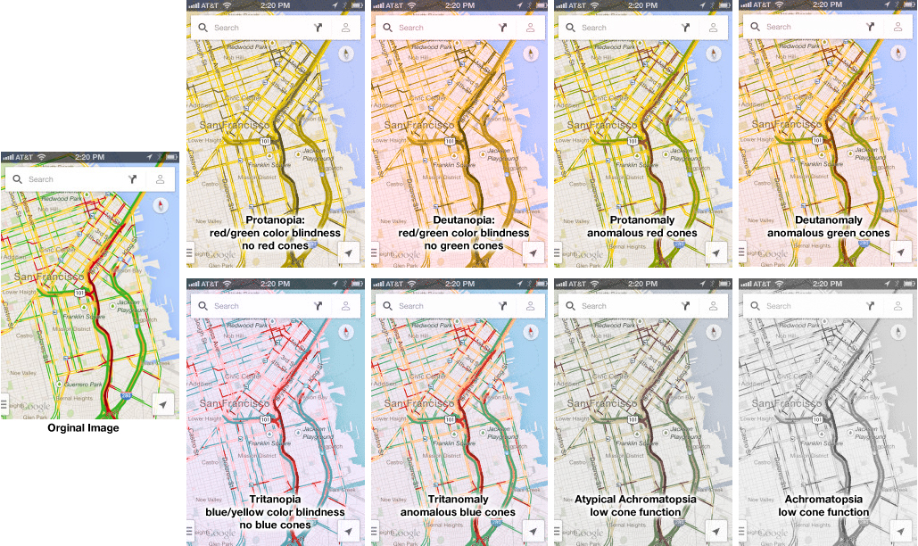
Colorblindness Test on iPhone Google Traffic Map

2013 iPhone Traffic Google Map Colorblind Test

Google Traffic Map on an iPhone (or any other mobile device) is a great product… unless you are colorblind. Then, it’s a nightmare! 5% to 20% of the population has some kind of color processing disorder. Here is a simple test if you are one of those. Which of the following look the same to you? Click on the image above to enlarge. Red/green confusion — Protanopia: red/green color blindness, no red cones; Deutanopia: red/green color blindness, no green cones; Protanomaly: anomalous red cones; Deutanomaly: anomalous green cones — are the most common visual processing problems. But there is also blue blindness — Tritanopia: blue/yellow color blindness, no blue cones; and Tritanomaly: anomalous blue cones. The most rare cases are the monochrome colorblindness, the true loss of color — Achromatopsia: low cone function; and Atypical Achromatopsia: low cone function with some color. As designers, we have to be aware of our audiences’ limitations and strength. And visual processing and comprehension is no exception. In the past, I’ve written about colorblindness: . But unfortunately, the site that helped identify problems with design doesn’t seem to work. Here’s a new sit e for your reference: Colorblind Web Page Filter If you are…

Some Examples of Design Failure in Physical Space

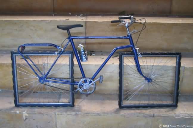
square wheeled bike

Affordance is a feature of an object or an environment that suggests a set of possible actions/interaction that a user of such object/environment can perform with it. For example, if an object has a handle (e.g. tea cup), a user can reasonably expect to pick it up via that handle without spilling the contents of the cup. On the other hand, no one has an expectation of the wheels of the bike below turning… We all recognize the bike above as an art piece. As a connoisseur of design failure, I regularly get emails with collections of failed design objects or situations. When I get enough to share, I usually post them on this blog. Bathrooms design fails seem to be a favorite, but there are others… Enjoy! (or my personal experience in The Hague) Some problems arise when the design specks change over time, like the size of a toilet paper roll versus the toilet paper holder… Some problems arise when the maps are out of date… or Some are due to timing and lack of built-in error handling… But some design solutions are there to fix the problem of cultural differences:

Cuteness Inspires Violence Research and Angry Birds

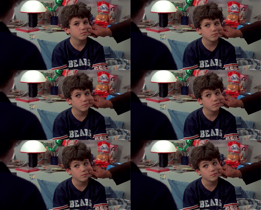
cheek pinching

Have you ever felt the urge to hug someone too hard? Squeeze a baby? Pinch a cheek? Even when you knew it might hurt the other person? If you have, you are not alone! Last month, Scientific American published an article Cuteness Inspires Aggression on the study done by Rebecca Dyer and Oriana Aragon of Yale University, documenting the intense response to cuteness. Cute aggression’s prevalence does not mean that people actually want to harm cuddly critters, Aragon explains. Rather the response could be protective, or it could be the brain’s way of tamping down or venting extreme feelings of giddiness and happiness. The scientists are currently conducting additional studies to determine what drives the need to squeeze. So this research led me to think of the success of the Angry Birds game. Originally, I thought that it was the juxtaposition of the cuteness factor and violence that made the game so irresistible as a sales effort (once people started playing it, the puzzles were good enough to sustain engagement with the game without the cute + aggressive factor). Would the game be just as fun to talk about (or to wear t-shirts) if the birds weren’t so damn cute?…

Cultural Differences in Interaction Design, a few observations

Amsterdam

A couple of months ago, I went on the business trip to The Hague and Amsterdam. There are always cultural differences, especially when a person visits a previously unfamiliar place. And so it was with me. Here are two quirky examples. The Room with a View I’m not particularly prudish or modest, especially when staying alone in a hotel room. But this feature of my room in The Hague was a bit puzzling. The shower and toilet were connected to the room not only by a door (with lock), but also by a picture window. The window coverings were controlled from the OUTSIDE of the bathroom — so effectively, if you were sharing a room, you were at a whim of your roommate when it came to your toilet privacy. But perhaps that’s how they roll in The Hague… I should also add that directly opposite of the toilet window was the window to the outside — if you haven’t considered what internal lighting does to your visibility to the outside world in time, you are out of luck. The Double Action As a designer, most of my work in web-based. But this doesn’t stop me from being annoyed at…

Review: Gamification at Work: Designing Engaging Business Software

gamification at work book cover

Interaction Design Foundation is about to publish Janaki Mythily Kumar’s and Mario Herger’s 2013 book: “Gamification at Work: Designing Engaging Business Software.” [reference: Kumar, Janaki Mythily and Herger, Mario (2013): Gamification at Work: Designing Engaging Business Software. Aarhus, Denmark, The Interaction Design Foundation. ISBN: 978-87-92964-06-9.] Kumar and Herger put together history and background of gamification among a broad spectrum of ventures and included a quick guide for how to apply some of the ideas and key concepts to the design of corporate dynamics for your company! Here are a few gems from the book: Figure 2.1: Player Centered Design Process. Courtesy of Janaki Kumar and Mario Herger. Copyright: CC-Att-ND (Creative Commons Attribution-NoDerivs 3.0 Unported). Figure 3.3: Bartle Player Types. Courtesy of Janaki Kumar and Mario Herger. Copyright: CC-Att-ND (Creative Commons Attribution-NoDerivs 3.0 Unported). If you think of these as user-types, then Kumar and Herger provide a set of ideas of how to design to meet the needs of these different player groups. They provide a great Player Persona Template. In Chapter 4, they explain how to gather the data for a particular company and develop user personas based on actual ethnographic information. Chapter 5 explores the motivational drivers and even…

User Roles and Governance

2013-06-09 Role vs Governance Diagram for NIH Citizen Engagement Think Tank

One of the areas of discussion at the NIH Citizen Science Engagement Think Tank meeting last month was how to categorize the roles (and thus rules of engagement) for citizen scientists. There was a continuous pressure to call individuals who “donate” their medical data to scientific research patients. Let me start by saying that I find that unacceptable — aside from the fact that every human being on Earth has been or will be a patient at some point in their lives; the label patient implies a lower level on the hierarchy than doctor or scientist. The whole point of citizen science initiative is to break down the barriers to entry — we are ALL scientists! Being a scientist is not measured by the number of years in school or diplomas on the wall. It is the willingness to do science that is key. Thus we can all be scientists. With that said, what follows is the discussion on group dynamics — how do people work in groups and how we can support productive scientific endeavors through good design and social engineering. Think Different Collective Groups of people are not made up of homogeneous people — we are all idiosyncratically…