Interaction Design

How does the product do it?

Building and Sustaining Online Communities

Pope Francis said an interesting and insightful commentary on online social media: “The Internet, in particular, offers immense possibilities for encounter and solidarity… The speed with which information is communicated exceeds our capacity for reflection and judgement, and this does not make for more balanced and proper forms of self-expression. … The variety of opinions being aired can be seen as helpful, but it also enables people to barricade themselves behind sources of information which only confirm their own wishes and ideas, or political and economic interests.” In other words, communities have the power to limit the range of views to only those that they seems culturally appropriate — a small subset of active users can completely change the group dynamics of a community. The responsibility of the managers to find their way to create and sustain healthy communities. I’ve been building and supporting communities for a while. It happened organically — I needed to help a client start a project and build a following around it; then another client needed something similar; after a dozen years (or more), I’ve found myself creating guidelines for communities and the people who help manage them. Below is some of my “wisdoms” from…

Changing Profiles: The Missing Edit Button

  Social media sites such as Facebook, LinkedIn, and Twitter have changed the nature of digital identities. The anonymous or pseudonymous online profiles of the 90s have been eschewed for real and “verified” identities. However, why do websites force us to conform to variables that describe our identities according to inflexible database fields? Identities are fluid by nature and change over time. We adopt nicknames and change them. We marry and change our surnames. We remarry and change them again. We endure ordeals in life and change our names to distance ourselves from threatening people or violent events. We change our names to avoid responsibilities. We even play with identity and names as an expressive art form. Though government agencies are adept at tracking the various forms of our identities, the common social media and web services that we use daily are not so willing. For example, Facebook has name standards. Their standards limit personal expression. They encourage people to use “real names” but names are subjective and contextual. In fact, the California law that governs identity recognizes that a name others use for you, even if not your “real name” can be legally valid. Furthermore, the “usage method” of the…

The Post-Password Era Begins

In November of 2012, Wired Magazine wrote a cover story titled, “Kill the Password,” in which Mat Honan retold how hackers stole his identity and hijacked his social media accounts. After some research, Honan shared just how easy it is for hackers to steal passwords, often with some fairly low-tech methods. Fast forward to October 9, 2013, when Adobe Systems emailed its users that hackers had stolen encrypted user passwords. However, the fact that Adobe was hacked wasn’t the problem. The email was sent to call attention to the real problem: “We recommend that you also change your password on any website where you use the same user ID or password.” Yikes! How many web-based accounts do I have that use the same user name? In January of 2012, I began documenting all the web-based accounts I use. 66 of 167 web accounts use the same user name. 40 use another. How many use the same password? Coincidentally, 66 use the same password. Despite how obviously vulnerable I am, I might have been complacent enough to ignore my own security negligence had two more Internet companies not emailed me about Adobe’s password breach. On November 16, Eventbrite emailed me to recommend that I change my password on their site because…

Some Examples of Design Failure in Physical Space

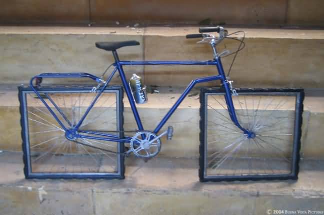
square wheeled bike

Affordance is a feature of an object or an environment that suggests a set of possible actions/interaction that a user of such object/environment can perform with it. For example, if an object has a handle (e.g. tea cup), a user can reasonably expect to pick it up via that handle without spilling the contents of the cup. On the other hand, no one has an expectation of the wheels of the bike below turning… We all recognize the bike above as an art piece. As a connoisseur of design failure, I regularly get emails with collections of failed design objects or situations. When I get enough to share, I usually post them on this blog. Bathrooms design fails seem to be a favorite, but there are others… Enjoy! (or my personal experience in The Hague) Some problems arise when the design specks change over time, like the size of a toilet paper roll versus the toilet paper holder… Some problems arise when the maps are out of date… or Some are due to timing and lack of built-in error handling… But some design solutions are there to fix the problem of cultural differences:

Cultural Differences in Interaction Design, a few observations

Amsterdam

A couple of months ago, I went on the business trip to The Hague and Amsterdam. There are always cultural differences, especially when a person visits a previously unfamiliar place. And so it was with me. Here are two quirky examples. The Room with a View I’m not particularly prudish or modest, especially when staying alone in a hotel room. But this feature of my room in The Hague was a bit puzzling. The shower and toilet were connected to the room not only by a door (with lock), but also by a picture window. The window coverings were controlled from the OUTSIDE of the bathroom — so effectively, if you were sharing a room, you were at a whim of your roommate when it came to your toilet privacy. But perhaps that’s how they roll in The Hague… I should also add that directly opposite of the toilet window was the window to the outside — if you haven’t considered what internal lighting does to your visibility to the outside world in time, you are out of luck. The Double Action As a designer, most of my work in web-based. But this doesn’t stop me from being annoyed at…

Task Analysis and Product Design

Kids from India and Vegetable Choices

Imagine your were given an assignment to develop a product that could help people eat healthy. How would you go about creating such a thing? What would you need to learn/understand? What is the right medium or technology vehicle for such a product? How would you even start? Below is a very brief outline of how to get started and the key tools necessary for the job. Project Goals The first order of business is figuring out the business needs and goals: What is the product really supposed to do? You have to ask this even if you are the one who is the client on this project. But, most probably, you are working for someone else — the client — and you have to start by understanding what your client really wants to do. You can do that in several ways: Analyzing the Request for Proposals: On many such projects, there will be an initial document, something like an RFP, that outlines the business goals and desires of the client. While some RFPs are very detailed and fully fleshed out, most are not. There are many reasons for this. Some clients are worried someone will “steal” their ideas and…

Going Potty…or iPotty!

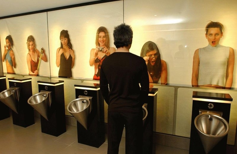
Edge Designs Men's Restroom Mural

An iPotty App for kids learning to use a toilet: And here’s a bit for an older audience: Would it have worked if the sexes were reveres — images of staring men on the walls of women’s room? I don’t think so… And here’s a link to a previous post on this subject: Toilet Games