
Tugend, A., (2011). “It’s Just Fine to Make Mistakes.” NYTimes.com. Visited on October 8, 2012: http://www.nytimes.com/2011/03/12/your-money/12shortcuts.html Experiment: A study was conducted comparing the productive abilities of participants testing high and low in “perfectionism”. The task was to rephrase a passage without interpretation for a panel of judges who were unaware of the status of the participants. The Outcome: Those rating high in perfectionism were judged to have passages “significantly poorer in quality”. This surprising finding can be attributed to a shortened process of learning in perfectionists, due to fear of failure and the loss of respect should a mistake be found. This isolation from feedback inhibits development. Additionally, the stress of perfectionism can be psychologically detrimental, further inhibiting learning especially in the face of failure. Interaction Design: For products with a high learning curve, built-in feedback could be considered when the product is not used as designed, and alternately when ideal conditions of usage are met. This would perhaps encourage experimentation and calibrate use. Interface Design: Friendly tone or customizable interface might also help to attract continued use. This could give perfectionists and non-perfectionists a positive working arena.
Interaction Design
How does the product do it?
Attention, Conceptual Design, Contributor, Interaction Design, Interface Design, Users
RE: Preloading and The Above-Average Effect
by Micah Johnson •
Valdesolo, P. (2010). “Flattery Will Get You Far.” ScientificAmerican.com. Visited on October 8, 2012: http://www.scientificamerican.com/article.cfm?id=flattery-will-get-you-far A study suggests that flattery is effective, illustrating that even obviously manipulative comments play into the an individual’s high self-regard, affecting later behavior. This phenomenon, called the above-average effect, can be found for example in advertising. When a person views an advertisement showing an exaggerated response to a product’s use, their response in the aisle when making a choice, is measurably swayed. Sunlight, breezes, and smiling people in light sweaters walking through green pastures create a positive impression we remember when buying liquid laundry detergent of a certain brand, even if we know there is little rational correlation. Conceptual Design: The principle of the above-average effect could be used strategically. Research into a population’s background might give a picture of how to articulate a product; or, similarly, the idea of preloading expectations through associations in a programmed environment could be used to aim a particular audiences preferences or choices, or make rational jumps easier when transitioning from one experience to another. Interaction Design: “I want to be special!” Letting the user interact and uniquely configure their use of the product. Research into cultural background should be…
Conceptual Design, Contributor, Interaction Design, Interface Design, Users
RE: Mac vs. PC gap is the narrowest since ’90s.
by jpcochran •
Gross, D. (2012). “Mac vs. PC gap is the narrowest since ’90s.” cnn.com. Visited on October 9, 2012: http://www.cnn.com/2012/07/05/tech/gaming-gadgets/mac-vs-pc-graph/index.html This article focuses on the recent trend that the ratio of Windows-based computers sold to Apple’s Macintosh computers is tightening to a 20-1 ratio. The article attributes this trend to the rise in use of portable computing and a perception that MacBook laptops are a superior product. Factoring in other portable devices from Apple such as iPods, iPads and iPhones decreases Microsoft’s sales advantage to a 2-to-1 ratio. Conceptual Design The article suggests that an integrated mobile device (laptop or hand held) that is perceived as a “better” product has led to the turnaround in sales for Apple in relation to Microsoft’s widows based PCs. When accounting for Apple’s smart phones and tablets the sales ratio tightens dramatically suggesting a post-PC era that will require product designers to think of new ways to take advantage of this portable computing trend. People spending more time on these non-PC devices threatens Microsoft’s Windows platform that has dominated the software industry for decades. Interaction Design The sales trend in a post PC world where devices are with you at all times suggests that people…
Conceptual Design, Interaction Design, Pipsqueak Articles, Product Design Strategy, Scaffolding
BRIDGE to Health
by Olga Werby •

This week, I was invited to attend a BRIDGE Summit at Stanford. I was there to represent Ushahidi’s work and wasn’t particularly sure what to expect… But it turned out to be a very interesting brainstorming session for a new product/service in the health space: BRIDGE. Dr. Stephen Friend (M.D. and PH.D., president/co-founder/director of Sage Bionetworks) ran the show. What you will read below are just my notes, ideas, and understanding of what we were trying to do. I’m sure others at this summit came away with a whole different set thoughts, but, in the interest of advancing my own understanding and sharing of ideas in general, it seemed worth putting together a narrative of the product we were designing. So what is BRIDGE? After a two day discussion, we settled that BRIDGE is a platform (rather than an app) that will strive to: help gather medical information; crowdsource algorithms that would act on collected data with an aim to make medical advances; provide services to patients (information, education, support); facilitate research and make it easier for scientists to get access to data and to post requests for crowdsourcing projects; ease communication between all individuals and organizations working to advance…
Conceptual Design, Cultural Differences, Interaction Design, Interface Design, Pipsqueak Articles, Product Design Strategy
Design and the Olympic Games
by Olga Werby •

The Olympic Games are coming to a close and there are some interesting design decisions that seem worth mentioning. But let’s start with a cursory set of design requirements: safety, transportation, visibility and observability of events, entertainment, fairness, cultural sensitivity and appropriateness, and so much more. As with all design problems, divide and concur is a good approach: who are the audiences; what are their needs; what are the time, budget, and personal resources of the project; and what are the considerations (goals) of the sponsoring country. These are the basics of product design. From these variables, we can set priorities and deduce probabilities of errors and failures and how to accommodate them with design. Clearly, this is too much to cover in one blog, but here are a few thoughts… Safety There are many safety concerns in staging big, multinational events. Let’s first consider the different groups of individuals: safety for the participants, organizers, audience, supporting staff. We can break this down even more (by country, by sex, by religion, by location, by celebrity, etc.), but these are the large categories. It’s important to consider the safety for each group separately and provide supports as necessary. There are different…
Conceptual Design, Interaction Design, Pipsqueak Articles, Product Design Strategy, Reference
Special Preview: Socio-Technical System Design
by Olga Werby •
Brian Whitworth and Adnan Ahmad contributed a chapter on Socio-Technical System Design for the free Interaction-Design textbook. This is a very interesting, if technical discussion of the subject. While reading it, I kept thinking about how I would love to debate some of the points raised in this Chapter in person. But lacking this opportunity, below are my ideas and thoughts on the subject of Socio-Technical System Design. First, let me give a quick summary of what is a socio-technological system paraphrasing a bit from Whitworth and Ahmad own words: Socio-technology is about technology and people. Technology is any device. IT system is then a combination of software AND device(s). Human computer interaction (HCI) is a person plus an IT system. Introduction of “person” brings physical, informational and psychological levels into the combined system. And finally, socio-technical system (STS) is merger of community and HCI(s). A Bit of Historical Perspective When my son was in third grade, he was given an assignment: compare some technology from today with that of 100 years ago. He chose transportation. Here’s his insight: 100 years ago, going from San Francisco to Berkeley took a very long time. There were no bridges. People had to drive their…
Conceptual Design, Errors, Featured, Interaction Design, Interface Design, Perception, Perceptual Blindness, Perceptual Focus Errors, Pipsqueak Articles, Product Design Strategy
Where to post the “OK” Button on the Screen?
by Olga Werby •
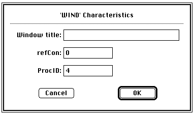
I have very strong opinions about where on the screen the OK or NEXT or SUBMIT buttons go in relation to CANCEL. Without giving it away, I’m going to walk through the design decision tree and provide a lot of references for both sides of the issue — yes, there are strong feelings about the right versus the left position choice. I’m not alone! Passive versus Active Buttons Active Buttons are the ones that advance the action to the next level. Passive ones return the users to previous state, negate the action sequence. OKAY, OK, NEXT, SUBMIT, ACCEPT, GO are all active buttons. CANCEL, BACK, PREVIOUS are action that reverse forward momentum and push the user to places they’ve been before. HELP and INFO sidetrack the user and distract from forward thrust of activity. In general, product designers want to move the users toward their goals — thus we want the perceptual focus to be on the action buttons. We want to make sure that users fist see the way forward, and then click on the right button that propels them forward to completion of the task. All distractions and side movements should be downplayed with Interface Design with the…