Our minds play tricks on us all the time. Once the information has entered our cognition via our senses, it still has to get processed to be understood. Like any other data, it’s all about context. For interesting examples of optical illusions, please visit http://www.lottolab.org/articles/illusionsoflight.asp. R. Beau Lotto has put together a few interesting examples of mis-processing! Or watch him deliver a talk at TED.
Pipsqueak Articles
Posts written by Olga Werby or Christopher Werby
Anchoring Errors, Background Knowledge, Background Knowledge Errors, Causal Net Problems, Diagnostic Errors, Featured, Mental Model Traps, Metaphor Mistakes, Misapplication of Problem Solving Strategies, Pipsqueak Articles, Product Design Strategy, Scaffolding
What is a p-prim?
by Olga Werby •

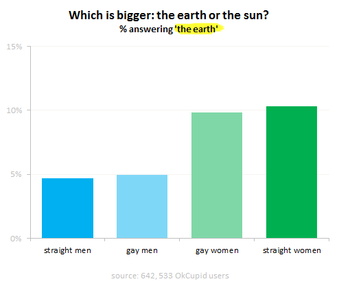
I’ve been using the p-prim ever since I’ve learned of them, back in my graduate school days at UC Berkeley. P-prims stand for phenomenological primitives and were “invented” by Andrea diSeesa, a UC Berkeley professor in the School of Education who also happens to be a physicist (diSessa, 1983). Visit his Wikipedia page and check out some of the cool projects he’s working at now. Before I give a definition of a p-prim, I think it would be good to give a few examples. Here’s a graph published by OkTrends on beliefs of various groups (in this case as defined by their sexual orientation) about the relative size of our sun versus the Earth (our planet). Even disregarding the differences in percentages due to sexual preference, an awesome 5 % to 10 % of our population believes that the planet we live on is larger than the star it orbits. Would this qualify as a p-prim? Yes: it’s not a formally learned concept; it describes a phenomenon; it’s a bit of knowledge based on personal observations: the sun looks like a small round disk in the sky; it’s a useful problem-solving tool when one has to draw a picture with…
Ethnographic & User Data, Featured, Interface Design, Pipsqueak Articles, Product Design Strategy
Emotional Design
by Olga Werby •

Product design is not just about usability. How we feel about a product makes a lot of difference. The research shows that two identical applications—with similar failure rate, but with a different take on dialogue box writing—result in very different perceptions of usability by its audience. The application with polite dialogue text always wins. Emotional design deals with how we feel about the product. Interfaces design is all about the look and feel and is responsible for a large portion of generated user emotions. Here are some examples of bag designs. If you want to encourage recycling, this is a great way of making these bags valuable—the users won’t throw them out after one use. Enjoy!
Errors, Ethnographic & User Data, Interface Design, Perception, Pipsqueak Articles, Product Design Strategy, Scaffolding, Users
Accidentally Supergluing an Eye Shut
by Olga Werby •

I hope the mere reading of the title made you queasy—it makes me shudder every time. On October 6th, CNN posted a story about a woman from Phoenix, Arizona, who accidentally put drops of super glue into her eye instead of the eye medication. She called 911, and in the emergency room the doctors had to cut open her eye and peel the hardened layer of super glue from her eye ball. If this doesn’t make you sick, then… One may ask: how stupid does one have to be to glue their eye shut? But, as with many other product-use errors, the woman made a very common mistake. The hospital wasn’t surprised—apparently these accidents happen all the time. Because of poor vision, she couldn’t distinguish between the bottles of her eye medicine and the package of super glue. Take a look at this: If you are relying purely on feel, the woman’s error no longer feels so outlandish. Here’s what she probably could see with her poor vision: And here is what we, the well-sighted, could see: So upon a close examination, the woman’s error is a natural mistake. (Yeah, I know, I know: Why would she keep the bottle…
Attention Controls Errors, Cognitive Blindness, Conceptual Design, Featured, Interaction Design, Mode Errors, Pipsqueak Articles, Users
Skin-deep Usability
by Olga Werby •

The Universal Remote Control Story A few years ago, we got a Star Trek phaser universal remote control as a gag gift for the holidays. As any universal remote control (URC), it was supposed to control any and all devices that were hooked up to our TV and do it with a flair of shooting a phaser at the general direction of our equipment. A few days later, it was relegated to our sons’ toy box, and now I wouldn’t even know where to look for the thing. Big buttons, footballs, phasers, UFOs, futuristic control centers—the makers of universal remote controls have tried them all. But consumers still buy one URC after another in the hope of finding something that would work for them. Why are these things so darn hard to use? Manufacturers seem to believe that by giving their products a friendly, toy-like appearances, these devices would seem more user-friendly and easier to use. But, personally, I don’t want a giant ball in middle of my kitchen table or rolling around my living room floor. I don’t want the kids to toss footballs to control the channels or fire phasers to lower the sound. I just want something…
Autopilot Errors, Background Knowledge Errors, Conceptual Design, Diagnostic Errors, Errors, Interaction Design, Interface Design, Interruptus Errors, Misapplication of Problem Solving Strategies, Mode Errors, Perceptual Blindness, Perceptual Focus Errors, Pipsqueak Articles, Product Design Strategy, Scaffolding, Users, Working Memory
The History of Usability
by Olga Werby •

When did we start being concerned with usability? Some will say that such concern is part of being human: cavemen worked their stone tools to get them just right. Interaction design mattered even then. But the field of usability research really came into being when the tools we used started to run up against our cognitive and physical limitations. And to avoid hitting literal, as well as psychological, walls, it was the aviation engineers who started to think about usability seriously. While cars were becoming ever more sophisticated and trains ever faster, it was the airplanes that were the cause of most usability problems around WWI. Cars were big, but didn’t go very fast or had a lot of roads to travel on at the turn of the century. In the first decade of the 20th century, there were only 8,000 cars total in the U.S. traveling on 10 miles of paved roads. In 1900, there were only 96 deaths caused by the automobile accidents. Planes were more problematic. For one thing, the missing roads weren’t a problem. And a plane falling out of the sky in an urban area caused far more damage than a car ever could. Planes…
Cognitive Blindness, Conceptual Design, Cultural Bias, Cultural Differences, Ethnographic & User Data, Featured, Interaction Design, Interface Design, Mirroring Errors, Pipsqueak Articles, Users
Be the Customer
by Olga Werby •

By our very nature, humans are an “us versus them” kind of mammal. We are quick to judge and categorize: “he’s our kind’a people” or “she’s management.” We adapt and root for our favorite sports teams, sometimes even resorting to violence to “defend our guys.” We peg an art department against the engineers; we side with nurses over doctors; we fight with democrats against republicans; we wave our flags in a spirit of nationalism. And it doesn’t matter if we all work for the same company, heal the same patients, want the same basic rights, or live on a very small planet—we tend to take sides. So it’s no surprise that when product designers develop products the feeling of “us against the users” creeps up into the process. To protect the design process from these “us versus them” impulses, we can create a well-realized user personas based on the the audience taxonomy developed during the conceptual design stage of product design. For each major category in the audience taxonomy, a sample fictional user is created which embodies all of the traits in that audience category: age, profession, socio-economic background, culture and sub-culture, interests and dislikes, family status, education level, etc.…
