Ethnographic & User Data

Knowledge, Context, and Expectation Part II

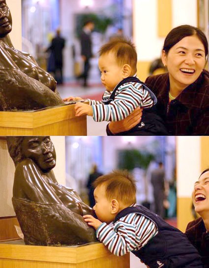
I first came across this image years ago in our pediatrician’s office. It made everyone who saw it laugh. The young boy—less than a year old, probably—has very limited world experience. But somethings he knows well—food comes out of those! The boy recognized the imagery, but with his limited background knowledge of art and contextual experience, his expectations of milk were quickly dashed (to the complete amusement of his mother). While we enjoy the boy’s predicament, it is good to keep in mind that the products we create can put our users at a disadvantage. The product’s audience can similarly have limited background knowledge, misinterpret the context, and be left with unexpected consequences. And a loving mother might not be there to console them…

Trolls, Dolls, and Poupees

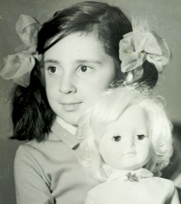
The first time I saw her, she was riding on a bus. Her hair was long and golden. Her eyes were amazing blue. She was stylishly dressed in a mini skirt and had a cool pair of earrings. But what got me—what burned that moment into my memory forever—was that her long slender legs bent without any visible joints. She was amazing. I wouldn’t see another like her until many years later, when my family was emigrating from Russia and living Vienna. Not far from the apartment we stayed in, there was a toy store and it was filled with wonders just like the one I remembered from so many buses ago: Barbie. When I was growing up in Russia, I played with dolls and poupees—all girls did. The dolls were made to resemble little kids, with big eyes, big heads, chubby cheeks, and cute clothes. I used old buttons and odd bits of cloth and lace to make them new clothes and bedding. My play mainly consisted of creating cool things for my dolls—I liked to sew and glue. And I don’t think that my play was all that much different from girls’ 100 years before—my dolls would have…

Thinking About Value

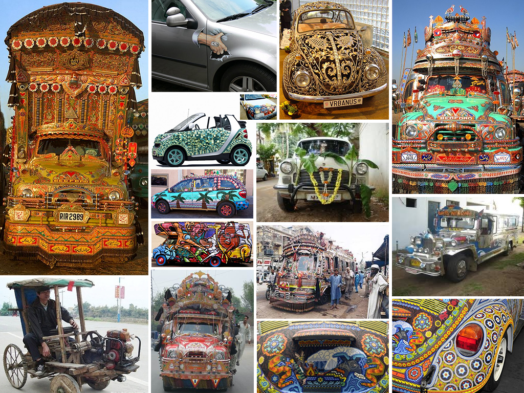
Which car do you find more pleasing? Which car would evoke a feeling of envy? Would you shake your head or starting thinking of how you can improve on the looks of your car? Which car’s origin would you place in the South Asia? Which in South America? Which owner cares about the aerodynamic qualities of the vehicle? Regardless of your personal feelings, the owners of these automobiles have clearly invested a tremendous amount of energy and effort into making them look like this and are very proud of the results! Telling a Story Each of the vehicles above tells a story about its owner and about its culture. The story conveys information: the owner’s goals for the car: utility or status symbol or both cultural value of design cultural symbols owner’s attitude towards possessions (e.g.: How long is the car expected to stay with one owner?) owner’s place in the social hierarchy owner’s unique identity owner’s investment into the vehicle (e.g.: time, money, skill, etc.) the perceived value of the vehicle to its owner These stories of cars and their owners change from culture to culture, from place to place, and of course in time. What we consider beautiful…

Cultural Differences or Child Abuse?

Sometimes, it’s in the eye of the beholder. Consider the images below: Is this child being physically tortured? The little girl is the photo is about 5 or so. The temperature of the air around her seems to be about the same: 5 F°. The temperature of the water is below freezing. The child is freaking out and is in serious danger of hyperthermia. So how do we judge the adults in this photo? The winter-coated men dunking the girl into the ice-cold water think they are doing good by this child! This is the right of Epiphany–a religious act meant to help the girl. How do we evaluate the social value of such act from the comfort and warmth of our computer lit rooms? How do you feel about this photo? If you’re not sure yet, follow this link: http://video.mail.ru/mail/mimozachina/2688/2690.html My personal feeling is that if zoo keepers saw this kind of behavior in the primate house, the baby ape would have been taken away due to its mother’s lack of parenting skills. But then again, I’m just imposing my cultural views and norms on someone else…or am I? The Call of Mother Tigers, Mother Grizzlies, Mother Dolphins… There…

Lessons to be Learned from the GAP Logo Debacle

Geoghegan, T. (2010). “Lessons to be learnt from the Gap logo debacle.” BBC News Magazine. Retrieved on October 12, 2010: http://www.bbc.co.uk/news/magazine-11517129 A new logo can brighten up a company’s image or enrage loyal customers. In the case of GAP, the latter was obvious. The release of the new logo led to a huge online backlash from customers on FB and twitter conveying how unhappy they were with the logo. Within a week of release, GAP chose to revert back to the original logo after a slew of criticism. GAP LOGO The importance of being an iconic brand has been severely undervalued. The association of the image and brand is overlaid in the minds of people for the last 20 years. Changing the visual must have pre empted GAP to have tested the logo with focus groups and understand the reactions of the audience.  The changed their visual imagery without upsetting customers. The logos below have retained their sense of familiarity which is refreshing and yet without really giving customers the need to process an all together new image to associate with the brand. Companies uniformly moved from serif font to a more elegant Helvetica. MSNBC LOGO GE LOGO Product Positioning:…

Cheating by Design

The Road to Hell is Paved with Good Intentions. This year, the Metropolitan Transpiration Commission introduced the new Clipper Smart Card. Public transit riders all over the Bay Area can now use a convent piece of plastic to pay for their BART trains, buses, MUNIs, etc. Just swipe the Clipper Card past one of the little readers, and the gates open to let you in and out of the station or pay for the bus. The cards could be purchased in stores and vending machines all over the area—$2 cards are the minimum value cards. More money can be easily added to these cards at all BART train stations. The designers of Clipper Card envisioned happy riders and happy transpiration authority. “We’ll make it easy,” the designers said. “Easy to use, easy to fill up. And if the passengers accidently run out of money on their cards, we’ll allow them some small negative balance so they can leave the train station and pay for their rides later.” In the Bay Area, the cost of public transportation is pretty high and it’s highly dependent on how far you want to go: travel from City Hall to Airport, pay $8.10 for a…