Gentle Readers, As you have been undoubtably aware for some time, this blog aims for audience with well above average vocabulary and IQ. You and your fellow readers are a very select group with strong interest in science and product design. You are scientists, engineers, and intellectuals. You have an amazing sense of style and fashion. You are able to see patterns and spot details that escape most of those around you. How do I know? I can see the strong engagement with the material on this blog — it’s all there in black and white numbers provided helpfully by Google day in and out. Some of you might think this letter cynical. But all of you know that this content appeals directly your amygdala — you are as happy to be recognized for your brilliance as I’m for your continued readership of my writing. You all know you are special, and you want to be acknowledged as such by those around you. And not only are you all above average, you are also extraordinarily lucky. Some might call this the “optimism bias”, but you and I know that your chances of success are much higher than the average Joe…
Cultural Bias
Conceptual Design, Cultural Bias, Cultural Differences, Pipsqueak Articles, Product Design Strategy
Special Preview: Visual Aesthetics
by Olga Werby •

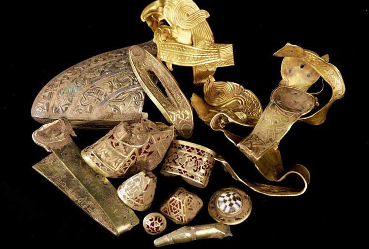
Interaction-Design.org is doing an amazing job of developing a textbook for Human-Computer Interaction (HCI) Design. This newest chapter, Visual Aesthetics in human-computer interaction and interaction design by Noam Tractinsky works to tease out the aspects of design that make products appealing, memorable, culturally-appropriate, emotionally satisfying, and beautiful. Beauty & Aesthetics Evolve in Time It’s good to remember that what we find beautiful and appealing changes and evolves in time as well as across cultures. Here’s a wonderful demonstration: 500 Years of Female Portraits in Western Art. What Makes Design Beautiful? In the Interaction-Design.org chapter, Tractinsky starts with Vitruvius’ design principles. Vitruvius lived in the 1st century BC and develop a set of standard criteria by which to evaluate architecture: Firmitas — durability or life-span of the building in relation to its purpose; Utilitas — usability of the building by its intended audience; and Venustas — the beauty of the building (this would be culturally-specific). 2,000 years on and we still talk about durability, usability, and aesthetics of products. Since this chapter discusses architecture, I would like to talk about weapons. Weapons pre-date architecture, but they still follow the same rules for design: durability and reusability, usability, and beauty. If you’ve…
Anchoring Errors, Background Knowledge, Background Knowledge Errors, Causal Net Problems, Cognitive Blindness, Cultural Bias, Mental Model Traps, Pipsqueak Articles
Information in the Age of ICT: the Guardian Newspaper 3 Little Pigs Ad
by Olga Werby •
The 2012 Guardian newspaper ad really captures the flow of information in the age of ICT (Information Communication Technologies). The ad retells the story of the 3 little pigs, their houses, and the big bad wolf. It shows how stories change with spin and through propagation through social media: twitter, Facebook, email, etc. Well done!
Background Knowledge, Background Knowledge Errors, Conceptual Design, Cultural Bias, Cultural Differences, Ethnographic & User Data, Pipsqueak Articles, Product Design Strategy, Users
US Rio+2.0 Breakout Session on Environmental & Conservation Education
by Olga Werby •
Below are the notes from the US Rio+2.0 conference hosted at Stanford last week. The notes are from the Education: Environment and Conservation breakout session. US Rio+2.0 Breakout Session Education: Environment and Conservation Attendees: Prof. Anthony D. Barnosky: Professor and Curator, Department of Integrative Biology at University of California Berkeley Wali Modaqiq: Deputy Director General (DDG), National Environmental Protection Agency (NEPA) of Islamic Republic of Afghanistan Dr. Khalid Naseemi: Chief of Staff & Spokes Person for National Environmental Protection Agency (NEPA) of Islamic Republic of Afghanistan Julie Noblitt: The Green Ninja — Climate-action Superhero Prof. Robert Siegel, M.D., Ph.D.: Associate Professor, Microbiology & Immunology Human Biology/African Studies at Stanford School of Humanities and Sciences Dr. Beth Stevens: Senior Vice President, Corporate Citizenship Environment and Conservation at Disney Worldwide Services, Inc. Madam Anyaa Vohiri, M.A., J.D.: Executive Director, Environmental Protection Agency of Liberia Olga Werby, Ed.D.: President, Pipsqueak Productions, LLC. Mostapha Zaher: Director General (DG), National Environmental Protection Agency (NEPA) of Islamic Republic of Afghanistan Our breakout group was partly the result of the conversation started the day before in the Environment session. Some of the members of our breakout group were present in that session as well. The main discussion…
Background Knowledge, Background Knowledge Errors, Conceptual Design, Cultural Bias, Cultural Differences, Ethnographic & User Data, Interface Design
How Do We Think of Brands
by Olga Werby •
I found this video by Adam Ladd — he made a video of an interview with his 5 year old daughter talking about brands. He showed her some very famous logos, and she told him what she thought they were. Naturally, this is a girl from a middle class background, from America. The answers would be very different from a 5 year old brought up in Russia or Papua New Guinea. Notice how she is able to quickly identify a Nike logo. And Disney’s D. And what’s really amazing is that she knows what a logo is in the first place! This little kid has developed a brand p-prim! And she has a well-developed comprehension of visual symbols. I wonder how the same interview would play out in a different culture…
Conceptual Design, Cultural Bias, Pipsqueak Articles, Product Design Strategy, Users
The Trouble with Social Search
by Olga Werby •

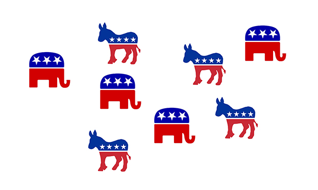
There have been changes in Google search and Google analytics. There have been many discussions on this topics. But there’s one big problem that I see with adding the social dimension to search: community bias or, as we’ve been referring to it in class, cultural bias. Cultural bias is one of the sources of human errors that render problem-solving more difficult. The problem comes from having one’s views on highly charged emotional topics (or social issues) continuously reinforced by the community. I’m writing this blog on Martin Luther King Day — particularly appropriate when discussing cultural bias and the difficulties of overcoming them. In the past, when we googled something, we got results based on the relevance to our query. This relevance had little to do with us personally and focused on the topic of interest. Google results to a politically polarized question looked the same whether one was a Democrat or a Republican: It didn’t matter that Democrats tended to socialize with like-minded individuals — meaning other Democrats. And Republicans preferred other Republicans, creating segregated social circles. In each such circle, people met, talked, and reinforced each other’s beliefs. BUT the Google results were the SAME for each group,…
Anchoring Errors, Cognitive Blindness, Cultural Bias, Cultural Differences, Diagnostic Errors, Ethnographic & User Data, Mental Model Traps, Pipsqueak Articles
Cultural Differences through Time
by Olga Werby •

There’s been a shift in our culture (at least in US) towards seeing medication as a sign of weakness from one of alleviation of suffering that predominated out society some 100 years ago. Some people I know are even proud of the fact that they’ve never taken a painkiller or were treated for cough. Stoicism became a virtue all in itself — “I’m a good person because I don’t take medicine, preferring to suffer the illness and/or the symptoms of the disease.” And it’s not just the patients that feel this way. Medical professionals routinely prescribe to the “complain 3 times” rule: their patients have to mention being in pain on multiple visits prior to getting a prescription that would deal with it. A friend told a story of a doctor visit during which he was told that “he didn’t want to appear to be complainer.” Several weeks later, he was having back surgery and remains in a wheelchair to this day, a decade later! How did we get here? This is a very complicated question, but it might help to examine how things use to be. Below are medications as they were packaged and sold all over America in the…
