Conceptual Design

What does the product do?

Task Analysis and Product Design

Kids from India and Vegetable Choices

Imagine your were given an assignment to develop a product that could help people eat healthy. How would you go about creating such a thing? What would you need to learn/understand? What is the right medium or technology vehicle for such a product? How would you even start? Below is a very brief outline of how to get started and the key tools necessary for the job. Project Goals The first order of business is figuring out the business needs and goals: What is the product really supposed to do? You have to ask this even if you are the one who is the client on this project. But, most probably, you are working for someone else — the client — and you have to start by understanding what your client really wants to do. You can do that in several ways: Analyzing the Request for Proposals: On many such projects, there will be an initial document, something like an RFP, that outlines the business goals and desires of the client. While some RFPs are very detailed and fully fleshed out, most are not. There are many reasons for this. Some clients are worried someone will “steal” their ideas and…

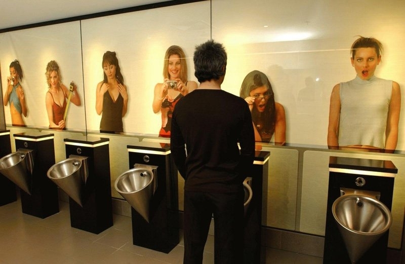
Going Potty…or iPotty!

Edge Designs Men's Restroom Mural

An iPotty App for kids learning to use a toilet: And here’s a bit for an older audience: Would it have worked if the sexes were reveres — images of staring men on the walls of women’s room? I don’t think so… And here’s a link to a previous post on this subject: Toilet Games

25 Awesome Quotes, 11 Ways, 10 Hateful Things, 8 Steps, 7 Reflections, 5 Hard Facts, 3 Reasons Why, 2 Questions, and 1 Mistake

5 second test

The latest in the professional social media writing is the creation of lists. Sing it with me: 25 Awesome Quotes 11 Secrets & 11 Ways 10 Hateful Things 8 Steps 7 Reflections 5 Seconds Test & 5 Hard Facts & 5 Ways 3 Audiences & 3 Big Trends & 3 Reasons 2 Questions 1 Career Mistake and a Partridge in a pear treeeeee…. What’s going on? Well, the new p-prim in town seems to be: “LinkedIn users like things in neatly organized lists.” And perhaps it is true — LinkedIn might see blogs written in this format as a good marketing trick, getting lots of hits. The more LinkedIn selects such format to feature, the more articles are written in this format — it is a self-replicating problem. In my classes, we talk of surface reading — how in today’s fast-moving culture, people peck and sample content in small bits and pieces: “Just give me the talking points, please.” And we see the results in the news, in PowerPoint presentations, and on LinkedIn’s Influencer Posts. Let’s just hope that some people still take the time to wade through details and read for deeper meaning.

Google Apps New Pay Policy and Behavioral Economics

Google Apps Icons

Yesterday, Google flipped a switched on its Google Apps policy — starting with December 7th, 2012, Google Apps will no longer be free! The change is for Google Apps for Business and it effectively ends the ability to create free accounts for groups of 10 or fewer users (here’s Google’s announcement). Individuals could still have a personal account, but businesses will have to pay $50 per user, per year… That is NEW business customers will have to pay — if you had a business account prior to the announcement, you get to keep it on the same terms you’ve signed up for — free! But all new Google Apps business customers from this point forward will pay to play. There’s a lot of chatter about whether Google’s customers will pay or walk away, but I’m interested in the behavioral economics analysis of this change. Allow me describe a few experiments on anchoring — the psychological phenomena where individuals get attached to the first result they witness and base their subsequent decisions on that original priming. The experiments I’m going to describe come from two books: Dan Ariely’s “Predictably Irrational, Revised and Expanded Edition: The Hidden Forces That Shape Our Decisions”…

Same Desire, Cultural Shift in Solution

Give cigarettes for christmas

Over time, some desires have stayed constant: an aversion to pain, a wish for health, a longing to be loved, and a craving for wealth, power, and youth. But desires are susceptible to cultural shifts, and so they shift with the whim of fashion: the need to be thin, the hope to fit the norms of current beauty, the yearning for popularity, an aspiration for fame. Each generation comes up with solutions for their desired that are based in the cultural soup that nourished them. What is a cultural soup? Well, it’s a heady mixture of the following: anxiety — each generation has their own issues that they loose sleep over. In addition to the ones that their parents experienced, each generation can choose and pick and invent their own worries. affordances — affordances are available actions that are mired in context and situation. As context changes, affordances evolve. Each generation sees a unique subset of problem solutions. emotional design — each generation is stirred by issues and fashion that are uniquely their own. Emotional design is by definition tied to a particular group of people, be they joined in time, cause, or geography. Social value, user satisfaction, and emotional…

In Search of Design Excellence

Rutter, G. B. (2010). “In Search of Design Excellence.” http://www.appliancedesign.com. Visited on October 15th, 2012: http://www.appliancedesign.com/Articles/Feature_Article/BNP_GUID_9-5-2006_A_10000000000000931808 Design excellence can be defined as a combination of design excellence, or the fidelity of decisions decisions and the innovations. Often, people conflate innovation and  the execution of design. Even if a design is new and a breakthrough, the execution of the design can make or break the how excellent a design truly is. One area to consider for design execution is human centered design. Examples given include the design of a music application. While it might be possible to dpwnload music in a new manner, it does not mean ease of use has been considered. Similary, when considering design decisions for making a new chair, often times, ergonomics and engineering check boxes may be used to create new experiences. However, if human centered design tenants are not considered, the design may still ultimately fail. Ie, s the music app easy to use? Fun to use? Is the chair comfortable? Does it fit in the users environment? For new innovations if human centered designed is a component of the design a better product may emerge, and this is one sign of excellent design. p-prim…

Article: Sometimes more choices leave people worse off

Research published in Biology Letters shows that people confronted with too many choices have difficulty making a good decision. The study analyses over 3,700 human dating descisons across 84 speed-dating events. The study found that when the numnber of variable attributes increases (ie heigh, occupation, education background), people made fewer dating proposals. The effect was even stronger as the number of potential partners increased. Another study shows that when participants in a dating study are given more potential partners, their emotional satisfaction is not higher than when presented with fewer options. Other studies have shows that more options cripple a people to not make any decision at all. Consumer studies show that when given limited options, consumers make a purchasing decison, and are happier with the limited set of options. When given large numbers of options, humans and other animals tend to rely on heuristics that help guide decision making. These rules of thumb help to reduce and simplify the decision making proceess by ignoring some information. We tend to default to quick, easy, and recognizable options. We can decide the appeal of a face in 13 milliseconds. So with fewer options, people make quicker decisions. With more options, people…