The best product designs not only work well, they make us smile. They solve problems we as consumers haven’t even consider yet or realized we had. Take a look at a selection of product designs below. The springy bed frame is not only functional, but a conversation starter — don’t you want to try it out? The “selfy stick” helps us take better photos of ourselves. Our arm reach is no longer a limitation or a liability — I like my portraits taken from the top to reduce that double chin! It’s fun to be elegant… until it all crushes down around us. Finger tip tray is the solution! Finger food will stay safely on top of the tray with this cool design. And again, it’s a conversation starter — a perfect tool at a party. While I’m not sure I would advertise my waist size with this imaginative belt, it could serve as a powerful reminder to keep to a diet. Serving tea to your aunt? Wouldn’t this put a smile on her face? In one of my design classes, a student proposed a bed light that would adjust to awaken the sleeper gently. This one does it with…
Conceptual Design
What does the product do?
Anchoring Errors, Background Knowledge, Background Knowledge Errors, Causal Net Problems, Cognitive Blindness, Conceptual Design, Cultural Bias, Cultural Differences, Diagnostic Errors, Errors, Interaction Design, Mental Model Traps, Metaphor Mistakes, Mirroring Errors, Misapplication of Problem Solving Strategies, Perceptual Blindness, Perceptual Focus Errors, Pipsqueak Articles, Reference, Scaffolding
Review eBook: Affordances and Design
by Olga Werby •
Victor Kaptelinin, a Professor at the Department of Information Science and Media Studies, University of Bergen, Norway, and the Department of Informatics, Umeaa University, Sweden, just published an eBook with Interaction Design Foundation: “Affordances and Design.” I was asked to write a review of this book and provide some insights into using affordances in interaction design and HCI. Let me start by providing the definition of affordance as given by Donald Norman: In his eBook, Victor Kaptelinin provides the history of the idea of affordance from its initial introduction by James Gibson in 1977 to the present day. The eBook’s bibliography and reference section is a great place to start the exploration of this topic for anyone new to these ideas. Unfortunately, the book doesn’t help much if an individual is looking for some guidance on how to apply these ideas in practical situations during interaction design or HCI design. For clarity’s sake, allow me to give a very brief explanation of affordances, from their roots to the present time. When James Gibson first introduced the concept of affordances, he focused on physical environment — what actions are possible? And the set of these action were invariable — just because…
Conceptual Design, Product Design Strategy
Perception of Value is Situational
by Olga Werby •
When you make pancakes, do you want them perfect? Perfect in taste? Perfect in texture? Perfect in shape? Who wouldn’t, right? When I cook, I want my creations to be pleasing to my audience (usually my family). Even on cooking shows, there’s a segment which helps home cooks make their creations look more professional — i.e. more perfect. As I was looking to buy a crepe-maker (non-electric), I read a bunch of reviews for all kinds of gadgets that promised a perfect crepe. One of the important criteria was the perfection of shape — a good crepe is circular, implying that a badly made crepe has irregular borders. There were all kids of clever inventions that helped the home cook achieve this circular perfection — molds, rakes, squeeze bottles, etc. At the end of my research, I got it — my crepes better be circular! But in others circumstances, this perfection of shape has a complete opposite perception of value. If you are buying frozen, pre-made crepes, then perfectly circular shapes signals “factory-made” or “made by robots” or “cookie-cutter crepes”. All of these are now derogatory things — who would want to eat crepes made by a machine? Untouched by…
Cognitive Blindness, Conceptual Design, Cultural Differences, Mirroring Errors, Product Design Strategy
Matters of Trust
by Olga Werby •
In the last few months I’ve started several new relationships. One was with BlueShiled of California — a relationship that was forced on me by the changing health insurance laws. The other came about from trying to find a place to stay in United Kingdom for our family vacation. I didn’t actively want these relationships, but here I am. And I am not very happy. The basic problem comes from the flow of trust. I’ve never heard of anyone else talk about the directionally of trust, but it is a very important concept to understand for any customer service oriented company. I will illustrate the idea using my new relationships. BlueShield Customer Service Failure! Let me start by saying that I wasn’t overly fond of my previous insurance company. In fact, that relationship was very much like this new one with BlueShield — antagonistic. My story begins in October of 2013, when I created a spreadsheet of all my family doctors versus possible new health insurance companies. I wanted to make sure that which ever insurance I picked, my family doctors would take it. I spent the afternoon making phones calls and ended up with BlueShield of California as my…
Anchoring Errors, Conceptual Design, Interaction Design, Interface Design, Mental Model Traps, Product Design Strategy
When Design and Interface are Dictated by the Technology
by Olga Werby •
You’ve probably heard: If you have a hammer, everything looks like a nail. This is a commentary on how our problem solving perspective is influenced by the tools we happen to have in our hands at that moment. The tools, of course, don’t have to be physical. They can be systems, or lists, or a set of approaches that we’ve learned at school or that are enforced at work. And they can also be digital tools that we feel particularly comfortable using. These “tools” constrict our metal models, limiting the possible solutions to the design problems we face at work (or at home). It’s not a surprise that if we Google “WordPress Templates,” all the results look more or less the same. This is partly because of the tool — WordPress is a great tool, but as any tool, it limits the final creative output to what is easy. (Especially, if the designer is not a programmer.) Here’s a look at Google Image results for “WordPress Screenshots”: What’s interesting is the flip side of this phenomenon. Once we see a lot of nails, we expect nails as the solution. So it is not a surprise that not only do most…
Conceptual Design, Cultural Differences, Interaction Design, Interface Design, Product Design Strategy, Reference, Scaffolding
Design for Social Good
by Olga Werby •
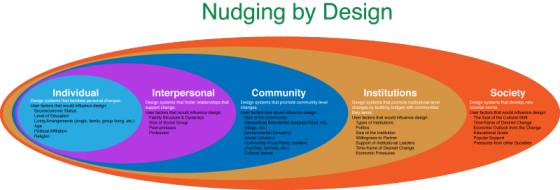
Social engineering is way of designing products and situations which actively encourage people to behave in a desired way — Nudging for Good. EDF Challenge “Sharing energy in the city, 2030” seems an ideal circumstance for social engineering for the greater social good. The basic question is how do we as designers find ways to incentivize individuals to save energy? How do we make a bit of personal sacrifice an attractive option for most? How do we “nudge” people to behave in a socially responsible ways when it comes to energy use? First, it makes sense to break up the problem into several user categories: personal energy sharing, family sharing, neighborhood or community sharing, city or village sharing. At each level we expand the circle to involve more and more individuals, and so we need a different approach for each category. Each category has a set of pressure points on which social engineers can apply pressure to achieve the desired changes. Once we identify the user groups targeted for “nudging”, game theory can be used to find the most attractive options. While there are numerous strategies that can be borrowed from game theory to incentivize the desired energy sharing behavior,…