Zimmer, C., (2010). “Sizing Up Consciousness by Its Bits.” NYTimes.com. Visited on October 3, 2010: http://www.nytimes.com/2010/09/21/science/21consciousness.html Carl Zimmer’s article “Sizing Up Consciousness by Its Bits” for The New York Times seeks to introduce and explore a relatively new area of research into human consciousness. In interviews with the medical researcher Dr. Giulio Tononi, the article discusses current and past conceptions of consciousness and its’ implications for our interactions with each other and with our environment. Given the importance of consciousness in everyday human life, one would reasonably assume that at this time science would have a detailed understanding of consciousness and how it functions. This is not the case, however. Despite centuries of philosophical debate, medical research, and technological development, humans are largely in the dark, so to speak, about what creates and maintains the spark of consciousness. In the context of our currently vague understanding, Dr. Tononi’s research proposes a novel way of conceptualizing consciousness. Dr. Tononi’s goal is to apply the theories of informational networks to the human brain, in a method he terms “Integrated Information Theory.” This theory, hereafter referred to as IIT, seeks to understand the human brain as an integrated network of nodes (neurons in…
Background Knowledge Errors
Background Knowledge, Background Knowledge Errors, Contributor, Errors, Interaction Design, Interface Design, Mental Model Traps, Product Design Strategy, Scaffolding, Users
More is always better – Or so most think!
by Mallika •

Tugend, A., (2010). “For the Dishwasher’s Sake, Go Easy on the Detergent.” NY Times Online. Visited on November 04, 2010: http://www.nytimes.com/2010/03/13/your-money/13shortcuts.html If dishwashers do not seem to be doing their job or if your clothes are not coming out as soft as you’d like them to, or if these machines break down easily, it is most likely due to “user error.” We throw in multiple fabric softener sheets because more is better. More isn’t better in this case! The excess sheets liquefy when the dryer gets hot and gum up the dryer. Most people use ten to fifteen times the amount of soap they need. This excess soap is detrimental to the life of the machines. This article has some clear implications for interaction and interface design. User errors are likely to happen. Even if you have a manual with detailed instructions, the chances of somebody reading that manual are very slim. Even if they read it, they are still likely to err. How can design inculcate the right usage in the user? In this case, what can design do to prevent errors resulting from the ‘More is better’ p-prim? Possible Interaction Design Solutions: Solutions could be…
Cognitive Blindness, Conceptual Design, Cultural Bias, Ethnographic & User Data, Featured, Flow, Interaction Design, Interface Design, Mental Model Traps, Mirroring Errors, Pipsqueak Articles, Product Design Strategy, Scaffolding, Users
Thinking About the Future of Reading
by Olga Werby •

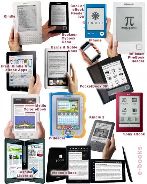
The Taxonomy of Usefulness We are a family with two Kindles, three iPads, two iPods, and an iPhone. We also have a few thousand old-fashioned paper books stored on bookshelves in every nook and cranny of our home: bedrooms, bathrooms, kitchen, stairs, garage, closets, family room, and any other space and surface that might hold a book or two or ten. We are into reading! And we use our Kindles, iPads/Pods/Phone, and computers to read as well. And while statistically speaking, we make just four data points for four family members, I feel we have something interesting to say about using technology to read. To help me understand my own relationship with reading and technology, I’ve come up with a little Taxonomy of Usefulness. If you’ve been reading this blog (or my books and papers), you’d have noticed that I like to slice up the world into groups sorted by a set of variables that I find useful at the time. Forming categories helps me think—the Cognitive Wheel is a prime example. Taxonomy of Usefulness These variables help derive the value of the electronic reading devices. Ergonomics There are many attributes to consider when describing the ergonomics of a device,…
Contributor, Cultural Bias, Cultural Differences, Ethnographic & User Data, Language, Metaphor Mistakes, Product Design Strategy
Language and thought in user-centered design
by mabelev •
Deutscher, G. (2010). “Does language shape the way you think?” New York Times Online Edition. Retrieved on October 4, 2010. http://www.nytimes.com/2010/08/29/magazine/29language-t.html This article summarizes the history and the current status of the linguistic relativity hypothesis or the idea that “language shapes thought.” This idea comes in several different formulations. The version on which Deutscher’s review focuses is a cross-linguistic claim that speakers of different languages use different mental representations or processes as a result of having learned different languages as children. A particularly strong version of the cross-linguistic hypothesis suggests that our native language provides us with a basic toolbox of conceptual representation, so if a concept or a mode of thought is not encoded in a given language, its monolingual speakers would be incapable of thinking about such a concept or thinking in such a mode. For instance, linguistic relativity led to the prediction that people’s perception of differences in color should reflect the way their language encodes color. This prediction was spectacularly disproven by the discovery that people whose language only has two color terms in its vocabulary perceive and categorize colors similarly to speakers of English, which has 11 basic color terms, plus many non-basic ones (Berlin…
Cognitive Blindness, Conceptual Design, Contributor, Interaction Design, Interface Design, Mental Model Traps, Perception
Re “Wine Study Shows Price Influences Perception”
by Van Nga •
Svitil, K., (2008). “Wine Study Shows Price Influences Perception.” California Institute of Technology. Visited on October 4, 2010: http://media.caltech.edu/press_releases/13091 This article is a research study about how the region of the brain called the medial orbitofrontal cortex showed higher activity when participants drank wines at a higher price. A wine tasting study was conducted at the California Institute of Technology and Stanford University. Twenty volunteers tasted five wine samples at different retail prices: $5, $10, $35, $45 and $90 per bottle. The volunteers tasted and evaluated which wines that they found more pleasurable. Two out of five of the wines were the same but one was priced at $10 and one at $90. In the experiment the subjects rated and preferred the $90 priced wine more than the $10, although they did not know that they tasted the same wine. Cognitive Design What does the product do? In this study the cognitive design was a wine tasting experiment. The concept of the research was to experiment on the perception of price on different wines. The setting was controlled in that the subjects did not know that they tasted the same wine but told that the price was different. While tasting…
Anchoring Errors, Background Knowledge, Background Knowledge Errors, Causal Net Problems, Diagnostic Errors, Featured, Mental Model Traps, Metaphor Mistakes, Misapplication of Problem Solving Strategies, Pipsqueak Articles, Product Design Strategy, Scaffolding
What is a p-prim?
by Olga Werby •

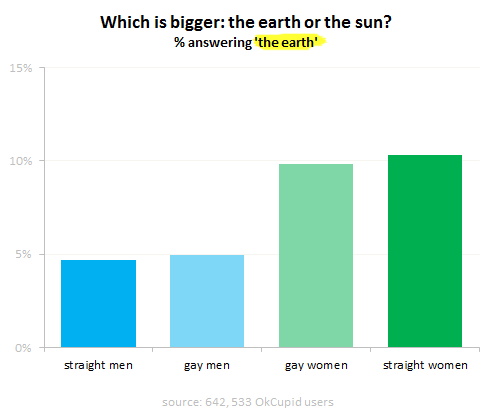
I’ve been using the p-prim ever since I’ve learned of them, back in my graduate school days at UC Berkeley. P-prims stand for phenomenological primitives and were “invented” by Andrea diSeesa, a UC Berkeley professor in the School of Education who also happens to be a physicist (diSessa, 1983). Visit his Wikipedia page and check out some of the cool projects he’s working at now. Before I give a definition of a p-prim, I think it would be good to give a few examples. Here’s a graph published by OkTrends on beliefs of various groups (in this case as defined by their sexual orientation) about the relative size of our sun versus the Earth (our planet). Even disregarding the differences in percentages due to sexual preference, an awesome 5 % to 10 % of our population believes that the planet we live on is larger than the star it orbits. Would this qualify as a p-prim? Yes: it’s not a formally learned concept; it describes a phenomenon; it’s a bit of knowledge based on personal observations: the sun looks like a small round disk in the sky; it’s a useful problem-solving tool when one has to draw a picture with…
Autopilot Errors, Background Knowledge Errors, Conceptual Design, Diagnostic Errors, Errors, Interaction Design, Interface Design, Interruptus Errors, Misapplication of Problem Solving Strategies, Mode Errors, Perceptual Blindness, Perceptual Focus Errors, Pipsqueak Articles, Product Design Strategy, Scaffolding, Users, Working Memory
The History of Usability
by Olga Werby •

When did we start being concerned with usability? Some will say that such concern is part of being human: cavemen worked their stone tools to get them just right. Interaction design mattered even then. But the field of usability research really came into being when the tools we used started to run up against our cognitive and physical limitations. And to avoid hitting literal, as well as psychological, walls, it was the aviation engineers who started to think about usability seriously. While cars were becoming ever more sophisticated and trains ever faster, it was the airplanes that were the cause of most usability problems around WWI. Cars were big, but didn’t go very fast or had a lot of roads to travel on at the turn of the century. In the first decade of the 20th century, there were only 8,000 cars total in the U.S. traveling on 10 miles of paved roads. In 1900, there were only 96 deaths caused by the automobile accidents. Planes were more problematic. For one thing, the missing roads weren’t a problem. And a plane falling out of the sky in an urban area caused far more damage than a car ever could. Planes…
