Interaction-Design.org is doing an amazing job of developing a textbook for Human-Computer Interaction (HCI) Design. This newest chapter, Visual Aesthetics in human-computer interaction and interaction design by Noam Tractinsky works to tease out the aspects of design that make products appealing, memorable, culturally-appropriate, emotionally satisfying, and beautiful. Beauty & Aesthetics Evolve in Time It’s good to remember that what we find beautiful and appealing changes and evolves in time as well as across cultures. Here’s a wonderful demonstration: 500 Years of Female Portraits in Western Art. What Makes Design Beautiful? In the Interaction-Design.org chapter, Tractinsky starts with Vitruvius’ design principles. Vitruvius lived in the 1st century BC and develop a set of standard criteria by which to evaluate architecture: Firmitas — durability or life-span of the building in relation to its purpose; Utilitas — usability of the building by its intended audience; and Venustas — the beauty of the building (this would be culturally-specific). 2,000 years on and we still talk about durability, usability, and aesthetics of products. Since this chapter discusses architecture, I would like to talk about weapons. Weapons pre-date architecture, but they still follow the same rules for design: durability and reusability, usability, and beauty. If you’ve…
Tag Archive for user satisfaction
Conceptual Design, Cultural Bias, Pipsqueak Articles, Product Design Strategy, Users
The Trouble with Social Search
by Olga Werby •
There have been changes in Google search and Google analytics. There have been many discussions on this topics. But there’s one big problem that I see with adding the social dimension to search: community bias or, as we’ve been referring to it in class, cultural bias. Cultural bias is one of the sources of human errors that render problem-solving more difficult. The problem comes from having one’s views on highly charged emotional topics (or social issues) continuously reinforced by the community. I’m writing this blog on Martin Luther King Day — particularly appropriate when discussing cultural bias and the difficulties of overcoming them. In the past, when we googled something, we got results based on the relevance to our query. This relevance had little to do with us personally and focused on the topic of interest. Google results to a politically polarized question looked the same whether one was a Democrat or a Republican: It didn’t matter that Democrats tended to socialize with like-minded individuals — meaning other Democrats. And Republicans preferred other Republicans, creating segregated social circles. In each such circle, people met, talked, and reinforced each other’s beliefs. BUT the Google results were the SAME for each group,…
Conceptual Design, Cultural Differences, Interaction Design, Interface Design, Pipsqueak Articles, Product Design Strategy, Scaffolding, Working Memory
Special Preview: Affective Computing
by Olga Werby •
Some 25 years ago, I came up with tiny application: each day, a person picks a color that represents his or her predominant emotional state; the collection of color moods are mapped onto a calendar and displayed as an animated film, summarizing the emotional life of person. It was simple and easy and very effective. And in some way, this was also part of the affective computing — computers that use emotion as part of HCI. [Note: This could and was done with watercolors as flip book some 40 years ago when I played in my art class in school.] Affective Computing, I feel, is only recently became part of the “vocabulary” of computer-based developers. When I first started working in this field, graphics were non-existent, thus Pong. In the early nineties, my business partner and I met with the president of Organic, a web design firm in San Francisco, who promptly informed us that his business had no need for Interaction or Interface Designers, that’s what graphic artists were for. Now, psychologists, sociologists, and sociologists are routinely hired by creative firms to help solve design problems. Times change! There are a lot of posts on emotional design on this…
Conceptual Design, Cultural Differences, Interaction Design, Interface Design, Pipsqueak Articles, Product Design Strategy, Scaffolding
Designing for the Blind
by Olga Werby •
Not much to add here — how many other cool video games are there for visually disabled? Using tactile clues instead of visual signals is a nice interaction design solution. Well done!
Cognitive Blindness, Pipsqueak Articles, Product Design Strategy, Scaffolding
Using Positive Emotion to Change Behavior
by Olga Werby •
Games can be used to change our behavior — make something fun, and we are likely to do it again and again. Psychologists call is positive reinforcement. Pleasure triggers our amygdalas — makes us make strong neural connections between the activity and positive emotion. Thrills are memorable and we seeks them out in our daily lives. Here are two examples of using fun to change people’s behavior, to make us do something we ordinarily don’t particularly want to: climb stairs and recycle. November 17th Update A fellow member of the Human Factors and Ergonomics Society (HFES), David Watts, recommended the following:
Conceptual Design, Cultural Bias, Interaction Design, Interface Design, Mental Model Traps, Pipsqueak Articles, Product Design Strategy
Design for Emotion, for Empowerment
by Olga Werby •
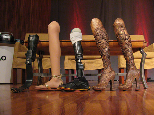
I use a cane to get around, a consequence of an unfortunate encounter with a taxi many years ago. I have many different canes (each heel size, for example, requires its own cane). All are cool. Some have animal carvings, some have silver, some have gold, some are complex in design, some are very Deco in style, and one has a sword (another a compass and a secret compartment). I get stopped on the street all the time — people love my canes and always comment. I was even told once that my limp is sexy — whatever… What I don’t have is an “old woman” cane — the kind you buy at a pharmacy. I’m just not that old, and plan never to be that old. I want funky, I want things that match my outfits and my moods. And I want them functional: the right hight, the right feel of the cane handle, the stability of the tip, the light weight, the structural security. I want it all and I want it sexy. Cane is a product — a very personal one. But most are stuck with poorly designed, boring, ugly, you-make-me-feel-like-an-invalid cane. Why? Aimee Mullins is a…
Cognitive Blindness, Mental Model Traps, Pipsqueak Articles
Intel i5 Core Commercial: When a company just doesn’t get it
by Olga Werby •
Sometimes, a company just doesn’t get it: it’s not about what a product can theoretically do, but what it can do for the user. Intel has a history of making a particular type of commercials — “the power inside” commercials, I call them. Intel marketing people use the following mental model: people/men like muscle cars; people like powerful things; thus if we emphasize the power “on the inside” people would like our computers. And so their current commercials for Intel i5 Core look like this: So what’s wrong with this? It’s all about them, it’s not about me. I don’t care what’s inside the machine, I care what it can do for me. Or, more accurately, what I can do with it. It’s about my performance. Imagine going to a car lot and the car salesmen tells you: “It got huge pistons. I mean HUGE. You’ve got to see those pistons!” Perhaps some car buyers would get inspired by such language, but I bet most would find it puzzling. Why should I care? Does it drive well? What’s the performance like? Maneuverability? Intel’s commercials about its chips are just like a car manufacturer’s fetish remarks about pistons. Sure some would…