I’m sitting by a window looking out at a rainy Paris street, thinking of cultural differences between Paris and San Francisco, taking advantage of bad weather to do some writing. Over two decades ago, I did some ethnographic research a Exploratorium, looking at how different visitors interacted with the museum’s hands-on exhibits. I was looking for ways to improve the visitors’ experience, raise understanding of the phenomena they were observing. What I saw was different ways in which visitors experienced failure: p-prims that got in a way; folksy wisdom that caused confusion; lack of affordances that led to bottlenecks; permission giving that set up strange expectations; etc. The results of this study turned into a Master Thesis for UC Berkeley. Now, I would like to explore some of the ideas that surfaced during my Exploratorium research and apply them to design of nudging — carefully crafted affordances and perceptual cues that manipulated users into acting a certain way while maintaining the illusion of freedom of action. Let me start with a bit of history — a quick summary of some of the results of Exploratorium study. Permission Giving Two decades ago, “hands-on” exhibits were still novel in the museum world.…
Tag Archive for user attitude
Background Knowledge, Cultural Bias, Cultural Differences, Mental Model Traps, Pipsqueak Articles, Product Design Strategy, Users
Foie Gras on Child’s Menu and Other Cultural Differences
by Olga Werby •
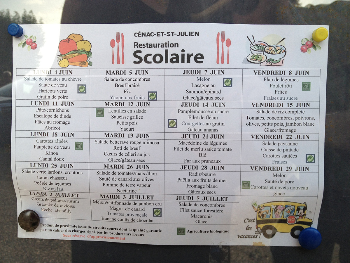
We are staying in a tiny village of Cenac, in a beautiful Dordogne Valley in France — the valley of foie gras (duck liver). The other day, when we went out for dinner in a local restaurant, we saw a great little item on the Child’s Menu: foie gras! Imagine a duck liver pate on a child’s menu anywhere in US? Here, it’s a common item — if not duck liver, than some other pate is often on the menu for kids. Check out the photo we took of the elementary school menu, posted on the door of the school: Notice the rabbit, duck, olives, salad and vegetables, and, of course, the pate on the menu! I think the families and children in this small village would be shocked by the menu offerings at our schools in San Francisco! This is a cultural difference! Cultural differences affect how we think about problem solving — how we approach the problem and how we go about looking for solutions. Consider a few images below. They are from India and show a cultural difference in imaginative solutions to every day problems: The motorcycle bus and the home-made flotation device show creativity within a…
Conceptual Design, Interaction Design, Interface Design, Perception, Pipsqueak Articles, Product Design Strategy, Scaffolding, Users
Special Preview: Wearable Computing (Steve Mann)
by Olga Werby •
The next chapter in the Interaction-Design.org tome on human-computer interaction design is now up for an early review to my readers. This chapter takes on Wearable Computing and is written by Steve Mann. Mostly, this is a historical review of Prof. Mann’s experimentations with wearable computing devices, and for those unfamiliar with this subject area, this is an interesting introduction. On the left, you can see an early version of wearable computing: Steve Mann’s backpack based system from the late 1970’s and early 1980’s. But as always, I have a slightly different take on this topic… The Little Mac That Saved My Son’s Life Almost 18 years ago, I went into a preterm labor. At 24 and a half weeks into gestation, this was very scary. At the time, San Francisco Children’s Hospital was pioneering a program for high risk pregnancies (which mine just turned out to be). Two doctors, Dr. Kuts and Dr. Maine, figured out how to use an old Mac SE, a modem, a telephone, a subcutaneous pump, and a belt which measures contractions to allow women like me to stay at home as much as we could (as opposed to spending months in the hospital). Here’s…
Cultural Bias, Cultural Differences, Interface Design, Language, Mirroring Errors, Personality, Pipsqueak Articles
Flattery — the Social Lubricant
by Olga Werby •
Gentle Readers, As you have been undoubtably aware for some time, this blog aims for audience with well above average vocabulary and IQ. You and your fellow readers are a very select group with strong interest in science and product design. You are scientists, engineers, and intellectuals. You have an amazing sense of style and fashion. You are able to see patterns and spot details that escape most of those around you. How do I know? I can see the strong engagement with the material on this blog — it’s all there in black and white numbers provided helpfully by Google day in and out. Some of you might think this letter cynical. But all of you know that this content appeals directly your amygdala — you are as happy to be recognized for your brilliance as I’m for your continued readership of my writing. You all know you are special, and you want to be acknowledged as such by those around you. And not only are you all above average, you are also extraordinarily lucky. Some might call this the “optimism bias”, but you and I know that your chances of success are much higher than the average Joe…
Conceptual Design, Cultural Bias, Cultural Differences, Pipsqueak Articles, Product Design Strategy
Special Preview: Visual Aesthetics
by Olga Werby •
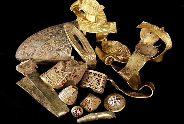
Interaction-Design.org is doing an amazing job of developing a textbook for Human-Computer Interaction (HCI) Design. This newest chapter, Visual Aesthetics in human-computer interaction and interaction design by Noam Tractinsky works to tease out the aspects of design that make products appealing, memorable, culturally-appropriate, emotionally satisfying, and beautiful. Beauty & Aesthetics Evolve in Time It’s good to remember that what we find beautiful and appealing changes and evolves in time as well as across cultures. Here’s a wonderful demonstration: 500 Years of Female Portraits in Western Art. What Makes Design Beautiful? In the Interaction-Design.org chapter, Tractinsky starts with Vitruvius’ design principles. Vitruvius lived in the 1st century BC and develop a set of standard criteria by which to evaluate architecture: Firmitas — durability or life-span of the building in relation to its purpose; Utilitas — usability of the building by its intended audience; and Venustas — the beauty of the building (this would be culturally-specific). 2,000 years on and we still talk about durability, usability, and aesthetics of products. Since this chapter discusses architecture, I would like to talk about weapons. Weapons pre-date architecture, but they still follow the same rules for design: durability and reusability, usability, and beauty. If you’ve…
Pipsqueak Articles, Product Design Strategy
Special Preview: Disruptive Innovation
by Olga Werby •
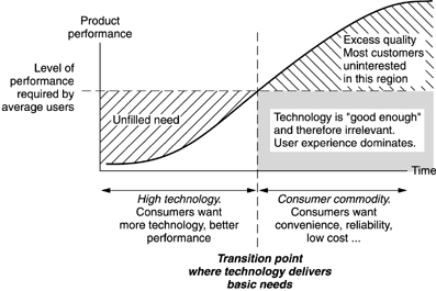
Interaction-Design.org The folks from Interaction-Design.org have just completed their newest chapter: “Disruptive Innovation” by Clayton M. Christensen. This chapter is an excerpt from Dr. Christensen’s 1997 book “The Innovator’s Dilemma: When New Technologies Cause Great Firms to Fail,” published by Harvard Business Press. His newer book, “The Innovator’s DNA: Mastering the Five Skills of Disruptive Innovators,” published in 2011 on Kindle, is a follow up to the ideas in the first book and those expressed in the Interaction-Design.org chapter. Disruptive Innovation The main idea of this chapter can be summed up by Donald A. Norman’s graph (see below). This is a graph of product performance over time — think of “product” is its most expansive form. When the product is first introduced into the market, it might not be “ready for prime time”, as we say — meaning that the product is: difficult to use, or too expensive, or replacing a well-established way of doing things, or has a high learning curve: even difficult to use products can have a shallow learning curve that allows small accomplishments right away by novice users, or requires a large ecosystem of other products and services that are not widely available: think electric cars…
Conceptual Design, Cultural Differences, Interaction Design, Interface Design, Pipsqueak Articles, Product Design Strategy, Scaffolding, Working Memory
Special Preview: Affective Computing
by Olga Werby •
Some 25 years ago, I came up with tiny application: each day, a person picks a color that represents his or her predominant emotional state; the collection of color moods are mapped onto a calendar and displayed as an animated film, summarizing the emotional life of person. It was simple and easy and very effective. And in some way, this was also part of the affective computing — computers that use emotion as part of HCI. [Note: This could and was done with watercolors as flip book some 40 years ago when I played in my art class in school.] Affective Computing, I feel, is only recently became part of the “vocabulary” of computer-based developers. When I first started working in this field, graphics were non-existent, thus Pong. In the early nineties, my business partner and I met with the president of Organic, a web design firm in San Francisco, who promptly informed us that his business had no need for Interaction or Interface Designers, that’s what graphic artists were for. Now, psychologists, sociologists, and sociologists are routinely hired by creative firms to help solve design problems. Times change! There are a lot of posts on emotional design on this…