Tag Archive for usability

More is always better – Or so most think!

Tugend, A., (2010). “For the Dishwasher’s Sake, Go Easy on the Detergent.” NY Times Online. Visited on November 04, 2010: http://www.nytimes.com/2010/03/13/your-money/13shortcuts.html   If dishwashers do not seem to be doing their job or if your clothes are not coming out as soft as you’d like them to, or if these machines break down easily, it is most likely due to “user error.” We throw in multiple fabric softener sheets because more is better. More isn’t better in this case! The excess sheets liquefy when the dryer gets hot and gum up the dryer. Most people use ten to fifteen times the amount of soap they need. This excess soap is detrimental to the life of the machines.   This article has some clear implications for interaction and interface design.  User errors are likely to happen. Even if you have a manual with detailed instructions, the chances of somebody reading that manual are very slim. Even if they read it, they are still likely to err. How can design inculcate the right usage in the user? In this case, what can design do to prevent errors resulting from the ‘More is better’ p-prim?    Possible Interaction Design Solutions: Solutions could be…

Thinking About the Future of Reading

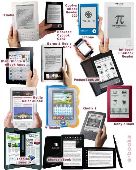
The Taxonomy of Usefulness We are a family with two Kindles, three iPads, two iPods, and an iPhone. We also have a few thousand old-fashioned paper books stored on bookshelves in every nook and cranny of our home: bedrooms, bathrooms, kitchen, stairs, garage, closets, family room, and any other space and surface that might hold a book or two or ten. We are into reading! And we use our Kindles, iPads/Pods/Phone, and computers to read as well. And while statistically speaking, we make just four data points for four family members, I feel we have something interesting to say about using technology to read. To help me understand my own relationship with reading and technology, I’ve come up with a little Taxonomy of Usefulness. If you’ve been reading this blog (or my books and papers), you’d have noticed that I like to slice up the world into groups sorted by a set of variables that I find useful at the time. Forming categories helps me think—the Cognitive Wheel is a prime example. Taxonomy of Usefulness These variables help derive the value of the electronic reading devices. Ergonomics There are many attributes to consider when describing the ergonomics of a device,…

Language and thought in user-centered design

Deutscher, G. (2010). “Does language shape the way you think?”  New York Times Online Edition. Retrieved on October 4, 2010. http://www.nytimes.com/2010/08/29/magazine/29language-t.html This article summarizes the history and the current status of the linguistic relativity hypothesis or the idea that “language shapes thought.” This idea comes in several different formulations. The version on which Deutscher’s review focuses is a cross-linguistic claim that speakers of different languages use different mental representations or processes as a result of having learned different languages as children. A particularly strong version of the cross-linguistic hypothesis suggests that our native language provides us with a basic toolbox of conceptual representation, so if a concept or a mode of thought is not encoded in a given language, its monolingual speakers would be incapable of thinking about such a concept or thinking in such a mode.  For instance, linguistic relativity led to the prediction that people’s perception of differences in color should reflect the way their language encodes color.  This prediction was spectacularly disproven by the discovery that people whose language only has two color terms in its vocabulary perceive and categorize colors similarly to speakers of English, which has 11 basic color terms, plus many non-basic ones (Berlin…

Emotional Design

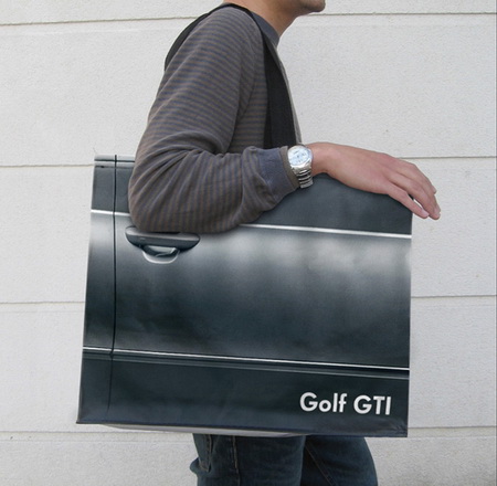
Product design is not just about usability. How we feel about a product makes a lot of difference. The research shows that two identical applications—with similar failure rate, but with a different take on dialogue box writing—result in very different perceptions of usability by its audience. The application with polite dialogue text always wins. Emotional design deals with how we feel about the product. Interfaces design is all about the look and feel and is responsible for a large portion of generated user emotions. Here are some examples of bag designs. If you want to encourage recycling, this is a great way of making these bags valuable—the users won’t throw them out after one use. Enjoy!

Accidentally Supergluing an Eye Shut

I hope the mere reading of the title made you queasy—it makes me shudder every time. On October 6th, CNN posted a story about a woman from Phoenix, Arizona, who accidentally put drops of super glue into her eye instead of the eye medication. She called 911, and in the emergency room the doctors had to cut open her eye and peel the hardened layer of super glue from her eye ball. If this doesn’t make you sick, then… One may ask: how stupid does one have to be to glue their eye shut? But, as with many other product-use errors, the woman made a very common mistake. The hospital wasn’t surprised—apparently these accidents happen all the time. Because of poor vision, she couldn’t distinguish between the bottles of her eye medicine and the package of super glue. Take a look at this: If you are relying purely on feel, the woman’s error no longer feels so outlandish. Here’s what she probably could see with her poor vision: And here is what we, the well-sighted, could see: So upon a close examination, the woman’s error is a natural mistake. (Yeah, I know, I know: Why would she keep the bottle…

Skin-deep Usability

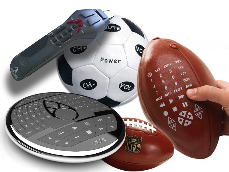
The Universal Remote Control Story A few years ago, we got a Star Trek phaser universal remote control as a gag gift for the holidays. As any universal remote control (URC), it was supposed to control any and all devices that were hooked up to our TV and do it with a flair of shooting a phaser at the general direction of our equipment. A few days later, it was relegated to our sons’ toy box, and now I wouldn’t even know where to look for the thing. Big buttons, footballs, phasers, UFOs, futuristic control centers—the makers of universal remote controls have tried them all. But consumers still buy one URC after another in the hope of finding something that would work for them. Why are these things so darn hard to use? Manufacturers seem to believe that by giving their products a friendly, toy-like appearances, these devices would seem more user-friendly and easier to use. But, personally, I don’t want a giant ball in middle of my kitchen table or rolling around my living room floor. I don’t want the kids to toss footballs to control the channels or fire phasers to lower the sound. I just want something…