We just returned from An Event Apart San Francisco and I am trying to put down notes and ideas while they are fresh in my mind. It was three full intense days of information — some great, some good, some not so much. But overall, it was a valuable experience (and they do conference right — great food, comfortable location, endless supply of coffee and sugar). My take is always unique — I overheard some people who were ecstatic over the presentations that I felt were completely off — but I have been in the business for over three decades now and I want ideas that are new to me. So here are my notes from the presentations. “The Fault, Dear Brutus (or: Career Advice From a Cranky Old Man)” by Jeffrey Zeldman A lot of what Jeffery spoke about resonated strongly: the need to force ourselves to get rid of disdain for our clients that just “don’t get it” — mutual respect is the foundation of designer-client relationship in conversation about design, focus on purpose and use and stay away from esthetics — every person has their own sometimes, people (clients, bosses) are incapable of seeing our growth as…
Tag Archive for usability
Conceptual Design, Interaction Design, Interface Design, Pipsqueak Articles, Product Design Strategy
Fun, Creativity, and Good Design
by Olga Werby •
The best product designs not only work well, they make us smile. They solve problems we as consumers haven’t even consider yet or realized we had. Take a look at a selection of product designs below. The springy bed frame is not only functional, but a conversation starter — don’t you want to try it out? The “selfy stick” helps us take better photos of ourselves. Our arm reach is no longer a limitation or a liability — I like my portraits taken from the top to reduce that double chin! It’s fun to be elegant… until it all crushes down around us. Finger tip tray is the solution! Finger food will stay safely on top of the tray with this cool design. And again, it’s a conversation starter — a perfect tool at a party. While I’m not sure I would advertise my waist size with this imaginative belt, it could serve as a powerful reminder to keep to a diet. Serving tea to your aunt? Wouldn’t this put a smile on her face? In one of my design classes, a student proposed a bed light that would adjust to awaken the sleeper gently. This one does it with…
Featured, Perception, Pipsqueak Articles, Product Design Strategy, Reference
Colorblindness Test on iPhone Google Traffic Map
by Olga Werby •
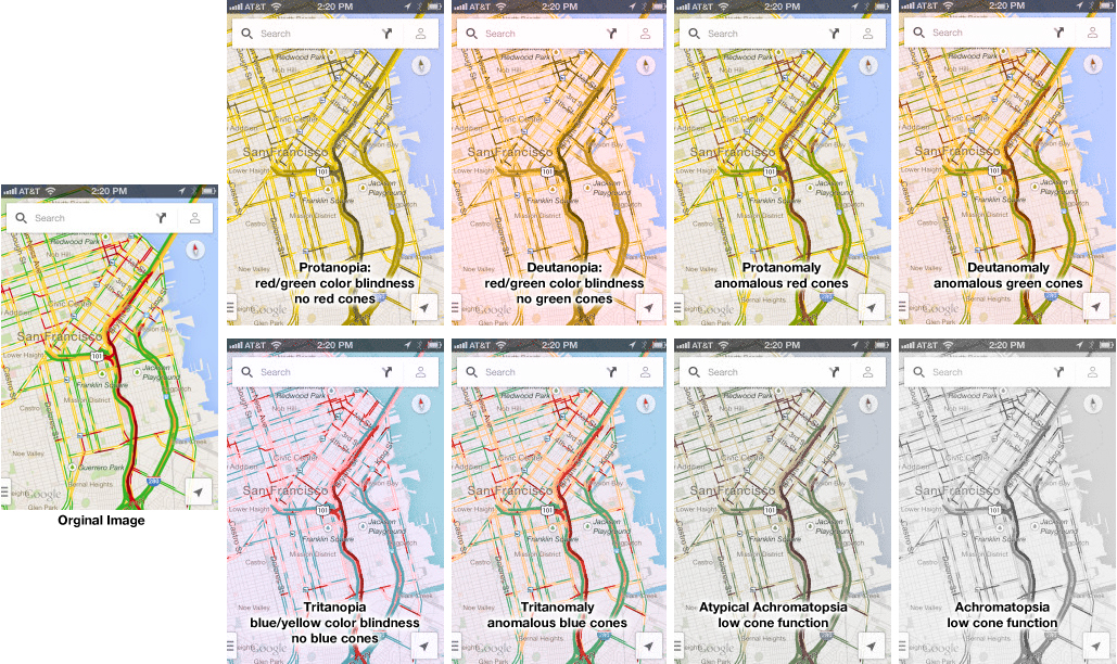
Google Traffic Map on an iPhone (or any other mobile device) is a great product… unless you are colorblind. Then, it’s a nightmare! 5% to 20% of the population has some kind of color processing disorder. Here is a simple test if you are one of those. Which of the following look the same to you? Click on the image above to enlarge. Red/green confusion — Protanopia: red/green color blindness, no red cones; Deutanopia: red/green color blindness, no green cones; Protanomaly: anomalous red cones; Deutanomaly: anomalous green cones — are the most common visual processing problems. But there is also blue blindness — Tritanopia: blue/yellow color blindness, no blue cones; and Tritanomaly: anomalous blue cones. The most rare cases are the monochrome colorblindness, the true loss of color — Achromatopsia: low cone function; and Atypical Achromatopsia: low cone function with some color. As designers, we have to be aware of our audiences’ limitations and strength. And visual processing and comprehension is no exception. In the past, I’ve written about colorblindness: . But unfortunately, the site that helped identify problems with design doesn’t seem to work. Here’s a new sit e for your reference: Colorblind Web Page Filter If you are…
Cognitive Blindness, Contributor, Errors
Define your terms: What is sex?
by Natesh Daniel •
The article, “Sex Makes You Smarter — Can ‘Virtual Sex’ Do The Same?” was a great example of either knowing your audience too well or over-using jargon. The most prevalent problem in it was the lack of defined terms. The author assumed that the reader knew terms like: neurogenesis, glucocorticoid levels, and dendritic architecture (a case of cognitive blindness). But the biggest failure was the author’s negligence to define the most basic term about which the article was written: sex. What is sex? Who is having it? How are they having it? These questions were unanswered. The research on which the article was based indicated that male rats were the subject of the study and were “exposed” to sexually-receptive female rats. That was it. That was the only definition of sex in the entire article, and it was a very vague definition, especially if one extrapolated it to the realm of human sex, which is known to be complicated and varied. Is the author talking about the sexual gratification of males only? If sex was a form of exercise, as the author explained it was, how much caloric effort should the male engage in to achieve it or what heart rate should…
Background Knowledge, Conceptual Design, Cultural Bias, Cultural Differences, Errors, Language, Pipsqueak Articles, Product Design Strategy, Scaffolding
Words, Language, Influence, & Design
by Olga Werby •
I’ve been thinking a lot lately about the power of language. Sure, there have been a lot of news relating to language (election, after all, is only a few months away): legitimate rape is one example of powerful words/phrases in the news. But I would like to briefly explore how words and language can influence the design and use of a product. Language Development It might be interesting to start really early (or to look to unusual cases of individuals without language). The following program by RadioLab does a wonderful job of introducing language and the development of comprehension: Words that Change the World. This half-hour audio show presents the work of Susan Schaller, Charles Fernyhough, Elizabeth Spelke, and James Shapiro. Susan describes a case of a deaf 27 year old man who was never taught language and his journey to comprehension. Charles describes an experiment where babies, kids, and rats are asked to find items in a blank room after a brief disorientation. He discovers that language is essential to linking concepts in our brain. Elizabeth explores the benefits of language farther. And James, a Shakespeare scholar at Columbia University, talks about the use of language to communicate complex…
Conceptual Design, Cultural Differences, Interaction Design, Interface Design, Pipsqueak Articles, Product Design Strategy
Design and the Olympic Games
by Olga Werby •
The Olympic Games are coming to a close and there are some interesting design decisions that seem worth mentioning. But let’s start with a cursory set of design requirements: safety, transportation, visibility and observability of events, entertainment, fairness, cultural sensitivity and appropriateness, and so much more. As with all design problems, divide and concur is a good approach: who are the audiences; what are their needs; what are the time, budget, and personal resources of the project; and what are the considerations (goals) of the sponsoring country. These are the basics of product design. From these variables, we can set priorities and deduce probabilities of errors and failures and how to accommodate them with design. Clearly, this is too much to cover in one blog, but here are a few thoughts… Safety There are many safety concerns in staging big, multinational events. Let’s first consider the different groups of individuals: safety for the participants, organizers, audience, supporting staff. We can break this down even more (by country, by sex, by religion, by location, by celebrity, etc.), but these are the large categories. It’s important to consider the safety for each group separately and provide supports as necessary. There are different…
Conceptual Design, Interaction Design, Pipsqueak Articles, Product Design Strategy, Reference
Special Preview: Socio-Technical System Design
by Olga Werby •
Brian Whitworth and Adnan Ahmad contributed a chapter on Socio-Technical System Design for the free Interaction-Design textbook. This is a very interesting, if technical discussion of the subject. While reading it, I kept thinking about how I would love to debate some of the points raised in this Chapter in person. But lacking this opportunity, below are my ideas and thoughts on the subject of Socio-Technical System Design. First, let me give a quick summary of what is a socio-technological system paraphrasing a bit from Whitworth and Ahmad own words: Socio-technology is about technology and people. Technology is any device. IT system is then a combination of software AND device(s). Human computer interaction (HCI) is a person plus an IT system. Introduction of “person” brings physical, informational and psychological levels into the combined system. And finally, socio-technical system (STS) is merger of community and HCI(s). A Bit of Historical Perspective When my son was in third grade, he was given an assignment: compare some technology from today with that of 100 years ago. He chose transportation. Here’s his insight: 100 years ago, going from San Francisco to Berkeley took a very long time. There were no bridges. People had to drive their…