
What can bad interface design do? Bad graphic? Bad packaging? There are people who think these don’t matter (I had a few clients like that), but here’s an example of how badly things turn out when interface design isn’t taken seriously. And here’s another example from one of my previous posts: eye medicine or super glue? You’d be the judge!
Tag Archive for product design
Anchoring Errors, Background Knowledge, Background Knowledge Errors, Cognitive Blindness, Cultural Bias, Cultural Differences, Diagnostic Errors, Errors, Ethnographic & User Data, Group Decision Errors, Mental Model Traps, Mirroring Errors, Misapplication of Problem Solving Strategies, Pipsqueak Articles, Product Design Strategy, Users
Cultural Barriers to Success
by Olga Werby •
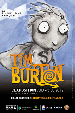
Man-made Disasters in a Wake of Tsunami This month, The Fukushima Nuclear Accident Independent Investigation Commission issued its final report on the disaster: It was man-made! Here’s a quote from the report: What must be admitted — very painfully — is that this was a disaster “Made in Japan.” Its fundamental causes are to be found in the ingrained conventions of Japanese culture: our reflexive obedience; our reluctance to question authority; our devotion to ‘sticking with the program”; our groupism; and our insularity. Had other Japanese been in the shoes of those who bear responsibility for this accident, the result may well have been the same. The last sentence is particular insightful — the blame was not rested on the shoulders of a particular individual, as tempting as that might be, or even on the shoulders of some manager. The fault was places on the cultural context in which the incident played out. Museums in Paris We just got back from seeing a Tim Burton exhibit at the La Cinémathèque, in Paris. The content of the exhibit, as one could imagine, is quite wonderful. But there were many, many human failures in making the visit an enjoyable experience. And yes,…
Background Knowledge, Cultural Bias, Cultural Differences, Mental Model Traps, Pipsqueak Articles, Product Design Strategy, Users
Foie Gras on Child’s Menu and Other Cultural Differences
by Olga Werby •
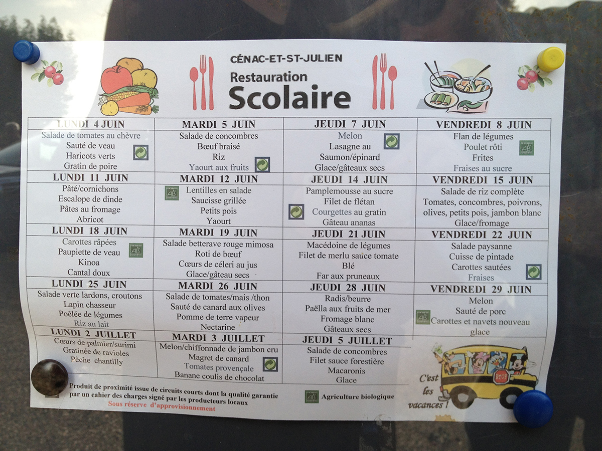
We are staying in a tiny village of Cenac, in a beautiful Dordogne Valley in France — the valley of foie gras (duck liver). The other day, when we went out for dinner in a local restaurant, we saw a great little item on the Child’s Menu: foie gras! Imagine a duck liver pate on a child’s menu anywhere in US? Here, it’s a common item — if not duck liver, than some other pate is often on the menu for kids. Check out the photo we took of the elementary school menu, posted on the door of the school: Notice the rabbit, duck, olives, salad and vegetables, and, of course, the pate on the menu! I think the families and children in this small village would be shocked by the menu offerings at our schools in San Francisco! This is a cultural difference! Cultural differences affect how we think about problem solving — how we approach the problem and how we go about looking for solutions. Consider a few images below. They are from India and show a cultural difference in imaginative solutions to every day problems: The motorcycle bus and the home-made flotation device show creativity within a…
Conceptual Design, Interaction Design, Pipsqueak Articles, Product Design Strategy, Reference
Special Preview: Socio-Technical System Design
by Olga Werby •
Brian Whitworth and Adnan Ahmad contributed a chapter on Socio-Technical System Design for the free Interaction-Design textbook. This is a very interesting, if technical discussion of the subject. While reading it, I kept thinking about how I would love to debate some of the points raised in this Chapter in person. But lacking this opportunity, below are my ideas and thoughts on the subject of Socio-Technical System Design. First, let me give a quick summary of what is a socio-technological system paraphrasing a bit from Whitworth and Ahmad own words: Socio-technology is about technology and people. Technology is any device. IT system is then a combination of software AND device(s). Human computer interaction (HCI) is a person plus an IT system. Introduction of “person” brings physical, informational and psychological levels into the combined system. And finally, socio-technical system (STS) is merger of community and HCI(s). A Bit of Historical Perspective When my son was in third grade, he was given an assignment: compare some technology from today with that of 100 years ago. He chose transportation. Here’s his insight: 100 years ago, going from San Francisco to Berkeley took a very long time. There were no bridges. People had to drive their…
Conceptual Design, Errors, Featured, Interaction Design, Interface Design, Perception, Perceptual Blindness, Perceptual Focus Errors, Pipsqueak Articles, Product Design Strategy
Where to post the “OK” Button on the Screen?
by Olga Werby •
I have very strong opinions about where on the screen the OK or NEXT or SUBMIT buttons go in relation to CANCEL. Without giving it away, I’m going to walk through the design decision tree and provide a lot of references for both sides of the issue — yes, there are strong feelings about the right versus the left position choice. I’m not alone! Passive versus Active Buttons Active Buttons are the ones that advance the action to the next level. Passive ones return the users to previous state, negate the action sequence. OKAY, OK, NEXT, SUBMIT, ACCEPT, GO are all active buttons. CANCEL, BACK, PREVIOUS are action that reverse forward momentum and push the user to places they’ve been before. HELP and INFO sidetrack the user and distract from forward thrust of activity. In general, product designers want to move the users toward their goals — thus we want the perceptual focus to be on the action buttons. We want to make sure that users fist see the way forward, and then click on the right button that propels them forward to completion of the task. All distractions and side movements should be downplayed with Interface Design with the…
Conceptual Design, Cultural Bias, Cultural Differences, Featured, Pipsqueak Articles, Product Design Strategy
30,000 Years of Logo Evolution
by Olga Werby •

Logos have undergone an amazing amount of visual change in the last 30,000 years — obvious statement, isn’t it? But if you look at the change, all grouped together, what we are seeing is the evolution of visual language. The way we relate to icons and what we want them to be is changing continuously. From “I was here” hand print on the wall of an ancient cave to the modern version of Apple logo, we are just trying to make a brand that the current generation of users finds visually appealing.
Conceptual Design, Interaction Design, Interface Design, Perception, Pipsqueak Articles, Product Design Strategy, Scaffolding
Alternative Haptic Interface for 3D Animation and Drawing
by Olga Werby •
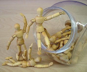
Qumarion built a prototype of a mannequin input device for intuitive 3D manipulation. For many years, artists used little wood manikins to help them with perspective and body positioning. 3D artists also used them for references, but there was no way translate directly from haptic manipulation of a little wooden figure into x, y, and z position in virtual space. Now there is: