The new generation will grow up with Siri: What will this mean to their expectations of how devices should/could work? What are the implications to product design and interaction design?
Tag Archive for iPhone
Conceptual Design, Pipsqueak Articles, Product Design Strategy
US Rio+2.0 Speed Geeking Session
by Olga Werby •

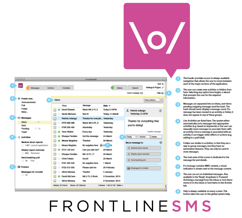
So I’ve learned a new word: Speed Geeking. It’s like speed dating but for geeks to quickly present their ideas to a small group. You have five minutes strict, and then move on to the next presenting geek. It was a very interesting format, but it clearly had accessibility issue: I walk with a cane and I found it very hard. It would have been impossible in a wheelchair. And others with disabilities clearly had issues with this format. But that said, I’ve learned a lot. Below are my notes on the Speed Geeking event at US Rio +2.0. Noel Dickover — Senior New Media Advisor, Office of eDiplomacy, U.S. Department of State — introduced Speed Geeking and ran the event with an iron fist! FrontlineSMS Demoed by Sean Martin McDonald, Director of Operations http://www.frontlinesms.com Main Point: SMS is cheap data that is easy to structure and moves over cell networks (without Internet) Yahoo Demoed by Gil Yehuda, Director of Open Source Product Management at Yahoo! Gil talk about the use of Flickr for journalism, human rights, and keeping people safe. He raised the issue of copyright. KIVA Demoed by Beth Kuenstler, VP of Marketing & Communications If you haven’t…
Conceptual Design, Cultural Differences, Interaction Design, Interface Design, Pipsqueak Articles, Product Design Strategy, Scaffolding, Working Memory
Special Preview: Affective Computing
by Olga Werby •

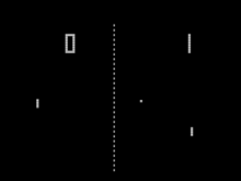
Some 25 years ago, I came up with tiny application: each day, a person picks a color that represents his or her predominant emotional state; the collection of color moods are mapped onto a calendar and displayed as an animated film, summarizing the emotional life of person. It was simple and easy and very effective. And in some way, this was also part of the affective computing — computers that use emotion as part of HCI. [Note: This could and was done with watercolors as flip book some 40 years ago when I played in my art class in school.] Affective Computing, I feel, is only recently became part of the “vocabulary” of computer-based developers. When I first started working in this field, graphics were non-existent, thus Pong. In the early nineties, my business partner and I met with the president of Organic, a web design firm in San Francisco, who promptly informed us that his business had no need for Interaction or Interface Designers, that’s what graphic artists were for. Now, psychologists, sociologists, and sociologists are routinely hired by creative firms to help solve design problems. Times change! There are a lot of posts on emotional design on this…
Interaction Design, Interface Design, Pipsqueak Articles, Scaffolding
Passionate Interface: Siri Inspires Love
by Olga Werby •
You know your product is succeeding with its users when, within days of its launch, they write love songs to your work. Check out this love ode to Siri, Apples latest interface update.
Anchoring Errors, Conceptual Design, Mental Model Traps, Pipsqueak Articles, Product Design Strategy
Innovation 2.0
by Olga Werby •

In my book on product design, Interfaces.com, I talk about a shift from evolutionary product design to the current model of version numbering. There has been a murmur of disappointment this last week when Apple issued iPhone 4S instead of the expected iPhone 5. The new features of iPhone 4S are exciting, new, and unexpected (think Siri). So what’s the problem? Is it really that the version number is too low for our expectations? In the days of yore, no one has ever heard of version numbers. What hammer do you own? Is it version 1.0 or 5.0? Do you care? We have many different types of hammers in our garage, but we don’t think of them in terms of version numbers, rather we focus on what they were designed to help us do: hammer a nail in the wall; pull out a nail; tack in the a little staple in the floor boards; create a hammered copper art piece. Each task requires a different approach and a different tool. And each tool was carefully and systematically honed to perfection by thousands of years of human use: from stone hammers to our tools in the garage a continuous progression of…
Conceptual Design, Pipsqueak Articles
Augmented Reality in Design
by Olga Werby •
For those of you who have been designing iphone apps that use the geo-location features, social media connections, and tie-ins with local businesses, here are a few ideas and platforms that might help push your projects along to completion. In particular, if you’re considering developing a shopping iphone app (shopping lists, price comparisons, coupons, bulk purchases with friends, and sale alerts), this is worth watching. Argon, the Augmented Reality Web Browser Blair MacIntyre, director of Argon Project, and associate professor in Georgia Tech’s College of Computing, describes the new platform for smart phone (iphone) that uses the same tools as those used to develop web sites. Ad-dispatch Augmented Reality Video This video shows how iphone can be used to interact with packaging, ad, and billboards. What is daqri? This video shows off a piece of software which allows “rich spatial media experience”: Daqri.
Cognitive Blindness, Conceptual Design, Cultural Bias, Ethnographic & User Data, Featured, Flow, Interaction Design, Interface Design, Mental Model Traps, Mirroring Errors, Pipsqueak Articles, Product Design Strategy, Scaffolding, Users
Thinking About the Future of Reading
by Olga Werby •

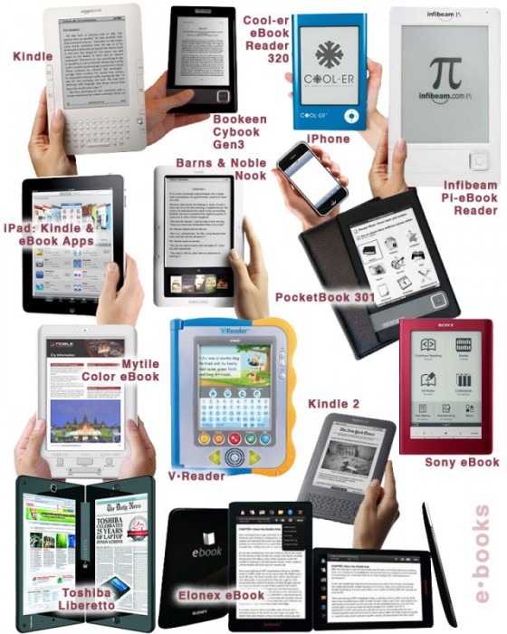
The Taxonomy of Usefulness We are a family with two Kindles, three iPads, two iPods, and an iPhone. We also have a few thousand old-fashioned paper books stored on bookshelves in every nook and cranny of our home: bedrooms, bathrooms, kitchen, stairs, garage, closets, family room, and any other space and surface that might hold a book or two or ten. We are into reading! And we use our Kindles, iPads/Pods/Phone, and computers to read as well. And while statistically speaking, we make just four data points for four family members, I feel we have something interesting to say about using technology to read. To help me understand my own relationship with reading and technology, I’ve come up with a little Taxonomy of Usefulness. If you’ve been reading this blog (or my books and papers), you’d have noticed that I like to slice up the world into groups sorted by a set of variables that I find useful at the time. Forming categories helps me think—the Cognitive Wheel is a prime example. Taxonomy of Usefulness These variables help derive the value of the electronic reading devices. Ergonomics There are many attributes to consider when describing the ergonomics of a device,…
