“Lost in Translation” was a wonderful movie by Sofia Coppola, starring Bill Murray and Scarlett Johansson. It depicted the delicious confusion of Western tourists in total Japanese cultural emersion. In particular, the scenes where Bill Murray shoots a liquor commercial for the Japanese market are simply priceless. In retrospect, I see where Ms. Coppola got her ideas. Her cousin, Nicholas Cage, have been making wonderfully odd (to our sensibilities) commercials for years. He clearly had stories to share. Here are a few of his gems, courtesy the World Wide Web: and But it’s not only Japan that surprises our/my cultural biases. This morning, my husband and I went to a local grocery store in Rome, Italy. In the cheese section, there was a little paper bottle of parmesan cheese with a mouse of the package. The mouse didn’t work for me at all! So much for cultural differences. Here’s a small collection of ads for McDonalds from all over the world. Please compare it to the packaging and menus for this restaurant chain that I’ve posted here in the past: “Cultural World Domination”. Notice all of the anchoring errors, metaphor mistakes, cultural biases, mirroring errors, and general cognitive and cultural…
Tag Archive for impulse buys
Cognitive Blindness, Conceptual Design, Cultural Bias, Cultural Differences, Ethnographic & User Data, Mental Model Traps, Pipsqueak Articles
Thinking About Value
by Olga Werby •

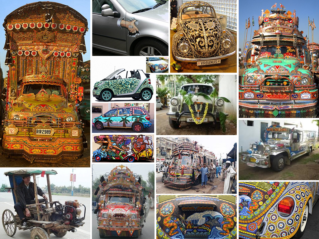
Which car do you find more pleasing? Which car would evoke a feeling of envy? Would you shake your head or starting thinking of how you can improve on the looks of your car? Which car’s origin would you place in the South Asia? Which in South America? Which owner cares about the aerodynamic qualities of the vehicle? Regardless of your personal feelings, the owners of these automobiles have clearly invested a tremendous amount of energy and effort into making them look like this and are very proud of the results! Telling a Story Each of the vehicles above tells a story about its owner and about its culture. The story conveys information: the owner’s goals for the car: utility or status symbol or both cultural value of design cultural symbols owner’s attitude towards possessions (e.g.: How long is the car expected to stay with one owner?) owner’s place in the social hierarchy owner’s unique identity owner’s investment into the vehicle (e.g.: time, money, skill, etc.) the perceived value of the vehicle to its owner These stories of cars and their owners change from culture to culture, from place to place, and of course in time. What we consider beautiful…
Conceptual Design, Cultural Bias, Cultural Differences, Ethnographic & User Data, Flow, Personality, Pipsqueak Articles, Product Design Strategy, Users
Branding & Emotional Design: The Culture of Sneakers
by Olga Werby •

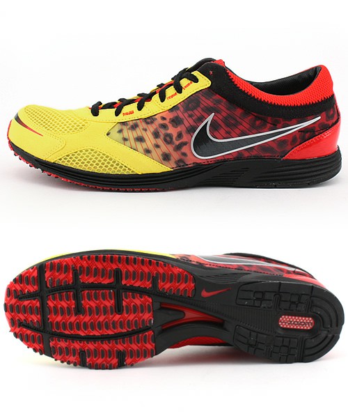
How do we spend our money? Well, the first cut goes to survival: essential goods and services that are absolutely necessary to our survival. Food, housing, medical care are all part of the basic necessities of life. Some, of course, are more necessary than others (we might postpone going to a dentist…but not for long), but there’s a core of stuff that we need to live. The next tier up from survival is comfort. This is a very large tier—what’s comfort to some is a necessity to others and visa versa. People use their income to increase their general comfort level. This might mean a large house, more comfortable beds, larger selection of clothing. But generally, when we talk of comfort, we don’t include jet setting to Paris for a nice date out on the town. Comfort is about everyday life needs, but more comfortable. The top tier of our income is the disposable income and it is spent on luxury—the money we have left over from dealing with our needs and comforts; the money we can chose to spend in an extravagant and even wasteful manner. When economists make predictions about the average size of the available disposable income,…
Conceptual Design, Contributor, Interface Design, Language, Product Design Strategy, Users
Using Menu Psychology to Entice Diners
by Mallika •
Kershaw, S., (2009). “Using Menu Psychology to Entice Diners.” New York Times Online. Visited on October 02, 2010: http://www.nytimes.com/2009/12/23/dining/23menus.html. This article discusses how an understanding of human psychology is being applied to sculpt a restaurant menu into a lucrative tool for the restaurateur. Restaurateurs play down the importance of the cost figure by eliminating the dollar sign and decimals. Adding a personal touch to an item (‘Grandma Mary’s cake’) or a descriptive menu label (‘buttery pasta’) draws more attention to the dish. Other decoys include using a description that glorifies a more profitable dish compared to others. During the tough economic times in the last year, some restaurants were reinventing their restaurants through such menu design techniques, and were hoping that would make the difference they needed. Conceptual design: When you go to a restaurant, good food is not the only thing you seek; you are looking for a good experience. Of course sometimes, great food can make us turn a blind eye to any other inadequacy and draw us back into the restaurant. Nevertheless, a good experience overall manifests itself as a stronger loyalty. If your overall experience has made a lasting positive impression, you may recommend the restaurant…
Conceptual Design, Contributor, Interaction Design, Interface Design, Product Design Strategy, Users
Miles of Aisles for a Gallon of Milk?
by BrentM •
Article: Carless, W. (2008) “Miles of Aisles for a Gallon of Milk?” The New York Times. Visited on 10 September 2008 http://www.nytimes.com/2008/09/10/business/10grocery.html Conceptual Design: In a world of giant grocery stores where consumers have to make mentally-taxing decisions on every product they consider purchasing, create a grocery store that caters to grab-and-go shopping patterns for prepared meals and a few items rather than the big shopping trip for the week. Tailor the experience to “time-starved” shoppers. The average person spends 22 minutes shopping which is not enough time to see all 60,000 products in the store. Interaction Design: User surveys have shown that consumers would rather have high-quality products they can trust than 50 feet of ketchups they aren’t sure about. The store should offer fewer choices to speed decision making on the consumer’s part. Personal extrapolations to Interaction Design: Optimize for quick sales and discourage long shopping trips which would in turn result in a consumer having a lot at the register to purchase which slows everyone else down. Interface Design: Lay out the store with fewer aisles, stocked with only one or a few kinds of each item (one spaghetti sauce that is really good as opposed to 50…
