In the last few weeks there has been several articles and studies published on the effectiveness of alternative medicines and placebos: “Placebos Help Patients Even Without Faking It, Scientists Say“; “Sugar Pills Help, Even When Patients are Aware of Them“; and “Alternative remedies ‘dangerous’ for kids says report“; “Doctors warn over homeopathic ‘vaccines’“. The gist of these beliefs derives from several factors: People Tend to Get Better: most of us get well over time even without medical intervention. Colds pass; flues do too. Most infections heal with time without the aid of antibiotics. Evolution have provided the human race with a great immune system. Medicine helps, we get better faster with treatment. But in most cases, we survive. So when you hear someone recommend an alternative medicine and predict that a cold will go away in three days, chances are you will get better. And over time, we the people develop p-prims (folksy wisdoms) that link health with alternative tratments. “Natural Chemicals” p-Prims: there is a strong belief among industrialized societies, at the present time, that “natural” is better for us than “artificial”. There are many sources of this belief, too many to cover in this short article. And somehow,…
Tag Archive for emotional reaction
Anchoring Errors, Causal Net Problems, Cognitive Blindness, Conceptual Design, Cultural Bias, Cultural Differences, Errors, Group Decision Errors, Mental Model Traps, Mirroring Errors, Misapplication of Problem Solving Strategies, Pipsqueak Articles, Product Design Strategy, Scaffolding
TSA: the Good, the Bad, and the Ugly
by Olga Werby •
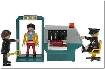
There has been a lot of stories lately about the Transportation Security Administration (TSA), and most have been less than flattering (to say the least). How can an agency that was designed to “serve and protect” the citizens of the United States from harm evoke such wrath from ordinarily shy and non-vocal travelers? This blog is about product design, and so my analysis of the situation will treat this as a failure of product design. Where are the failures? Mistake #1 TSA Conceptual Design: Blocking There are bad guys out there that want to do us—citizen travelers from US—harm. There are the box-cutter carrying terrorists, the shoe-bombers, the liquid explosives bandits, the underwear-bombers, the printer cartridge explosives engineers. TSA installed airport security measures that would counteract each of these threats as they revealed themselves. The basic conceptual design strategy here is blocking: identify a threat and find an effective block. This is a strategy based on hindsight: if we knew that people could sneak bombs in their underwear, then we would have had a way to block it. We didn’t know, but now we do, and so we created systems to block this threat in the future. TSA Game Plan: Escalating…
Cognitive Blindness, Conceptual Design, Contributor, Cultural Bias, Cultural Differences, Ethnographic & User Data, Group Decision Errors, Interaction Design, Interface Design, Product Design Strategy, Users
Lessons to be Learned from the GAP Logo Debacle
by Sheetal Elangovan •
Geoghegan, T. (2010). “Lessons to be learnt from the Gap logo debacle.” BBC News Magazine. Retrieved on October 12, 2010: http://www.bbc.co.uk/news/magazine-11517129 A new logo can brighten up a company’s image or enrage loyal customers. In the case of GAP, the latter was obvious. The release of the new logo led to a huge online backlash from customers on FB and twitter conveying how unhappy they were with the logo. Within a week of release, GAP chose to revert back to the original logo after a slew of criticism. GAP LOGO The importance of being an iconic brand has been severely undervalued. The association of the image and brand is overlaid in the minds of people for the last 20 years. Changing the visual must have pre empted GAP to have tested the logo with focus groups and understand the reactions of the audience. The changed their visual imagery without upsetting customers. The logos below have retained their sense of familiarity which is refreshing and yet without really giving customers the need to process an all together new image to associate with the brand. Companies uniformly moved from serif font to a more elegant Helvetica. MSNBC LOGO GE LOGO Product Positioning:…
Background Knowledge, Background Knowledge Errors, Causal Net Problems, Diagnostic Errors, Group Decision Errors, Mental Model Traps, Pipsqueak Articles, Product Design Strategy
e-Waste & Product Design
by Olga Werby •
I just came across a very interesting video by Annie Leonard. She’s been making little, approachable documentaries that explain difficult to understand issues—e-waste being one of those. Here’s her latest: The Story of Stuff. This is the story about how stuff gets designed, made, distributed, and then trashed. The Story of Bottled Water. This is the story about drinking water and the marketing of bottled water.
Conceptual Design, Contributor, Cultural Differences, Interaction Design, Interface Design
Dating by blood type in Japan
by Roman Shumikhin •
Buerk, R. (2010). “Dating by blood type in Japan.” BBC News. Retrieved on 3 October, 2010: http://news.bbc.co.uk/2/hi/8646236.stm People in most parts of the world do not think about their blood group much, unless they have an operation or an accident and need a transfusion. But in Japan, whether someone is A, B, O or AB is a topic of everyday conversation. There is a widespread belief that blood type determines personality, with implications for life, work and love. Interest in blood type is widespread in Japan, particularly which combinations are best for romance. Women’s magazines run scores of articles on the subject, which has also inspired best-selling self-help books. There are employers who are discriminating against prospective candidates by asking about their blood type. A term for such behavior in Japan is burahara, which translates as blood group harassment. The preoccupation with blood ultimately dates back to theories of eugenics during the inter-war years. Stripped of its racial overtones, the idea emerged again in the 1970s. Now, blood typecasting is as common as horoscopes in the West, with the whiff of science—although dubious—giving it added credibility. Scientists regularly debunk the blood group theory but it retains its hold—some believe because,…
Cognitive Blindness, Conceptual Design, Cultural Bias, Ethnographic & User Data, Featured, Flow, Interaction Design, Interface Design, Mental Model Traps, Mirroring Errors, Pipsqueak Articles, Product Design Strategy, Scaffolding, Users
Thinking About the Future of Reading
by Olga Werby •
The Taxonomy of Usefulness We are a family with two Kindles, three iPads, two iPods, and an iPhone. We also have a few thousand old-fashioned paper books stored on bookshelves in every nook and cranny of our home: bedrooms, bathrooms, kitchen, stairs, garage, closets, family room, and any other space and surface that might hold a book or two or ten. We are into reading! And we use our Kindles, iPads/Pods/Phone, and computers to read as well. And while statistically speaking, we make just four data points for four family members, I feel we have something interesting to say about using technology to read. To help me understand my own relationship with reading and technology, I’ve come up with a little Taxonomy of Usefulness. If you’ve been reading this blog (or my books and papers), you’d have noticed that I like to slice up the world into groups sorted by a set of variables that I find useful at the time. Forming categories helps me think—the Cognitive Wheel is a prime example. Taxonomy of Usefulness These variables help derive the value of the electronic reading devices. Ergonomics There are many attributes to consider when describing the ergonomics of a device,…
Cultural Bias, Interface Design, Pipsqueak Articles, Product Design Strategy
Type & Brand
by Olga Werby •
Helvetica: Period. Cultural shifts as expressed in type: the story of Helvetica. Trajan is the Movie Font. Some fonts are in vogue for certain industries only.