The “Why” questions are important part of design: Why are we building this product? Why would users want it? Why us? Why now? Why this technology? The value of any question asked during the design process is in how the answer to that question helps advance the project; or help the design group bond; or reveal a significant insight into the problem that the group is trying to solve; or help clarify the use scenario; etc. All such questions are about moving the project forward. But it is easy to get sidetracked here, and I saw just that at the NIH biomedical research design brainstorming meeting. Before I proceed, let me describe a bit of background research and give a concrete example when the wrong answer to the Why question jeopardizes the design solution. About ten years ago now, we were asked to design a set education materials for the San Francisco Zoo. The problem was lack of structure for school visits. San Francisco public schools allow all elementary school children to visit the city zoo once a year. That’s a lot of school children…and a lot of visits per kid. But do these students learn anything during these visits?…
Tag Archive for emotional design
Conceptual Design, Cultural Bias, Cultural Differences, Pipsqueak Articles
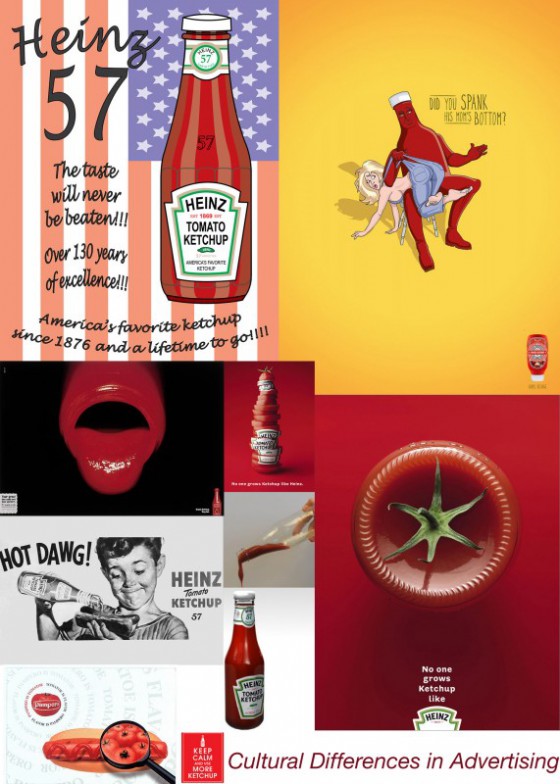
Cultural Differences in Advertising
by Olga Werby •
Cognitive Blindness, Conceptual Design, Cultural Bias, Cultural Differences, Product Design Strategy
Extreme Hypocrisy
by Olga Werby •
On the same day as I read about Gul Meena — a 17 year old Pakistani girl who was almost killed and severely maimed by her own brother — I bought a pair of skinny jeans. When I got home, I noticed they were made in Pakistan. I think I don’t need to say more… Gul Meena, 17, left her abusive husband in Pakistan for another man. Meena’s brother hacked her friend to death with an ax, before turning on her. Skinny Jeans Made in Pakistan
Conceptual Design, Cultural Bias, Cultural Differences, Interface Design, Perception, Pipsqueak Articles, Product Design Strategy
The Tone and the Interface
by Olga Werby •
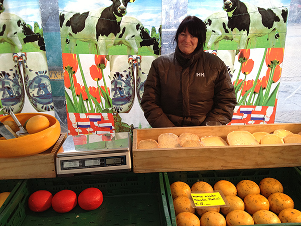
I just returned from a brief visit to The Hague and Amsterdam. When in a foreign country encountering an unfamiliar language, it’s easy to focus on the visual presentation of content since the linguistic portion of the presentation is unavailable for processing. People who can read can’t help but do so when presented with text. But when one can’t process the linguistic content, all that is left are visual clues (and smells and sounds…). So I took a few snapshots to show how the tone of the interface impacts the emotional processing of content and attitude of the customer to the content. Selling Cheese in Amsterdam This is a farmers’ market stall in the middle of Amsterdam, selling home-made cheese. The woman in the photo is the actual cheese maker. Note the hand-lettered signs, the simple wooden boxes, the plain presentation — the overall effect is home made goods, care in production, quality product, even made with love. Fancy production values would just be off putting in this context, and probably result in lower sales of cheese. This NOT a museum, but rather a neighborhood cheese store in Amsterdam. (It is located next door to the flower museum…). What is…
Background Knowledge, Conceptual Design, Cultural Bias, Featured, Pipsqueak Articles, Product Design Strategy
Forgetting by Design
by Olga Werby •
I get a lot of email forwards…don’t we all? And just the other day I got one that I have seen many times already over the past few years… Usually, you look, you smirk, you move on. But this time, the photo got me thinking: that poor kid — he has no memory of this shot, but he will be remembered for it for the rest of his life! The shot has long ago slipped from the close circle of sharing that his parents intended it for and has been widely distributed through out the world. Someday, this kid might even get it as mail forward himself: an adult man looking at a silly embarrassing moment that got away… Information with Expiration Date Somehow, I don’t imagine that getting “an image that got away” of oneself would be a source of continuous pleasure. One might want to forget the whole thing… And it is not just images — although having images with expiration dates would be very valuable — there are loads of information that should be forgotten by design. When my generation was growing up, the silly and stupid things we did didn’t end up as data for public…
Cultural Differences, Ethnographic & User Data, Pipsqueak Articles
Kurisumasu ni wa kentakkii!
by Olga Werby •
Who would have thought that our KFC fried chicken would be an object of desire in Japan? But perhaps all it takes is some very good PR (and some luck), and a product designed to please a very specific audience finds a new user group… Kentucky Fried Chicken for Christmas Dinner Japanese tradition started in 1974. While Japan is not a Christian nation — most Japanese (84% to 96%) identify themselves as Shinto or Buddhists — people do celebrate Christmas. There are Christmas office parties, people put up trees and give gifts, and families and friends eat Christmas dinners together. But unlike here in U.S., Christmas turkey dinners are not common — it is almost impossible to get a turkey at a local supermarket. To celebrate the Christmas spirit with an authentic American flavor, Japanese turn to KFC! The Kurisumasu ni wa kentakkii — or Kentucky for Christmas — is so popular, that people have to order their Christmas fried chicken buckets a month in advance! This is the power of advertising.