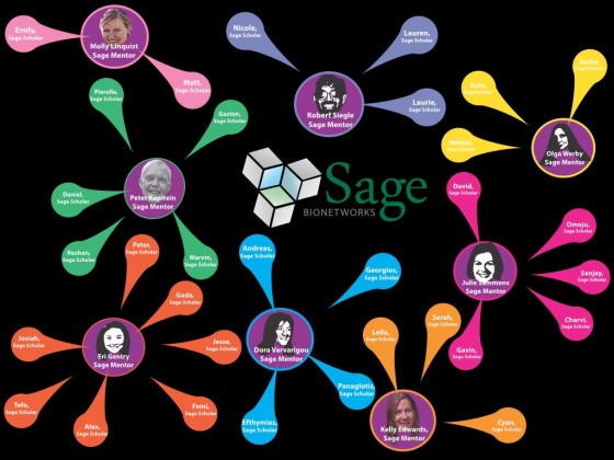
One of the goals of the Sage Assembly was to facilitate opportunities for groups whose members rarely have a chance to make their voices and opinions heard at such events, whose members could benefit from the exposure to the ideas and people at the Sage Assembly, and who can take those ideas and projects and connections back to their own social networks and help them grow. To achieve this goal, Sage Bionetworks had set up a scholarship fund — Open Innovator Awards — to assist ten recipients with travel and living expenses in Paris. The recipients of the Open Innovator Awards were pulled from a pool of applicants, Sage Scholars, who have been nominated by Sage Mentors. Each Sage Mentor was responsible for selecting no less than 2 and no more than 10 Sage Scholars. Sage Mentors had complete freedom to choose those who they believe would have benefited from participating and who could contribute in a positive way to the Assembly. Sage Scholars had to be 18 years of age or older. Sage Mentors were expected to help their Sage Scholars with their applications and the final Poster Presentations: “Instances of Open Practice”. The presentations were be on display…


