This is an interesting collection of videos and background materials on End-User Development — situations when end users design and develop software for their own use. If you’re old enough, you would remember BASIC and HyperCard — tools that let anyone develop simple games and applications. A great example is “Spelunking” game totally developed in HyperCard (these guys when on to develop “Myst”!). I’ve made a few games like this myself. And of course FileMaker is another system that allows application development by the end users — we have one for time tracking. There have been many many others, and unfortunately, many of them are now gone. The discussion on what happens when end users develop for themselves is fascinating. Most times, these users are experts in their own fields and are not software developers (some have no and some have little formal training). Thus there are cultural differences between “real” programmers and end users that take up programming to achieve their own goals, often because they can’t find what they need out in the world. These end-user designed products have strengths and they also have many weakness. In particular, these products are tightly focused on the needs of those…
Interaction Design
How does the product do it?
Attention, Background Knowledge, Conceptual Design, Interaction Design, Language, Perception, Pipsqueak Articles, Product Design Strategy
Thinking about the Science of Communication and Interaction
by Olga Werby •

In the Galaxy Far Far Away… What if sentient being evolved on a planet with permanent cloud cover? What if these being never saw stars? Would they still be able to discover the laws of nature? These kinds of hypothetical thinking questions — the Gedankan Experiments, as Einstein put it — are very useful in science. I’ll try to use them here for analyzing product design and communication. So what senses do we need to communicate? And what body appendages are necessary to produce this communication? Note that it helps keep track of these separately. Aroma-bet When I was little, I “designed” a language based on smell: each smell was assigned a character in an alphabet and, strung together in sequence, my smelly letters transcribed into words — the Aroma-bet. There were several problems with this: It was difficult to get an alphabet-worth of distinct odors; Arranged next to each other, the odors started to blend into each other, making “reading” difficult; I got a very bad headache; My mom didn’t like her expensive perfumes used in such a creative way… And I couldn’t remember what letter each smell stood for, requiring the creation of a smell-o-dictionary, which in turn…
Conceptual Design, Cultural Bias, Interaction Design, Interface Design, Mental Model Traps, Pipsqueak Articles, Product Design Strategy
Design for Emotion, for Empowerment
by Olga Werby •

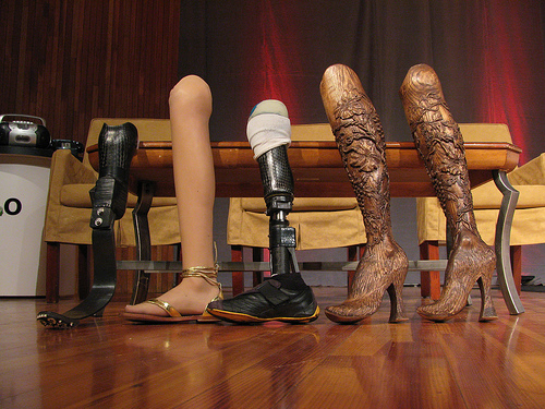
I use a cane to get around, a consequence of an unfortunate encounter with a taxi many years ago. I have many different canes (each heel size, for example, requires its own cane). All are cool. Some have animal carvings, some have silver, some have gold, some are complex in design, some are very Deco in style, and one has a sword (another a compass and a secret compartment). I get stopped on the street all the time — people love my canes and always comment. I was even told once that my limp is sexy — whatever… What I don’t have is an “old woman” cane — the kind you buy at a pharmacy. I’m just not that old, and plan never to be that old. I want funky, I want things that match my outfits and my moods. And I want them functional: the right hight, the right feel of the cane handle, the stability of the tip, the light weight, the structural security. I want it all and I want it sexy. Cane is a product — a very personal one. But most are stuck with poorly designed, boring, ugly, you-make-me-feel-like-an-invalid cane. Why? Aimee Mullins is a…
Interaction Design, Interface Design, Pipsqueak Articles, Scaffolding
Passionate Interface: Siri Inspires Love
by Olga Werby •
You know your product is succeeding with its users when, within days of its launch, they write love songs to your work. Check out this love ode to Siri, Apples latest interface update.
Conceptual Design, Cultural Bias, Flow, Interaction Design, Interface Design, Language, Perception, Pipsqueak Articles, Product Design Strategy, Scaffolding, Working Memory
The Haptic Feel of Books versus eBooks
by Olga Werby •

We’ve traveled to Rome for our family vacation this year, and aside from a few summer reading books that I couldn’t find in an eBook format, we relied on our two Kindles and 3 iPads for our family reading needs. This is the second summer we brought primarily electronic versions of books—”The Count of Monte Cristo” is much easier to read when it fits into your hand and doesn’t weigh a ton… In the days before the Kindle and iPad, we carried an extra suitcase just for books. But there are drawbacks to buying and reading eBooks. Below are some of my thoughts and experiences—the cogitations of a voracious reader. Time & Progress As I was reading my novels, I found myself repeatedly trying to figure out where in the book I was. How far along was I? When is the next natural break (chapter, section end)? How many pages are there to the end of the chapter, end of the section, end of the book? These were not idle curiosities about my reading accomplishments, although when you do finish reading the book version of “The Count of Monte Cristo”, you do have a sense of having read something. An…
Background Knowledge, Conceptual Design, Flow, Interaction Design, Interface Design, Pipsqueak Articles, Product Design Strategy, Scaffolding, Users, ZPD
Remarkable Design
by Olga Werby •

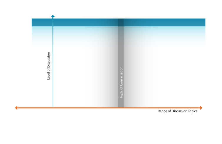
How does one design a remarkable product? “Well, it depends on a product,” some would say. But couldn’t we say something general? Why do we feel passionate about some products but not others? Consider conversations: some are fun, some are boring; some engage lots of people, some not so much; some result is heated exchanges, some are more neutral. Note that you can be very passionate about a topic, but don’t consider it fun: rape, genocide. Politics engages lots of people, but the details leave most bored. Some conversations generate sustained interest, and some fizzle out without a remark. What’s required for a conversation to be remarkable? That depends on the audience. To be engaged in a discussion, you have to find the topic interesting to you. And what’s interesting to you, might not be to me. Thus the topic of conversation is a variable of the targeted audience. Even if you find the topic amusing, you might not have the time to participate in the conversation. “I would love to talk to you about quantum space time, but the plane leaves in 5 minutes.” And it is so noisy on the plane that you can only hear every other…
Attention, Attention Controls Errors, Cognitive Blindness, Conceptual Design, Cultural Bias, Featured, Flow, Interaction Design, Interface Design, Mental Model Traps, Perceptual Focus Errors, Pipsqueak Articles, Product Design Strategy, Users, Working Memory
Multitasking Myth
by Olga Werby •

I’ve been noticing a lot of praise and demand for mutlitaskers: “We are looking for a talented individual who is [insert a laundry list of qualifications here] and is also a great multitasker!” or “Women are naturally better at multitasking.” or “Not only is he gifted, but he is able to work on all these projects simultaneously. If only we had a dozen more just like him!” (—probably just to get anything done!) The interesting aspect of this increased demand for multitasking is the rise of ADHD diagnosis. So I thought it would be an interesting exercise to pin down what exactly is being praised and diagnosed. A Curious Case of ADHD Let’s start with formal diagnostic criteria for ADHD (attention deficit hyperactivity disorder). What are the symptoms of ADHD? Below is a list of attributes that is adapted from the Diagnostic and Statistical Manual of Mental Disorders 4th ed. (DSM-IV). When you read this list the first time, imagine an eight year old boy trapped in an elementary classroom. On the second reading, consider an 80-year-old woman in a nursing home. On the third, visualize a soldier just back from Afghanistan. And finally, when you read the list for…
