Featured

Skin-deep Usability

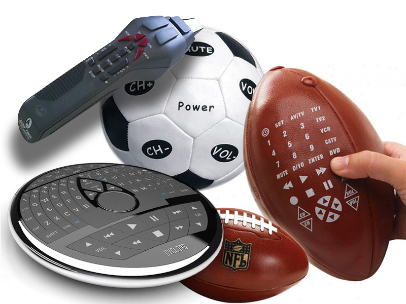
The Universal Remote Control Story A few years ago, we got a Star Trek phaser universal remote control as a gag gift for the holidays. As any universal remote control (URC), it was supposed to control any and all devices that were hooked up to our TV and do it with a flair of shooting a phaser at the general direction of our equipment. A few days later, it was relegated to our sons’ toy box, and now I wouldn’t even know where to look for the thing. Big buttons, footballs, phasers, UFOs, futuristic control centers—the makers of universal remote controls have tried them all. But consumers still buy one URC after another in the hope of finding something that would work for them. Why are these things so darn hard to use? Manufacturers seem to believe that by giving their products a friendly, toy-like appearances, these devices would seem more user-friendly and easier to use. But, personally, I don’t want a giant ball in middle of my kitchen table or rolling around my living room floor. I don’t want the kids to toss footballs to control the channels or fire phasers to lower the sound. I just want something…

Be the Customer

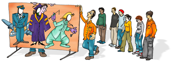
By our very nature, humans are an “us versus them” kind of mammal. We are quick to judge and categorize: “he’s our kind’a people” or “she’s management.” We adapt and root for our favorite sports teams, sometimes even resorting to violence to “defend our guys.” We peg an art department against the engineers; we side with nurses over doctors; we fight with democrats against republicans; we wave our flags in a spirit of nationalism. And it doesn’t matter if we all work for the same company, heal the same patients, want the same basic rights, or live on a very small planet—we tend to take sides. So it’s no surprise that when product designers develop products the feeling of “us against the users” creeps up into the process. To protect the design process from these “us versus them” impulses, we can create a well-realized user personas based on the the audience taxonomy developed during the conceptual design stage of product design. For each major category in the audience taxonomy, a sample fictional user is created which embodies all of the traits in that audience category: age, profession, socio-economic background, culture and sub-culture, interests and dislikes, family status, education level, etc.…

Color Blind Design

Do you see any difference between these two images? About 10% of the male population (with up to 20% among some ethnic groups) do not. Do differences in the way individuals perceive and process color information matter? Sometimes… Consider this informational graphic: It’s easy to see how the information contained within this chart has been transformed and no longer carries the same meaning. Which is the right one? When designing information for communication, it’s important to consider the totality of the intended audience: What are their strength? What are their limitations? Like cognitive traits, perceptual differences have to be accommodated by good design. Some issues that individuals with deuteranope deficit (red/green confusion) face is inability to tell the difference between colored items that are too thin (lines), point sources, and blinking lights (think traffic lights blinking green or yellow). These problems effect real-life performance and can lead to accidents: think traffic light color confusion. It is the job of a product designer to reduce the difficulties these individuals face. You can use this URL to check your site for color blind usability: http://www.vischeck.com/vischeck/vischeckURL.php

The Anatomy of Failure

On May 7th 2010, at around 2:30 p.m. Eastern Time, the stock market went on a wild ride, dropping over 900 points in matter of just minutes. What happened? There’s lot’s of speculation, and some know more then they are willing to say. But what’s clear is that there was just the right confluence of world events, human and computer errors, and system-wide communication breakdown that triggered a mass sell-off of stocks at fantastic prices. In other words, there was a catastrophic failure during product interaction. I’m not an investment analyst and have limited knowledge in this subject area, but I am interested in product failure. So Thursday’s stock market episode was very interesting. Here’s a little background on the events of that day broken down into steps leading to the failure. Step 1: When the New York stock market opened on Thursday, bad news was streaming in from Europe—there were fears that Greece would ultimately default on its loans; its people were staging massive demonstrations in Athens; Euro was going down. Step 2: In our very interconnected world, this kind of news makes investors skittish and the stock market was dropping value all morning. Step 3: At around 2:45…

Neuro-Parasites & Problem Solving Errors

Dr. Robert Sapolsky is a professor of neurobiology at Stanford University. He started his career studying baboons, charting the relationship between stress hormones and an individual animal’s social ranking in the baboon society hierarchy. The lower the rank, the more stress the animal experiences, the more consequences there are to the health outcomes and longevity of the baboon. Making a parallel to human society, the conclusions of Dr. Sapolsky’s study is that it sucks to be at the bottom of the social order. In his books “Primate’s Memoir” and “Zebras Don’t Get Ulcers,” Dr. Sapolsky provides copious details of his work and his conclusions. (see Recommended Books for details) But residing on the bottom of the social ladder is not the only problem a mammal like us can experience. In his video interview with Edge (www.Edge.org), Dr. Sapolsky describes the adventures of Toxoplasma–a protozoan parasite carried by cats which causes an infection Toxo–in our amygdala. Post an active infectious state, Toxo is able to manipulate human dopamine levels. People with the post-Toxo infection have higher than normal dopamine levels, resulting in some interesting cognitive consequences. There’s been solid research that documents a high level of Toxo infections in schizophrenic patients. There…

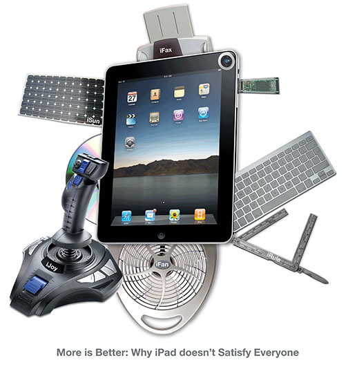
More is Better: Why iPad doesn’t Satisfy Everyone

Swiss Army iPad

There have been a lot of complaints flying around about how iPad doesn’t do this, and iPad can’t do that, and iPad won’t work with that other thing. Some people are so obsessed about all the things that iPad isn’t capable of doing that they overlook all that it can do. By looking for failure, these reviewers lost sight of what iPad is all about. There are plenty of people who are defending iPad out there, so I was interested in why the people who dislike iPad so passionately feel the way they do. We, the people, tend to make our decisions based on little snippets of information that we find to be true and productive for solving various problems. “If something is steaming, it must be hot.” “Big things fall harder and faster.” “Where there’s smoke, there’s fire.” “If one is good, two is even better.” “If it looks clean…” “Little kids don’t lie.” “If it’s natural, it’s not chemical.” “Summer is when the Earth is closest to the sun.” “One can’t get fat eating vegetables.” These are the building blocks of our intuitions. We are all walking encyclopedias of folksy wisdom—common sense explanations that are consciously and unconsciously…