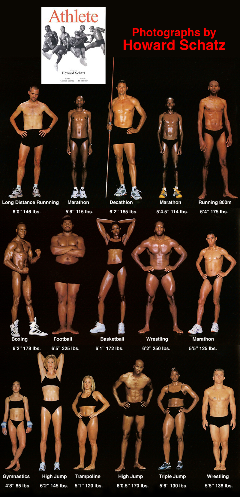
Cultural Bias

TSA: the Good, the Bad, and the Ugly

There has been a lot of stories lately about the Transportation Security Administration (TSA), and most have been less than flattering (to say the least). How can an agency that was designed to “serve and protect” the citizens of the United States from harm evoke such wrath from ordinarily shy and non-vocal travelers? This blog is about product design, and so my analysis of the situation will treat this as a failure of product design. Where are the failures? Mistake #1 TSA Conceptual Design: Blocking There are bad guys out there that want to do us—citizen travelers from US—harm. There are the box-cutter carrying terrorists, the shoe-bombers, the liquid explosives bandits, the underwear-bombers, the printer cartridge explosives engineers. TSA installed airport security measures that would counteract each of these threats as they revealed themselves. The basic conceptual design strategy here is blocking: identify a threat and find an effective block. This is a strategy based on hindsight: if we knew that people could sneak bombs in their underwear, then we would have had a way to block it. We didn’t know, but now we do, and so we created systems to block this threat in the future. TSA Game Plan: Escalating…

Lessons to be Learned from the GAP Logo Debacle

Geoghegan, T. (2010). “Lessons to be learnt from the Gap logo debacle.” BBC News Magazine. Retrieved on October 12, 2010: http://www.bbc.co.uk/news/magazine-11517129 A new logo can brighten up a company’s image or enrage loyal customers. In the case of GAP, the latter was obvious. The release of the new logo led to a huge online backlash from customers on FB and twitter conveying how unhappy they were with the logo. Within a week of release, GAP chose to revert back to the original logo after a slew of criticism. GAP LOGO The importance of being an iconic brand has been severely undervalued. The association of the image and brand is overlaid in the minds of people for the last 20 years. Changing the visual must have pre empted GAP to have tested the logo with focus groups and understand the reactions of the audience.  The changed their visual imagery without upsetting customers. The logos below have retained their sense of familiarity which is refreshing and yet without really giving customers the need to process an all together new image to associate with the brand. Companies uniformly moved from serif font to a more elegant Helvetica. MSNBC LOGO GE LOGO Product Positioning:…

Japanese Playing a New Video Game: Catch-Up

Tabuchi, H., “Japanese Playing a New Video Game: Catch-Up.” New York Times Online. Visited on October 4, 2010: http://www.nytimes.com/2010/09/20/technology/20game.html?_r=1 This article discuss how Japan is partnering with Westerns in the gaming industry. In the mid 1980s’ through 1990s most game franchises were developed from Japan. Some of Nintendo’s Mario, Pokemon, Sonic the Hedgehog from Sean and Gran Turismo from Sony. Japan is now at least five years behind in the industry. The best selling game was Call of Duty: Modern Warfare 2 which was developed in the United States. Concept Design: Japan use to define the gaming industry. Part of it’s problem is that they need to appeal to players that are located overseas. Interaction Design: Developers want to try and reach out to the West and collaborate. Collaboration in trying to make games have a more global appeal can possibly generate a bigger target audience. Capcom for example developed Take Shadow of Rome. This 2005 action game was made for European and American markets. Instead of designing over sized samurai swordsmen they designed over sized gladiators. Interface Design: The interface design are collaborating with people from overseas and learn their culture in order to appeal in the market. They…

Thinking About the Future of Reading

The Taxonomy of Usefulness We are a family with two Kindles, three iPads, two iPods, and an iPhone. We also have a few thousand old-fashioned paper books stored on bookshelves in every nook and cranny of our home: bedrooms, bathrooms, kitchen, stairs, garage, closets, family room, and any other space and surface that might hold a book or two or ten. We are into reading! And we use our Kindles, iPads/Pods/Phone, and computers to read as well. And while statistically speaking, we make just four data points for four family members, I feel we have something interesting to say about using technology to read. To help me understand my own relationship with reading and technology, I’ve come up with a little Taxonomy of Usefulness. If you’ve been reading this blog (or my books and papers), you’d have noticed that I like to slice up the world into groups sorted by a set of variables that I find useful at the time. Forming categories helps me think—the Cognitive Wheel is a prime example. Taxonomy of Usefulness These variables help derive the value of the electronic reading devices. Ergonomics There are many attributes to consider when describing the ergonomics of a device,…

Language and thought in user-centered design

Deutscher, G. (2010). “Does language shape the way you think?”  New York Times Online Edition. Retrieved on October 4, 2010. http://www.nytimes.com/2010/08/29/magazine/29language-t.html This article summarizes the history and the current status of the linguistic relativity hypothesis or the idea that “language shapes thought.” This idea comes in several different formulations. The version on which Deutscher’s review focuses is a cross-linguistic claim that speakers of different languages use different mental representations or processes as a result of having learned different languages as children. A particularly strong version of the cross-linguistic hypothesis suggests that our native language provides us with a basic toolbox of conceptual representation, so if a concept or a mode of thought is not encoded in a given language, its monolingual speakers would be incapable of thinking about such a concept or thinking in such a mode.  For instance, linguistic relativity led to the prediction that people’s perception of differences in color should reflect the way their language encodes color.  This prediction was spectacularly disproven by the discovery that people whose language only has two color terms in its vocabulary perceive and categorize colors similarly to speakers of English, which has 11 basic color terms, plus many non-basic ones (Berlin…