The next chapter in the Interaction-Design.org tome on human-computer interaction design is now up for an early review to my readers. This chapter takes on Wearable Computing and is written by Steve Mann. Mostly, this is a historical review of Prof. Mann’s experimentations with wearable computing devices, and for those unfamiliar with this subject area, this is an interesting introduction. On the left, you can see an early version of wearable computing: Steve Mann’s backpack based system from the late 1970’s and early 1980’s. But as always, I have a slightly different take on this topic… The Little Mac That Saved My Son’s Life Almost 18 years ago, I went into a preterm labor. At 24 and a half weeks into gestation, this was very scary. At the time, San Francisco Children’s Hospital was pioneering a program for high risk pregnancies (which mine just turned out to be). Two doctors, Dr. Kuts and Dr. Maine, figured out how to use an old Mac SE, a modem, a telephone, a subcutaneous pump, and a belt which measures contractions to allow women like me to stay at home as much as we could (as opposed to spending months in the hospital). Here’s…
Tag Archive for visual processing
Conceptual Design, Cultural Bias, Cultural Differences, Pipsqueak Articles, Product Design Strategy
Special Preview: Visual Aesthetics
by Olga Werby •
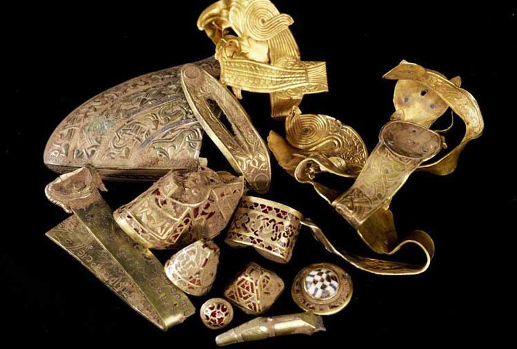
Interaction-Design.org is doing an amazing job of developing a textbook for Human-Computer Interaction (HCI) Design. This newest chapter, Visual Aesthetics in human-computer interaction and interaction design by Noam Tractinsky works to tease out the aspects of design that make products appealing, memorable, culturally-appropriate, emotionally satisfying, and beautiful. Beauty & Aesthetics Evolve in Time It’s good to remember that what we find beautiful and appealing changes and evolves in time as well as across cultures. Here’s a wonderful demonstration: 500 Years of Female Portraits in Western Art. What Makes Design Beautiful? In the Interaction-Design.org chapter, Tractinsky starts with Vitruvius’ design principles. Vitruvius lived in the 1st century BC and develop a set of standard criteria by which to evaluate architecture: Firmitas — durability or life-span of the building in relation to its purpose; Utilitas — usability of the building by its intended audience; and Venustas — the beauty of the building (this would be culturally-specific). 2,000 years on and we still talk about durability, usability, and aesthetics of products. Since this chapter discusses architecture, I would like to talk about weapons. Weapons pre-date architecture, but they still follow the same rules for design: durability and reusability, usability, and beauty. If you’ve…
Perception, Pipsqueak Articles, Users
McGurk Effect — Synesthesia in Action
by Olga Werby •
McGurk Effect is synesthesia in action. The sounds you hear depend on the visual information you’re getting through your senses! This is an amazing little video demonstration. Imagine if all your senses were so interconnected — perseptual information tangled up mid stream…
Background Knowledge, Background Knowledge Errors, Conceptual Design, Cultural Bias, Cultural Differences, Ethnographic & User Data, Interface Design
How Do We Think of Brands
by Olga Werby •
I found this video by Adam Ladd — he made a video of an interview with his 5 year old daughter talking about brands. He showed her some very famous logos, and she told him what she thought they were. Naturally, this is a girl from a middle class background, from America. The answers would be very different from a 5 year old brought up in Russia or Papua New Guinea. Notice how she is able to quickly identify a Nike logo. And Disney’s D. And what’s really amazing is that she knows what a logo is in the first place! This little kid has developed a brand p-prim! And she has a well-developed comprehension of visual symbols. I wonder how the same interview would play out in a different culture…
Featured, Interface Design, Perception, Pipsqueak Articles
Creativity, Perception, and Public Art
by Olga Werby •
Art or craft? Creativity or public nuisance? Sometimes, the line between these is so fine, so complex, so fractal, that it’s simply doesn’t matter. The images below span thousands of years in dates of creation. The artists used light and shadow, perspective, and clever geometry of space to add meaning to their work. All showed an amazing amount of imagination, all provide commentary on current events or a point of view. Happy holidays to all! Enjoy! [flagallery gid=3 name=”Gallery”]
Conceptual Design, Cultural Differences, Interaction Design, Interface Design, Pipsqueak Articles, Product Design Strategy, Scaffolding
Designing for the Blind
by Olga Werby •
Not much to add here — how many other cool video games are there for visually disabled? Using tactile clues instead of visual signals is a nice interaction design solution. Well done!