Tag Archive for user satisfaction

Emotional Design

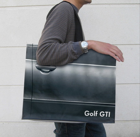
Product design is not just about usability. How we feel about a product makes a lot of difference. The research shows that two identical applications—with similar failure rate, but with a different take on dialogue box writing—result in very different perceptions of usability by its audience. The application with polite dialogue text always wins. Emotional design deals with how we feel about the product. Interfaces design is all about the look and feel and is responsible for a large portion of generated user emotions. Here are some examples of bag designs. If you want to encourage recycling, this is a great way of making these bags valuable—the users won’t throw them out after one use. Enjoy!

Skin-deep Usability

The Universal Remote Control Story A few years ago, we got a Star Trek phaser universal remote control as a gag gift for the holidays. As any universal remote control (URC), it was supposed to control any and all devices that were hooked up to our TV and do it with a flair of shooting a phaser at the general direction of our equipment. A few days later, it was relegated to our sons’ toy box, and now I wouldn’t even know where to look for the thing. Big buttons, footballs, phasers, UFOs, futuristic control centers—the makers of universal remote controls have tried them all. But consumers still buy one URC after another in the hope of finding something that would work for them. Why are these things so darn hard to use? Manufacturers seem to believe that by giving their products a friendly, toy-like appearances, these devices would seem more user-friendly and easier to use. But, personally, I don’t want a giant ball in middle of my kitchen table or rolling around my living room floor. I don’t want the kids to toss footballs to control the channels or fire phasers to lower the sound. I just want something…

Be the Customer

By our very nature, humans are an “us versus them” kind of mammal. We are quick to judge and categorize: “he’s our kind’a people” or “she’s management.” We adapt and root for our favorite sports teams, sometimes even resorting to violence to “defend our guys.” We peg an art department against the engineers; we side with nurses over doctors; we fight with democrats against republicans; we wave our flags in a spirit of nationalism. And it doesn’t matter if we all work for the same company, heal the same patients, want the same basic rights, or live on a very small planet—we tend to take sides. So it’s no surprise that when product designers develop products the feeling of “us against the users” creeps up into the process. To protect the design process from these “us versus them” impulses, we can create a well-realized user personas based on the the audience taxonomy developed during the conceptual design stage of product design. For each major category in the audience taxonomy, a sample fictional user is created which embodies all of the traits in that audience category: age, profession, socio-economic background, culture and sub-culture, interests and dislikes, family status, education level, etc.…

Metacognition Failure: If I find it easy, it must not be important

Making something easy to understand is extremely difficult. A good designer knows this, knows how hard one has to work to make something comprehensible and easy to use. Unfortunately, users and consumers of products (including education) tend not to get it. We live in society ruled by “More is Better” p-prim: more stuff is better, more money is better, more food is good, more medication is great…more, more, more. Movies, television, newspapers, magazines, all reinforce this idea in our minds. We live in a “super-size me” world. But this basic decision-making algorithm leads to very faulty reasoning. There are multiple corollaries to the “more is better” axiom: thick books without graphics are more educationally valuable, more important (this is based on research I did many years ago with 5th graders); longer essays are clearly better and should get higher graders (the students worked harder/longer on them); big words are better than small ones in expressing ideas (thus we get very pretentious writing); work should be judged by the time it took to complete and not by the quality of the results it produces; more expensive clothes (cars, stereos, etc.) are clearly more valuable (this is a true statement, but most…

Space-Time Changes in Cultural Variables

Some designs are timeless, some are dated. TV shows, movies, books, and even Web sites change as both technologies driving the medium change and as our sensibilities as consumers alter in time. Cultural shock is easy to spot as we move globe trot, searching for new experiences. But cultural shock is just as easy to get at home, watching old commercials and movies. As product designers, we want to find those attributes that will stand the course of time and space. The need for innovation and push to grab the most number of users makes evolutionary design less and less appealing. But it’s the “hammers” of the world that retain their value long after the newest fads have come and gone. A product that is build as an answer to a specific, human need, stands the test of space-time utility.

Color Blind Design

Do you see any difference between these two images? About 10% of the male population (with up to 20% among some ethnic groups) do not. Do differences in the way individuals perceive and process color information matter? Sometimes… Consider this informational graphic: It’s easy to see how the information contained within this chart has been transformed and no longer carries the same meaning. Which is the right one? When designing information for communication, it’s important to consider the totality of the intended audience: What are their strength? What are their limitations? Like cognitive traits, perceptual differences have to be accommodated by good design. Some issues that individuals with deuteranope deficit (red/green confusion) face is inability to tell the difference between colored items that are too thin (lines), point sources, and blinking lights (think traffic lights blinking green or yellow). These problems effect real-life performance and can lead to accidents: think traffic light color confusion. It is the job of a product designer to reduce the difficulties these individuals face. You can use this URL to check your site for color blind usability: http://www.vischeck.com/vischeck/vischeckURL.php

On “Flattery Will Get You Far”

Article:  Valdesolo, P. (2010). “Flattery Will Get You So Far.” Scientific American Online, Scientificamerican.com. Retrieved on 30 June 2010: http://www.scientificamerican.com/article.cfm?id=flattery-will-get-you-far Summary: Its not uncommon for people to kiss up and flatter others in their everyday lives, with the hopes that such remarks will get them what they want.  Many times these motives are easily recognized and written off as insincere.  However it’s quite possible that the effects of such flattery are more powerful than we think. Researchers are taking a deeper look into how blatant flattering influences consumer loyalty and sales.  A study conducted by the Hong Kong University of Science and Technology found that consumers exposed to a department store’s advertising campaign, commending shoppers on their sense of style, were likely to continue making purchases at the store.  Furthermore, these consumers, who explicitly expressed their awareness of the stores attempt to manipulate behavior through flattery, were likely to join the store club. Researchers believe this type of flattery works by reinforcing the above average ideas that individuals reserve for themselves, as well as increasing esteem in areas where some feel low.   The article suggests that positive images in advertising, when linked to products, might also subconsciously influence consumer desire…