Tag Archive for product design

Do you remember Gardol?

Colgate Gardol Ad

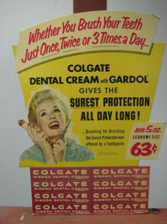
Do you know what Gardol is? Unless you are close to retiring, probably not… So here’s a bit of background: Gardol is sodium lauroyl sarcosinate — not a very harmonious sounding chemical. I’m guessing Gardol was a clever marketing trick of combining the words “Guard” and “All”, relying on the phonetic combination to drive home the idea of protective quality of this chemical compound. In our society, chemicals don’t sell — we have an aversion to chemicals, we only want natural products! The common Western p-prim (or folksy wisdom) is that chemical are bad for us, and products created from natural ingredients are good for us … never mind arsenic! Gardol might have disappeared from the drug store ads, but the chemical sodium lauroyl sarcosinate didn’t — today it goes by the name “Advance White” and is part of a very well respected for its natural and health-consious products, Arm & Hammer toothpaste! Oh, and we don’t like the word “dental cream” — it’s toothpaste now…

How Do You Know When Contractors are Lying to You?

Do you sometimes get that sunken feeling that your contractors are flat out making up statistics about your users on the spot? I do get that a lot…but until just a few days ago, I didn’t have the indisputable evidence. Slide below is from a Russian contractor Power Point deck explaining the user demographic breakdown for different forms of payment awareness among the 18 to 45 year-olds. The logo of the company which made this slide is blurred… But for those of you who don’t speak Russian, let me walk you through the slide. Horizontal variables are: Knowledge of the type of payment and Usage. The columns are: Credit Card Payments; eMoney; Internet Banking; non-Internet Currency (aka cash); and payments via SMS. 79% of the population of Russian cities with population of over 800,000 people (really?) know about SMS payment systems and 22% use them. While only 93% heard of “offline” cash!

Daniel Kahneman, Customer Service, and Perception of Quality

Last week, we went to listen to a talk by Daniel Kahneman and by coincidence I’ve just finished reading his book, Thinking Fast and Slow, just a few months ago. The ideas in the book are amazing and worth a read (it would be great if the two academic papers included in the back of the book and for which Dr. Kahneman received his Nobel Prize in Economics were printed in a font larger than 8 points!). And a few days after the lecture, I was struck by an obvious application of his ideas, or more to the point, how his experiential self versus remembering self concepts help explain the customer service phenomenon. It has been known for a long time that politeness of error messages and civility of customer service play a strong roll in how the experience with the product is remembered. Above a small portion of the Google Image Search results for “error messages”. The internet is full of these because people get so irked by such messages that they want to share their bad experiences with others. The results are just as illuminating for “bad customer service stories”. Again, a good bad story has legs! But…

Extreme Hypocrisy

Gul Meena, 17, left her abusive husband in Pakistan for another man. Meena's brother hacked her friend to death with an ax, before turning on her.

On the same day as I read about Gul Meena — a 17 year old Pakistani girl who was almost killed and severely maimed by her own brother — I bought a pair of skinny jeans. When I got home, I noticed they were made in Pakistan. I think I don’t need to say more… Gul Meena, 17, left her abusive husband in Pakistan for another man. Meena’s brother hacked her friend to death with an ax, before turning on her. Skinny Jeans Made in Pakistan

The Tone and the Interface

2013-03-21 Cheese from Farmers Market Amsterdam

I just returned from a brief visit to The Hague and Amsterdam. When in a foreign country encountering an unfamiliar language, it’s easy to focus on the visual presentation of content since the linguistic portion of the presentation is unavailable for processing. People who can read can’t help but do so when presented with text. But when one can’t process the linguistic content, all that is left are visual clues (and smells and sounds…). So I took a few snapshots to show how the tone of the interface impacts the emotional processing of content and attitude of the customer to the content. Selling Cheese in Amsterdam This is a farmers’ market stall in the middle of Amsterdam, selling home-made cheese. The woman in the photo is the actual cheese maker. Note the hand-lettered signs, the simple wooden boxes, the plain presentation — the overall effect is home made goods, care in production, quality product, even made with love. Fancy production values would just be off putting in this context, and probably result in lower sales of cheese. This NOT a museum, but rather a neighborhood cheese store in Amsterdam. (It is located next door to the flower museum…). What is…

Perceptual Blindness in Design

Toy Packaging and Design Fails

It is not always users that fail to see some particularly “cool” aspect of design, failure to notice which leads to failure in product use. Designers are people too and are just as prone to cultural and perceptual blindness — total inability to notice additional (sexual) meanings hidden in their designs. Below are examples that I’ve been collecting from email forwards over the last few years. The general groups are toy packaging, store signs, logos, religious strangeness (especially with cultural shifts in time), product labels, and in particular strange dentists’ ads… Enjoy! Thank you all who contributed to this post!