In the spirit of Animaniacs’ “Bad Idea, Good Idea,” enjoy the following product ideas. And for those who’ve never heard of Animaniacs, please watch the short segment (you can see more on YouTube!). Need a bit of assist in your bedroom? Add springs for the extra bounce. Find yourself in need of a sure grip? Make room for fingers. Short on space? Don’t waste the cupboards under each stair. Need more animation in the morning? Use the light. Bored with tea? Get a personal assistant. Worried about your waistline? Get measured. Live to serve? Bump it up. Too sure-footed? Make every climb a challenge. Too close? Give your photos some distance. Product design is limited only by imagination. A Short Introduction to Animaniacs’ “Bad Idea, Good Idea”
Tag Archive for product design
Cultural Differences, Pipsqueak Articles, Product Design Strategy, Reference, Scaffolding, Users
Generation C, a Sample User Persona
by Olga Werby •
Here’s an Booz & Company article by Roman Friedrich, Michael Peterson, Alex Koster, and Sebastian Blum: “The Rise of Generation C Implications for the World of 2020.” [contact information for the authors is available inside the PDF] The Rise of Generation C
Cognitive Blindness, Conceptual Design, Diagnostic Errors, Errors, Featured, Mirroring Errors, Pipsqueak Articles, Product Design Strategy, Scaffolding
Empathy on the Brain
by Olga Werby •
Empathy is a necessary component of product design. To design and make something that is comfortable to use for someone else, requires the maker of the product to imagine how another human being would feel while using it. This is a hard thing to do. Medical students have to take “bed side manners” classes that explicitly teach empathy for the patient. Some design schools do the same (check out this video in Product Design Resources). Fortunately, humans come equipped with a special region in the brain whose job it is to help us see the world from another’s point of view. Here’s a short introduction by Rebecca Saxe, “How we read each other’s minds.” So when we go to the movies, we relate to the characters and feel what they feel, and cry when they are sad, and laugh when they are happy, and cringe when things get awkward, because we have the Right TPJ (or RTPJ) region in our brain just behind and above our right ear. We aren’t born ready to use this part of our brain, as the experiments described by Dr. Saxe in the video show. It takes a long time for this social problem solving…
Cultural Differences, Pipsqueak Articles, Product Design Strategy
Bio-Couture
by Olga Werby •
My grandmother grew a “mushroom” in her kitchen, feeding it tea and sugar. It had a slightly sickly sweet smell and it was hard and springy to the touch. I never liked to drink the stuff, but I always considered it somewhat of a family pet (I never had a dog or cat, being allergic to both). Years later, a friend game a small batch of mother culture grown in black tea—”That’s the stuff,” I thought! I kept growing it for a few years, with my family extremely squeamish even at the thought of it living in our kitchen. But I liked it, it felt like a bit like having grandma in my kitchen. It lived for about 4 years, and then died when we left it alone for a few weeks while we traveled on vacation. My boys were thrilled. Recently, I’ve read that Google has been growing these in green and black tea varieties for their employees cafeteria—apparently, it’s in fashion again. And now I came across a video below: Now that’s truly being fashionable!
Cultural Bias, Cultural Differences, Ethnographic & User Data, Pipsqueak Articles, Product Design Strategy
Cultural World Domination
by Olga Werby •
When we first arrived in New York as Russian refugees many, many years ago, everything was so confusing. I remember lying on the bed in a hotel room somewhere in Brighton Beach, Brooklyn, with my whole family (mother, father, sister, and me) and watching commercials on TV. There was a stick figure running around the screen screaming “Cherio-o-o-o-o-o-o-o-s.” We debated for hours trying figure out what it was about. And then there was a time when my parents let me buy a bag of Cheetos. I almost vomited when I tried one—in Russia, things that looked like that were sweet. The complete mismatch between my expectations and the actual taste made me gag. To this day, I hate the stuff! So when companies are on the path of world domination with their products, understanding cultural differences in background knowledge, perceptual expectations, preferred ways of doing things is a must. To see how some giants customize their products to make them more culturally sensitive, I took a look at McDonalds‘ menus from around the world. Check it out: Note: I went looking for the old Cheerios commercial, but could only find this one—it’s close, but the one we saw didn’t have…
Conceptual Design, Cultural Differences, Ethnographic & User Data, Pipsqueak Articles, Product Design Strategy, Users
Demonstration of Wealth
by Olga Werby •
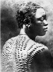
People have been flashing “bling” around since the cave days. But what we perceive as “bling” has changed dramatically over the years and over cultures. We are social animals, we put a lot of value in our place in the social hierarchy of the group. By demonstrating wealth, we are advertising our social status in the community. Body Image How can you tell how much influence a cave man had in his group? Well, one was probably the way he looked: body paint, tattoos, scarification, body modification, hairdos, teeth filings, nail beautification, and accessories. And while somethings were transitory—beads are easily lost in battle, nails broken during a hunt—some are permanent status symbols. When all you owe is carried on you, then permanent modifications is a good solution to broadcasting your importance and achievements to the group. Each scar carries meaning and is much easier to show off than notches on the bed post. But body modifications is a very painful bling. Products Once the society is a bit more stable, stuff becames a preferred way of social display. Jewelry can be worn, homes can be owned, cars can be seen—there are many ways to show off wealth in the…
Background Knowledge, Conceptual Design, Cultural Bias, Interface Design, Pipsqueak Articles, Reference
Evolutionary Theory of Beauty
by Olga Werby •
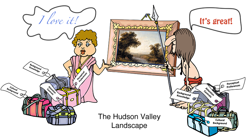
David Brooks: The Social Animal I just finished reading a book by David Brooks, “The Social Animal.” While initially hesitant, I really enjoyed reading it. The book, a fiction, bundles together a lot of interesting information on the latest (and not so latest) advances in our understanding of the workings of the human mind. So it’s easy to see why I would like it! While there are many ideas worth considering in the book, I picked a small detail mentioned in passing: the evolutionary pull towards the love of a “Hudson Valley Landscape.” The Hudson Valley Landscape has the following features: The landscape has lots of open space interspersed with tall vegetation. There’s a far horizon that defines the space: a valley, a glade, a river basin, a farm, etc. There’s a clear evidence of fresh water: a river, a stream, a pond, etc. There are a few large trees in the foreground, offering shade, fruit, safe escape, or all of the above. There’s a path from the foreground to the background. There are people and man-made structures visible somewhere. There are “safe” animals or birds visible: cows, ducks, deer, etc. Amazingly, all cultures respond positively to this genre of…