I came across this short video: “The White Wolf” by Pierre-Luc Granjon. It is an 8 minute animation short about two brothers living in a small French village. Please pay attention to the story-line (I know it is an obvious thing to pay attention to): would it have been received well in US? Note that it is not more gruesome than “Snow White”… This is why cultural context is so important to product design and why I teach the class!
Tag Archive for context
Background Knowledge Errors, Cultural Bias, Group Decision Errors, Mental Model Traps, Misapplication of Problem Solving Strategies, Pipsqueak Articles, Product Design Strategy, Scaffolding
Knowledge, Context, & Expectation
by Olga Werby •

These are three necessary components of any product design: Knowledge: the background information that forms the foundation of product design Context: the ecosystem in which the product will be used Expectation: the alignment of goals between product creators and the users for which it was designed A failure to fully understand any of the above variables results in errors that propagate throughout the product system. But what if the product is disaster preparedness? Consider the design of an evacuation plan ahead of a disaster. You would need to understand the what kinds of damage the disaster is capable of wrecking; the probabilities for each outcome; the people and the ecosystem in which the disaster will occur; and expectations of all the participants in the evacuation plans. Tsunami and The Zoo A few years ago, I was teaching a fifth grade science class where we were discussing the possible damage from a tsunami in San Francisco (we just visited the Bay Model). The problem I posed to the students was to design a reasonable evacuation plan for The San Francisco Zoo animals. The Zoo lies on the tsunami flood plane, and as far as we knew there was no plan for…
Cultural Bias, Cultural Differences, Interface Design, Mirroring Errors, Pipsqueak Articles
Context and Information Processing
by Olga Werby •

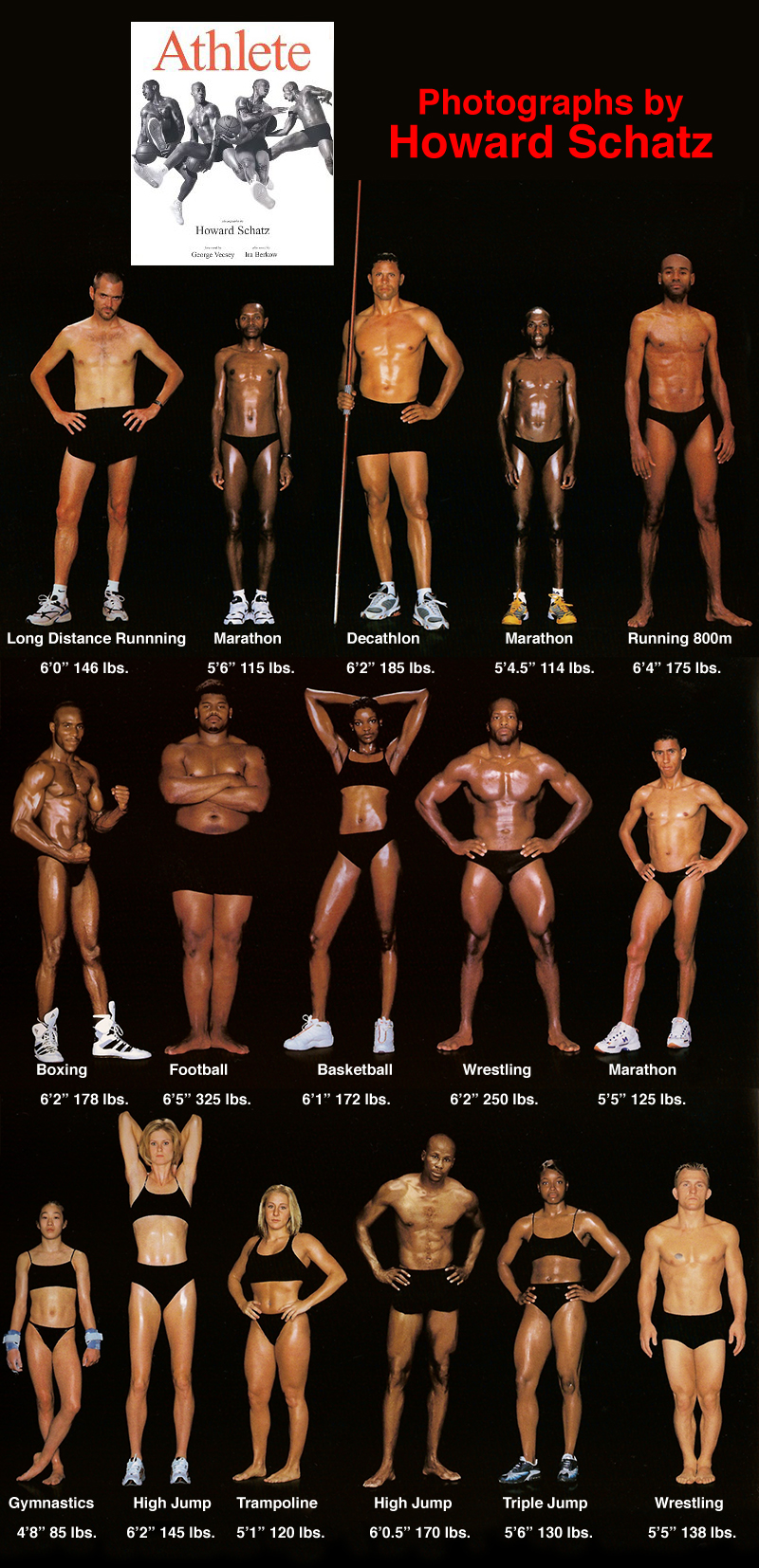
Sometimes a book comes along that demonstrates in a very effective way the meaning of perfect. There’s a saying: “I will know when I see it.” But our seeing and knowing is wrapped up in our cultural bias and prone to mirroring errors. This contextual confusion over categorization is often cited during the discussion of American blindness to fat—when everyone in a group is over weight, no one is. The book “Athlete” shows what’s normal for various athletic groups. And what’s normal to some is amazing to others…
Background Knowledge, Conceptual Design, Flow, Interaction Design, Interface Design, Pipsqueak Articles, Product Design Strategy, Scaffolding, Users, ZPD
Remarkable Design
by Olga Werby •

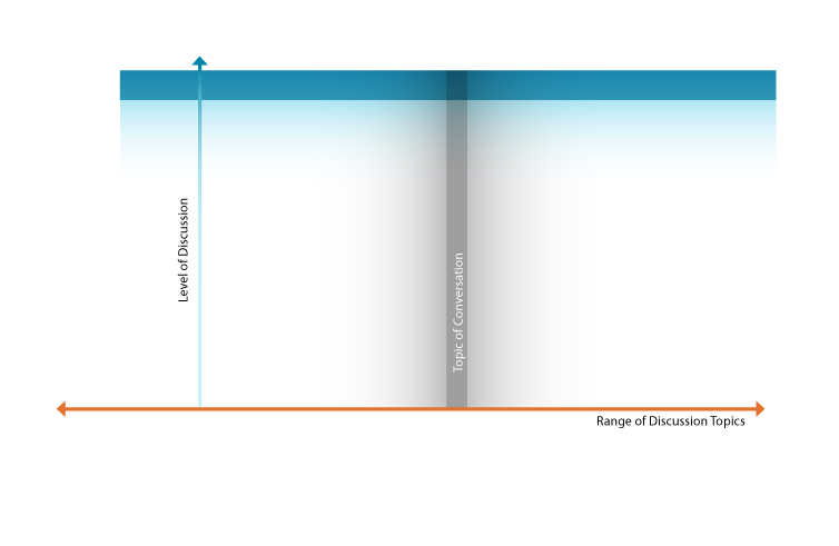
How does one design a remarkable product? “Well, it depends on a product,” some would say. But couldn’t we say something general? Why do we feel passionate about some products but not others? Consider conversations: some are fun, some are boring; some engage lots of people, some not so much; some result is heated exchanges, some are more neutral. Note that you can be very passionate about a topic, but don’t consider it fun: rape, genocide. Politics engages lots of people, but the details leave most bored. Some conversations generate sustained interest, and some fizzle out without a remark. What’s required for a conversation to be remarkable? That depends on the audience. To be engaged in a discussion, you have to find the topic interesting to you. And what’s interesting to you, might not be to me. Thus the topic of conversation is a variable of the targeted audience. Even if you find the topic amusing, you might not have the time to participate in the conversation. “I would love to talk to you about quantum space time, but the plane leaves in 5 minutes.” And it is so noisy on the plane that you can only hear every other…
Cognitive Blindness, Conceptual Design, Contributor, Cultural Bias, Cultural Differences, Ethnographic & User Data, Group Decision Errors, Interaction Design, Interface Design, Product Design Strategy, Users
Lessons to be Learned from the GAP Logo Debacle
by Sheetal Elangovan •

Geoghegan, T. (2010). “Lessons to be learnt from the Gap logo debacle.” BBC News Magazine. Retrieved on October 12, 2010: http://www.bbc.co.uk/news/magazine-11517129 A new logo can brighten up a company’s image or enrage loyal customers. In the case of GAP, the latter was obvious. The release of the new logo led to a huge online backlash from customers on FB and twitter conveying how unhappy they were with the logo. Within a week of release, GAP chose to revert back to the original logo after a slew of criticism. GAP LOGO The importance of being an iconic brand has been severely undervalued. The association of the image and brand is overlaid in the minds of people for the last 20 years. Changing the visual must have pre empted GAP to have tested the logo with focus groups and understand the reactions of the audience. The changed their visual imagery without upsetting customers. The logos below have retained their sense of familiarity which is refreshing and yet without really giving customers the need to process an all together new image to associate with the brand. Companies uniformly moved from serif font to a more elegant Helvetica. MSNBC LOGO GE LOGO Product Positioning:…
Conceptual Design, Ethnographic & User Data, Interaction Design, Pipsqueak Articles, Product Design Strategy, Scaffolding
Cheating by Design
by Olga Werby •

The Road to Hell is Paved with Good Intentions. This year, the Metropolitan Transpiration Commission introduced the new Clipper Smart Card. Public transit riders all over the Bay Area can now use a convent piece of plastic to pay for their BART trains, buses, MUNIs, etc. Just swipe the Clipper Card past one of the little readers, and the gates open to let you in and out of the station or pay for the bus. The cards could be purchased in stores and vending machines all over the area—$2 cards are the minimum value cards. More money can be easily added to these cards at all BART train stations. The designers of Clipper Card envisioned happy riders and happy transpiration authority. “We’ll make it easy,” the designers said. “Easy to use, easy to fill up. And if the passengers accidently run out of money on their cards, we’ll allow them some small negative balance so they can leave the train station and pay for their rides later.” In the Bay Area, the cost of public transportation is pretty high and it’s highly dependent on how far you want to go: travel from City Hall to Airport, pay $8.10 for a…
Cognitive Blindness, Conceptual Design, Cultural Bias, Ethnographic & User Data, Featured, Flow, Interaction Design, Interface Design, Mental Model Traps, Mirroring Errors, Pipsqueak Articles, Product Design Strategy, Scaffolding, Users
Thinking About the Future of Reading
by Olga Werby •

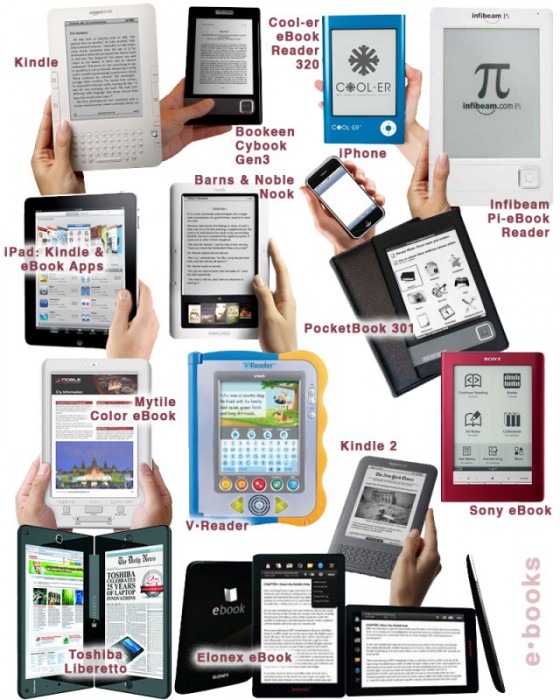
The Taxonomy of Usefulness We are a family with two Kindles, three iPads, two iPods, and an iPhone. We also have a few thousand old-fashioned paper books stored on bookshelves in every nook and cranny of our home: bedrooms, bathrooms, kitchen, stairs, garage, closets, family room, and any other space and surface that might hold a book or two or ten. We are into reading! And we use our Kindles, iPads/Pods/Phone, and computers to read as well. And while statistically speaking, we make just four data points for four family members, I feel we have something interesting to say about using technology to read. To help me understand my own relationship with reading and technology, I’ve come up with a little Taxonomy of Usefulness. If you’ve been reading this blog (or my books and papers), you’d have noticed that I like to slice up the world into groups sorted by a set of variables that I find useful at the time. Forming categories helps me think—the Cognitive Wheel is a prime example. Taxonomy of Usefulness These variables help derive the value of the electronic reading devices. Ergonomics There are many attributes to consider when describing the ergonomics of a device,…
