Remarking on the Unremarkable

Steve Jobs Wikipedia cropped B&W

What’s the difference between a consumer of good design and a designer? Well, it boils down to the ability to notice an opportunity where a product or a fix or a nudge can make a positive difference in someone’s life. During his 1989 interview with Inc Magazine, Steve Jobs famously said: “You can’t just ask customers what they want and then try to give that to them.” You see, designers don’t ask for solutions. They discover them and share them with the world. So what does it take to discover a good design solution? I believe it comes down to ability to see a pain point, to notice an opportunity, to remark on the unremarkable! Allow me to share to few examples from personal experience in the last few months. Drug Labels I recently had a heart stress test. Unfortunately, the IV drug they tried to use had an unusual side effect — my heart rate would go up and then quickly drop, enabling the doctors to perform the test. The nurses scrambled for another drug, but they also needed to make a report — such and such a drug on such and such a patient resulted in bad reaction.…

We Are the Magicians

Maximilien Luce, Morning, Interior, 1890, using pointillist technique

We all make magic every day. Don’t think so? Then consider this, we conjure up complete worlds of information with a mere suggestion, just a bit of outline, a stroke or two, a few words, a spatter of color, a dash of melody. We literally make grand visions from just a trickle of data. This is true for those who design and those who consume information. Let’s first explore our ability to comprehend very incomplete information. Take pointillism — an art movement (technique) that required artists to create images using points of pure color — why are we able to “see” the complete image from a mere collection of dots? With just a collection of colored dots, we are all able to imagine the mood, understand the story, visualize the universe behind this painting. You can say: “well, the artist was great at using dots.” But it is not just dots that we are good at. We reconstruct our reality from little bits of incomplete data all day every day of our lives. Consider the tone of voice of the person who answered the phone — you can easily tell the mood and even guess at the personality of that…

Fun, Creativity, and Good Design

springy bed frame

The best product designs not only work well, they make us smile. They solve problems we as consumers haven’t even consider yet or realized we had. Take a look at a selection of product designs below. The springy bed frame is not only functional, but a conversation starter — don’t you want to try it out? The “selfy stick” helps us take better photos of ourselves. Our arm reach is no longer a limitation or a liability — I like my portraits taken from the top to reduce that double chin! It’s fun to be elegant… until it all crushes down around us. Finger tip tray is the solution! Finger food will stay safely on top of the tray with this cool design. And again, it’s a conversation starter — a perfect tool at a party. While I’m not sure I would advertise my waist size with this imaginative belt, it could serve as a powerful reminder to keep to a diet. Serving tea to your aunt? Wouldn’t this put a smile on her face? In one of my design classes, a student proposed a bed light that would adjust to awaken the sleeper gently. This one does it with…

Review eBook: Affordances and Design

Manches a Gigots

Victor Kaptelinin, a Professor at the Department of Information Science and Media Studies, University of Bergen, Norway, and the Department of Informatics, Umeaa University, Sweden, just published an eBook with Interaction Design Foundation: “Affordances and Design.” I was asked to write a review of this book and provide some insights into using affordances in interaction design and HCI. Let me start by providing the definition of affordance as given by Donald Norman: In his eBook, Victor Kaptelinin provides the history of the idea of affordance from its initial introduction by James Gibson in 1977 to the present day. The eBook’s bibliography and reference section is a great place to start the exploration of this topic for anyone new to these ideas. Unfortunately, the book doesn’t help much if an individual is looking for some guidance on how to apply these ideas in practical situations during interaction design or HCI design. For clarity’s sake, allow me to give a very brief explanation of affordances, from their roots to the present time. When James Gibson first introduced the concept of affordances, he focused on physical environment — what actions are possible? And the set of these action were invariable — just because…

Self-Marketing Ideas for Small Businesses, Non-profits, and Schools

Self-Marketing Ideas for Small Businesses

If you are running a small business, or a non-profit, or a school, marketing budgets tend to be very small. There’s just not a lot of money to spend. But institutions that are lacking in money can use time — of their volunteers, family, friends, staff, and students — to support their marketing and PR efforts and to generate some buzz about their organization, work, and services. The chart below focuses on just five media outlets: LinkedIn, Twitter, Facebook, Pinterest, and a blogging platform WordPress (other blogging SMS systems can be easily substituted). The idea is to spend time to continuously generate fresh and relevant-to-your-industry and audience content and then share it. Some things are very easy and don’t take much time: sharing articles and photos, tweeting and retweeting, liking and favoring, and pinning. Other activities take a bit more time: writing reviews and comments, creating galleries and image collections, etc. The hardest is blogging — this can take a lot of time and small organizations have to be careful how they allocate their time. But students and friends and volunteers can help. Used together, LinkedIn, Twitter, Facebook, Pinterest, and an organization blog, can form a powerful do-it-yourself marketing strategy:

Perception of Value is Situational

When you make pancakes, do you want them perfect? Perfect in taste? Perfect in texture? Perfect in shape? Who wouldn’t, right? When I cook, I want my creations to be pleasing to my audience (usually my family). Even on cooking shows, there’s a segment which helps home cooks make their creations look more professional — i.e. more perfect. As I was looking to buy a crepe-maker (non-electric), I read a bunch of reviews for all kinds of gadgets that promised a perfect crepe. One of the important criteria was the perfection of shape — a good crepe is circular, implying that a badly made crepe has irregular borders. There were all kids of clever inventions that helped the home cook achieve this circular perfection — molds, rakes, squeeze bottles, etc. At the end of my research, I got it — my crepes better be circular! But in others circumstances, this perfection of shape has a complete opposite perception of value. If you are buying frozen, pre-made crepes, then perfectly circular shapes signals “factory-made” or “made by robots” or “cookie-cutter crepes”. All of these are now derogatory things — who would want to eat crepes made by a machine? Untouched by…

Matters of Trust

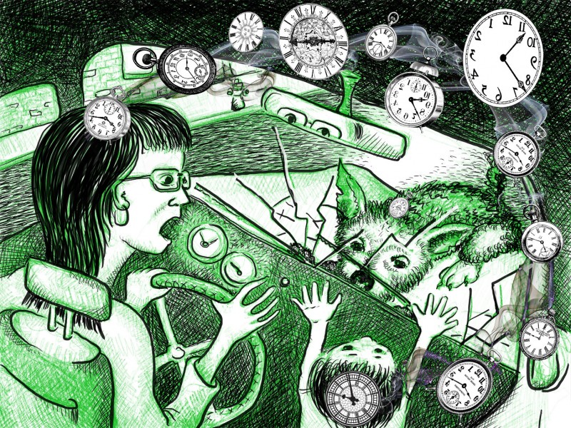
call center experience

In the last few months I’ve started several new relationships. One was with BlueShiled of California — a relationship that was forced on me by the changing health insurance laws. The other came about from trying to find a place to stay in United Kingdom for our family vacation. I didn’t actively want these relationships, but here I am. And I am not very happy. The basic problem comes from the flow of trust. I’ve never heard of anyone else talk about the directionally of trust, but it is a very important concept to understand for any customer service oriented company. I will illustrate the idea using my new relationships. BlueShield Customer Service Failure! Let me start by saying that I wasn’t overly fond of my previous insurance company. In fact, that relationship was very much like this new one with BlueShield — antagonistic. My story begins in October of 2013, when I created a spreadsheet of all my family doctors versus possible new health insurance companies. I wanted to make sure that which ever insurance I picked, my family doctors would take it. I spent the afternoon making phones calls and ended up with BlueShield of California as my…